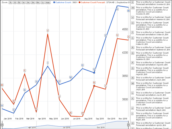
The Annotation Chart helps to visualize data over time using a line chart with annotations to provide insight into data points. Annotation charts are interactive, time series line charts with full annotations that are visible on the side of the visualization, rather than appearing in a tooltip. The annotations correspond to specific data points on the chart.
The sample annotation chart below compares current customer counts with customer counts for last month and last year, over the period of a year. View the image below for reference:
Object requirements:
Minimum Strategy version: 10.2
Publisher: Strategy
To install this visualization:
By downloading or using this visualization, you accept and acknowledge these terms.
This visualization is both intended as sample code and provided as a convenience to Strategy users. Strategy cannot guarantee that the code provided will apply to any Strategy releases and clients outside of the versions stated within this article. This sample is supported by Strategy Technical Support up to and including the basic visualization functionality listed in this article. Defects will be triaged by the Strategy team as they are raised. For users with active Strategy Technical Support contracts, contact Strategy Technical Support to raise these defects.
Anyone seeking to use this visualization is encouraged to review and adapt this sample based on user requirements. Contact Strategy Professional Services for assistance with these same adaptations. If users would like to provide feedback on or recommendations for this visualization, post in the comments section of this article.