Starting with the release of Strategy ONE (March 2024), dossiers are also known as dashboards.
In Strategy, you can create beautiful and informative bar charts to analyze data. Also called Bar Graphs, Bar Charts can be vertically or horizontally aligned. The "swap" feature lets you switch axes with just one click of a button. Bar charts consist of rectangular bars with lengths proportional to the values that they represent. They work well when we want to determine the largest and smallest groups in a dataset, as well as examine differences between intermediate values.
Some potential uses of bar charts:
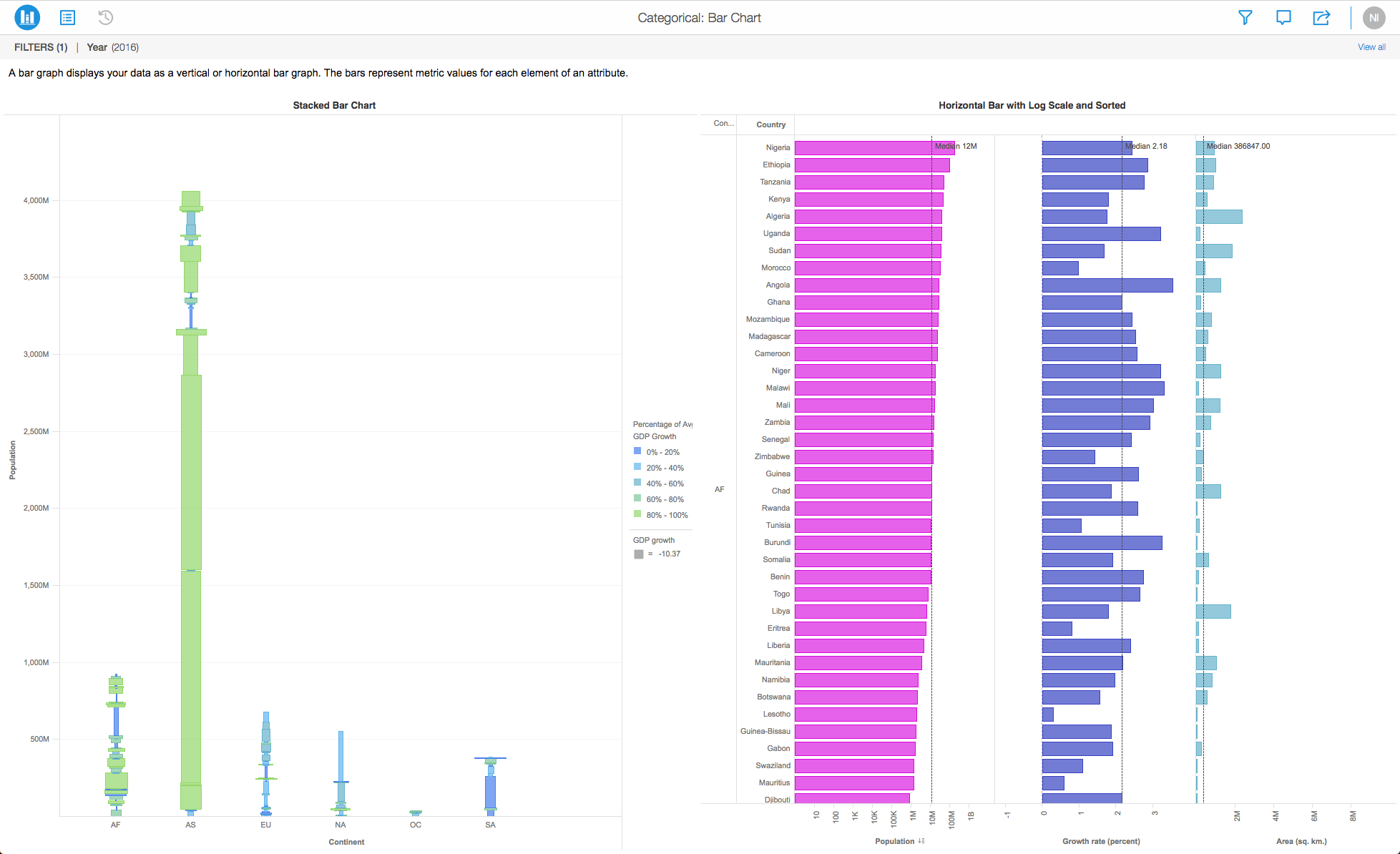
Bar charts are easy to use, flexible, and allow you to easily compare a wide range of data values. When a user hovers over the data on a bar chart, tooltips are displayed to convey important information and data values.
Here are some different Bar Chart types that you might want to get familiar with:
Minimum Strategy version: 10.9
Publisher: Strategy
To view this dossier with the visualization, download the .mstr file below and deploy it in Strategy Desktop or Strategy Web. You can open a working demo by uploading the .mstr file below and doing the following:
Start your analysis using bar charts by downloading MicroStrategy Desktop now!
Interested in learning more about Dossier authoring? Visit the Learning Center on Community!
Or go to our Documentation pages for more product information.
A project in beta by ferdio, (2017, December 4th). Retrieved from https://datavizproject.com/