Starting with the release of Strategy ONE (March 2024), dossiers are also known as dashboards.
The State of Location Intelligence
Obtaining and integrating location-based data into analysis is essential to the success of an organization’s business strategy. This is true for companies across the board—restaurants viewing the most popular locations across geography, hospitals evaluating the locations that have the most incoming emergencies, or even universities obtaining information on in-state versus out-of-state admission. And that’s just the start. Advertising companies have recently started to use geo-fencing capabilities to capture user data and create targeted ads based on specific location, weather, or even specific events (i.e. Coachella, World Series, etc.).
Historically, many of these companies have used bar charts or grids to view location data, but now turn to advanced mapping solutions to easily find trends that might not have been seen before. And that’s where we come in. With a large portion of big data being geospatial, Strategy offers two main mapping solutions: ESRI and Mapbox geospatial services. The goal is to craft our mapping solutions to empower you to make critical business decisions faster—and make impressive, next-level visualizations nonetheless.
To help you design maps that have impact, our Product team has compiled best practices.
Let's get started with Mapbox.
Start by reviewing your data and really think about the insights that you would want to be able to view from on the map. What would help executives make a decision? What metrics should be in the tooltip? Do you want creative labels? Do you have specific metrics that you want to see in the tooltips?
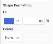
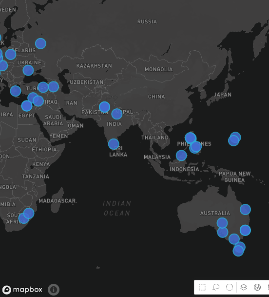
It may seem like a more trivial decision, but the color of the map (both the map style and colors chosen for thresholds) can enhance analysis tremendously. In fact, many times a map visualization can be the central part of a Dossier. Users can easily mix-and-match map styles with shape colors to make the map unique to the organization. Our top color combinations? We love to mix the Dark Mode with light blues or greens for an electric vibe.

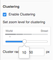
Zooming enables users to add a dynamic element to the map. For example, at the World level, you might want to view Sales or Revenue at an aggregate level. As the Business user zooms into the state-level or city-level, they may want to view data at the store level. With multiple layers and zooming effects, the user gets more data for analysis.

The tilt is a secret weapon for many of our users, but it is a powerful setting. To use the tilt function, use the

icon on the map canvas. You can tilt the map and continue to zoom in and out to view the map at a new angles.
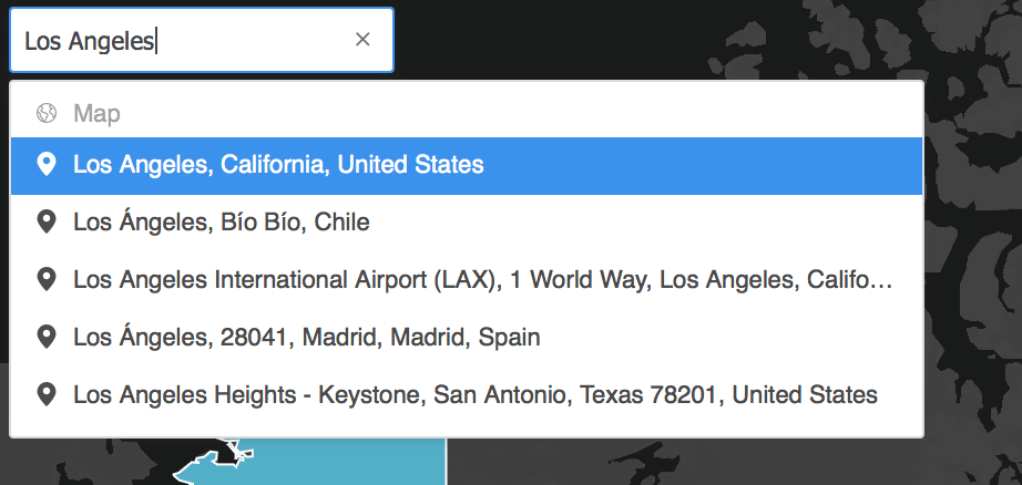
Want to know another top trick? Use the Search bar in authoring or Library to quickly locate a spot on the map.
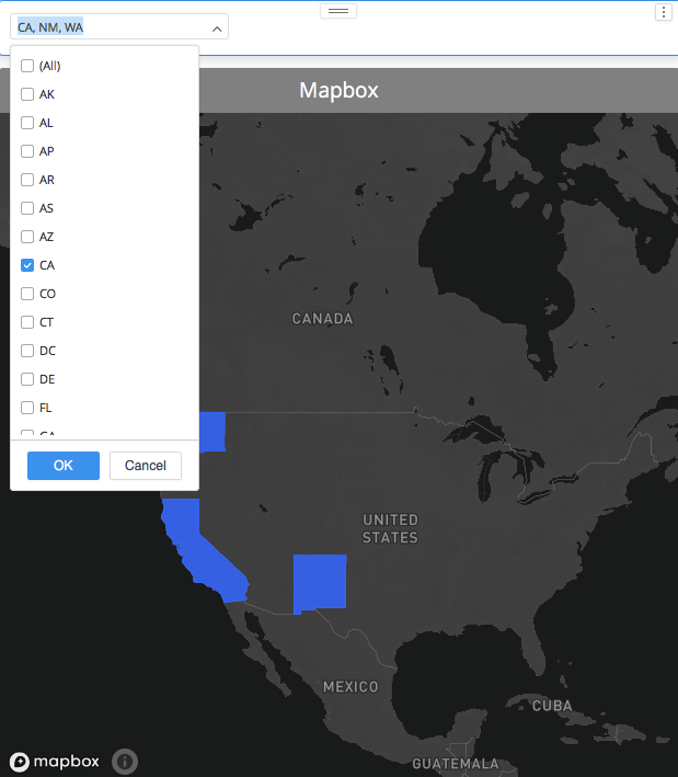
Filters help users to evaluate specific parts of the map. Feel free to use an advanced visualization filter to add a qualification or a page filter (Attribute/Element filter) that the end user can change or manipulate during analysis. Many times, the user might want to only see specific countries or states on the map for quick insights.
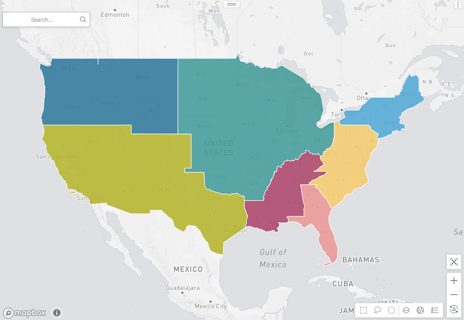
Custom Shapes are new to Strategy 2020 and allow you to create map boundaries such as custom regions or custom Sales territories for more precise analysis. Although custom shapes were offered with ESRI in previous versions, the new Mapbox workflow allows you to bring in KML or GeoJSON files directly in Data Import.
Not sure where to start?
If you are interested in making your own GeoJSON. Please visit http://geojson.io/. You can draw area(s) with the drawing tool online and export it to GeoJSON data. Then, continue with Dossier.
You can also use the Google Earth Pro Desktop application to create shapes.
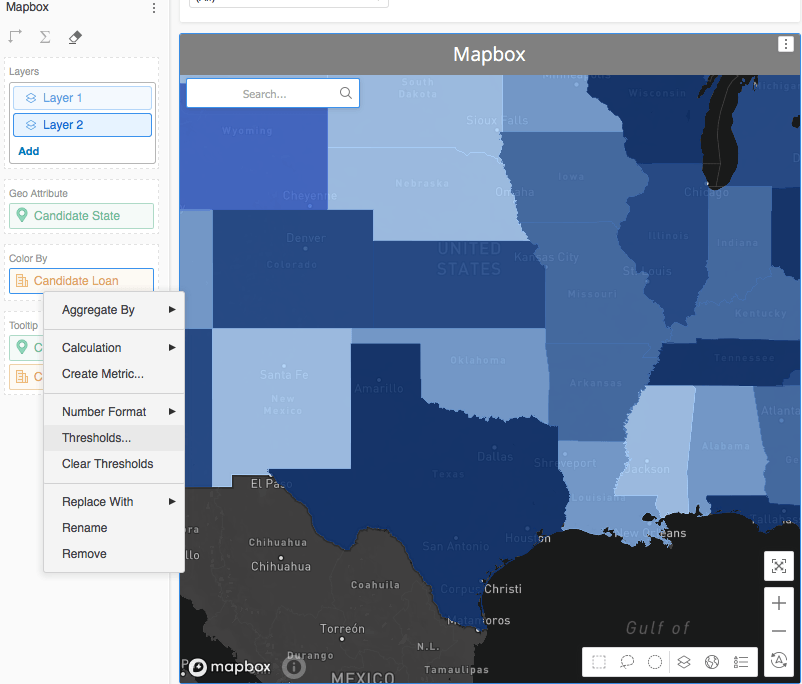
Thresholds enable users to get faster insights at a glance. For example, if they are used to specific colors that represent a high number of Sales versus low, they can easily glance at the states on the map to view Sales information that helps to drive business decisions.
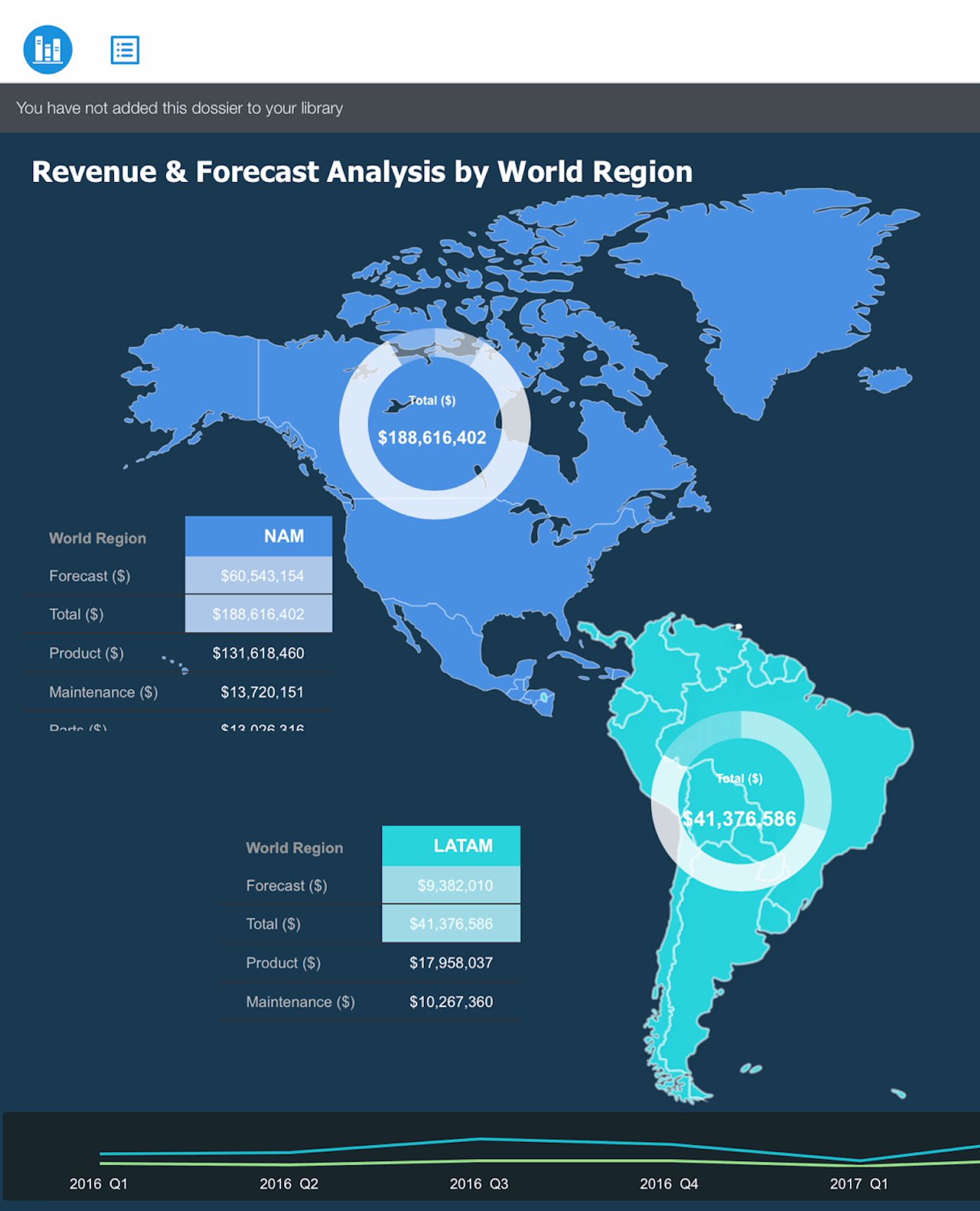
Free-Form allows you to layer visualization over others to create innovative Dossiers, as well as enhance analysis for your end users. Dossier authors can mix-and-match grids with maps or place filters easily over the map for easy use. Our favorite layering technique is to add the Sunburst visualization over the map for insights across geography.
Still looking to understand the differences between ESRI and Mapbox? Check out this article.
Learning Resources
Interested in learning more about creating maps with Strategy? Visit the Learning Center on Community.
