Starting with the release of Strategy ONE (March 2024), dossiers are also known as dashboards.
Strategy® is fully committed to inclusion of its customers and users with disabilities. We are taking steps to help ensure that the applications within many of our Strategy products, and our customers’ experiences, adhere to WCAG 2.0 Level AA standards. As a part of our commitment, we are pleased to present guidelines on how to create accessibility friendly dossiers and we encourage our users to keep the following tips and tricks in mind.
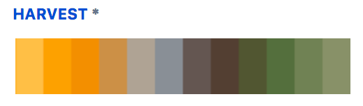
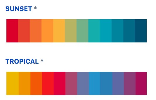
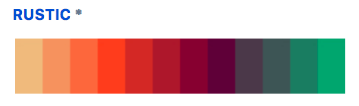
We have designed four out-of-the-box color palettes which are both color-blind friendly and high contrast. You can rest assure that your users will be able to distinguish between different components and analyze your visualizations with ease.
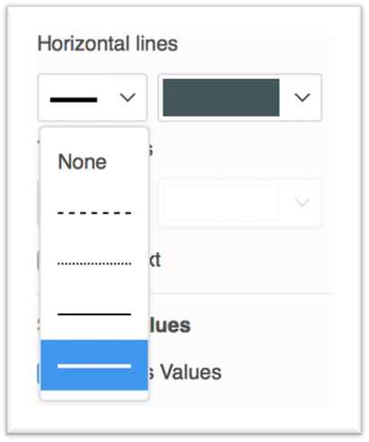
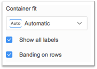
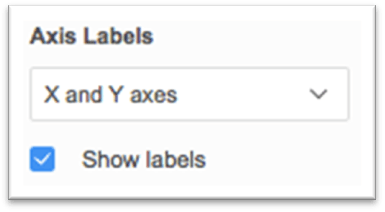
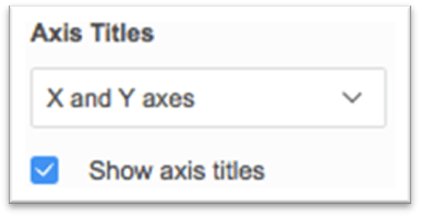
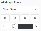
Readability is an important part of dossiers for all users, but it is especially crucial for those with low vision. There are several formatting properties you should enable to ensure visualizations can be seen with ease:
To see more helpful information on additional properties, view the documentation here.
Text size that is too small makes the content significantly harder to comprehend. Make sure your users can comfortably read text by following the recommended body text minimum of 9 pt and title text minimum of 12 pt.
Screen readers are essential assistive software programs that help convert digital content into synthesized speech. When a screen reader is used, the names of dossiers, chapters, pages, and visualizations will be read aloud to its user. It is important that these are appropriately named. Even if visualization titles are hidden in the dossier, ensure that the default titles are still replaced with a meaningful name which will be picked up by screen readers.
Assistive technology users often use the keyboard for navigation and you want to ensure your users are able to tab through the visualizations in your Dossier in a logical order. In Dossiers, containers are traversed in a natural reading order from left to right and from top to bottom based on their positions on the canvas. Place visualizations to the dossier with deliberation so that the intended order for keyboard traversal can be preserved.
Show Data in Library Web is a powerful tool for users who are visually impaired and allows them to still consume the information from a highly visual component, like a chart or map, in an alternate format. This feature will translate the information shown in the visualization into a screen reader friendly grid. Once a visualization is in focus, the Show Data window can be opened using the keyboard shortcut Ctrl+D. To read more information about this feature, view the documentation here.