Starting with the release of Strategy ONE (March 2024), dossiers are also known as dashboards.
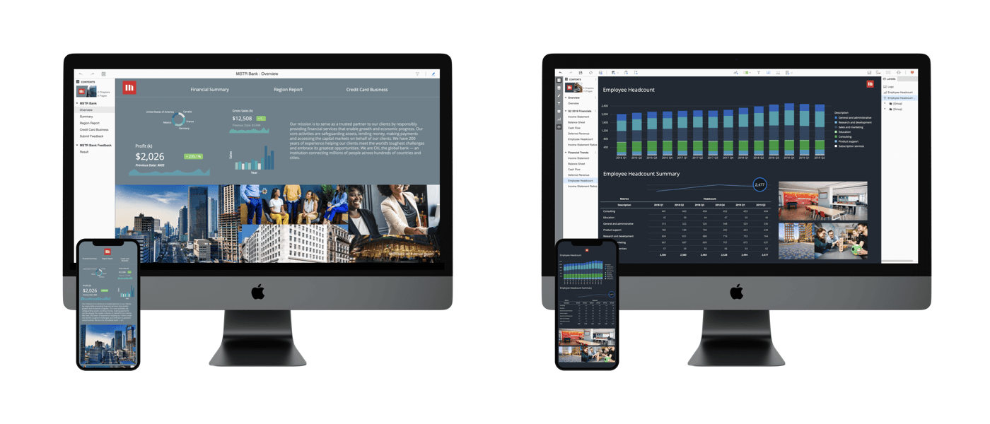
A dossier is an interactive display that you can create to showcase and explore business data. Dossiers were built to automatically resize based on a user’s device. No matter the device, the dossier will fit to the screen. However, this does not mean that the dossier will resize perfectly. In some instances, elements could be cut off or placed out of order.
With the launch of the new free-form layout in Strategy 2020, the idea of making your dossiers responsive is even more important. Free-form layout allows you to organize and overlap the containers that contain your visualizations, filters, selectors, images, HTML, and so on. With this added customization, it’s even more important to make sure the content is designed for both web and mobile viewers.
To help make this process smoother, the Product Management and UX Design Teams have collaborated to make you an expert in constructing a responsive free-form dossier.
Strategy encourages anyone who builds dossiers to read through. Even a quick review of the concepts can help ensure your dossiers look good wherever they are viewed. Many times, small tweaks can make it look just right.
Designing a free-form dossier for multiples devices requires a bit of planning ahead.
Understanding a percentage-based canvas and responsive design can help you build a dossier that looks great on most screens. There are different approaches to optimize your free-form dossier on web, tablets, phones, and anything in-between.
In this article, we’ll explore the following concepts:
Let’s begin!
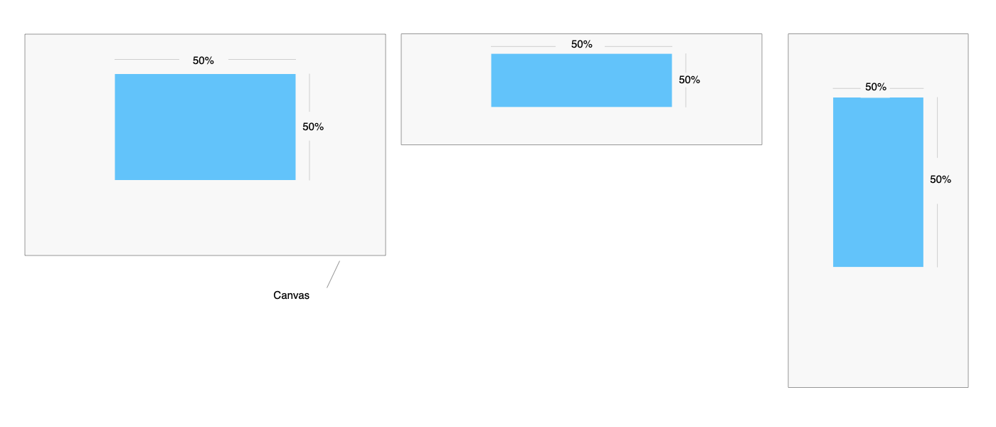
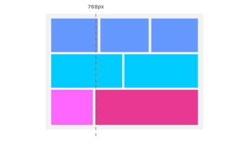
The free-form canvas is based on percentage, meaning each container will remain in its relative position and size to the canvas. In most cases, the canvas size is inherited by the screen size or the browser window.
Before the canvas width hits its breakpoint (768px), the layout should respect the entire canvas size. Whenever the canvas size changes, the contents of the containers is re-rendered.
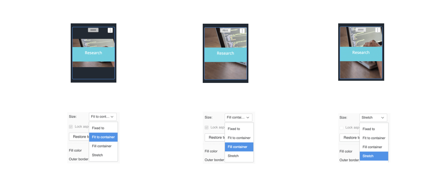
To allow your images to fit any screen size, go to your image’s Format options and set the Size to Fill container or Stretch. However, the Fit to container setting only works on a very specific image sizes, and it generally leaves unwanted white space whenever the canvas size changes.
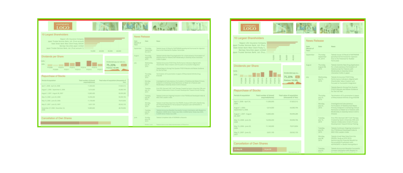
The percentage-based canvas is an effective strategy to handle layout within a size range. However, when the orientation changes (like from landscape to portrait), or the screen size dramatically shrinks (from desktop to mobile), it can be very challenging to maintain proper placement. This is where Responsive View kicks in.
Responsive layout grid (fluid) from spacing & layout grids
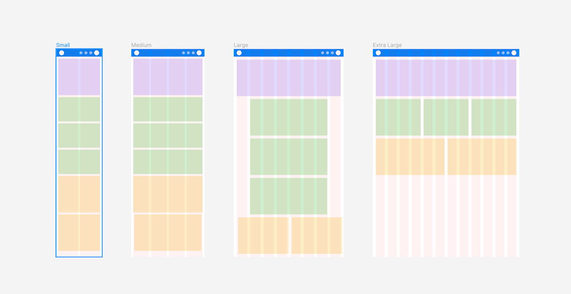
If you are coming from a web design background, you will find our Responsive View and responsive web design very familiar. The basic concept is that it breaks elements into small blocks and then lays out everything vertically on mobile. The only difference is that, instead of multiple breakpoints, the only breakpoint is 768px in dossier authoring.
The following explains quick and easy tips on how to build your dossier for the Responsive View.
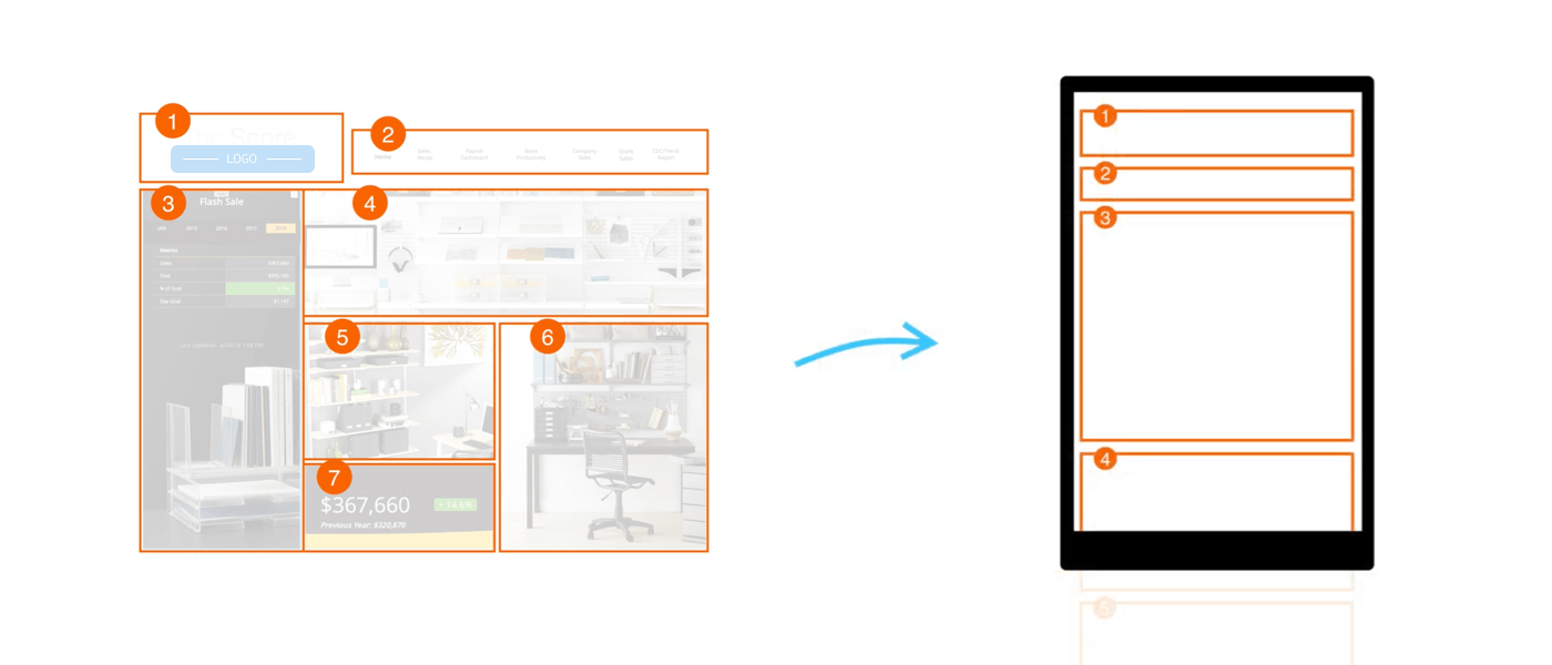
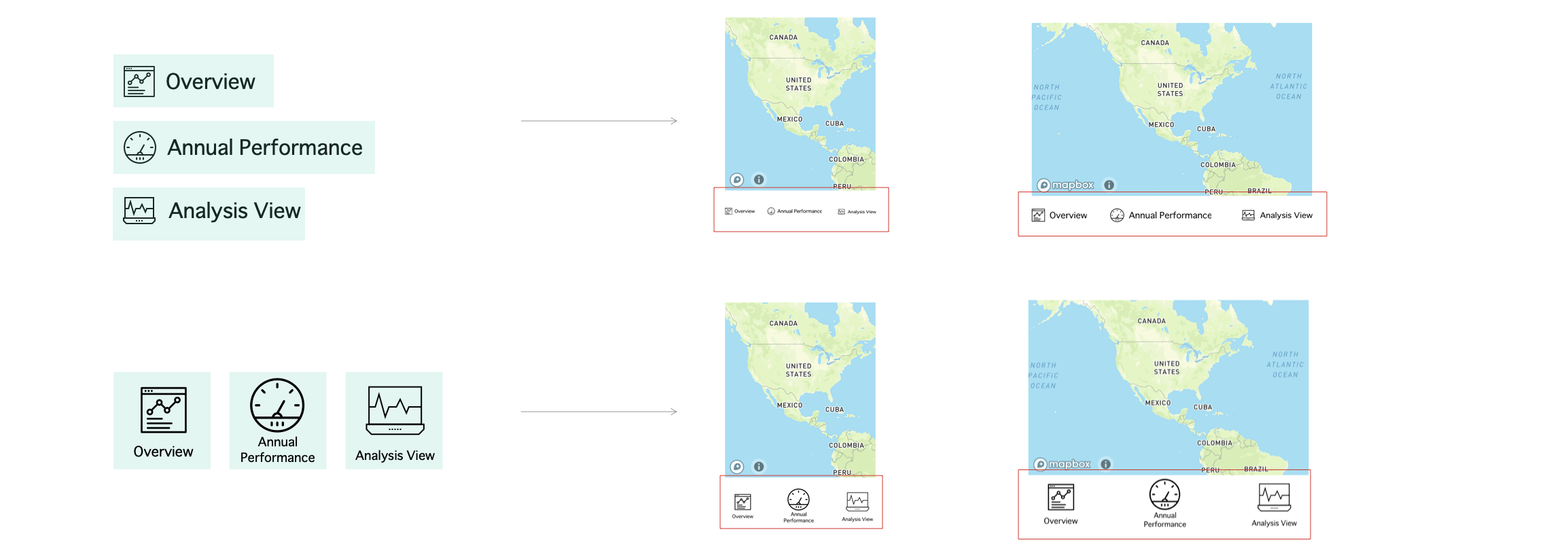
In free-form layout, we provide an intuitive way to let you visually “group” containers together. Then, for mobile devices, our Responsive View will take over the layout and place groups vertically on the canvas. The mobile placement order follows a “Z-path” (left-to-right and top-to-bottom order). With this in mind, you can build your dossier so that the containers will effectively follow the “Z-path.”
Additionally, you may find that canvas designs without boundaries are more difficult to read on smaller screens. For example, a design across the full canvas with blended layers is typically difficult to view on a mobile device. Instead, dossiers created with discrete layout groups usually work better on all screen sizes.
Quick Tip: To create a full-screen design that is also responsive on mobile devices, divide the background into pieces and then group them separately from the top layer’s contents. The design will then display perfectly on both big and small screens.
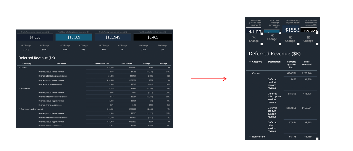
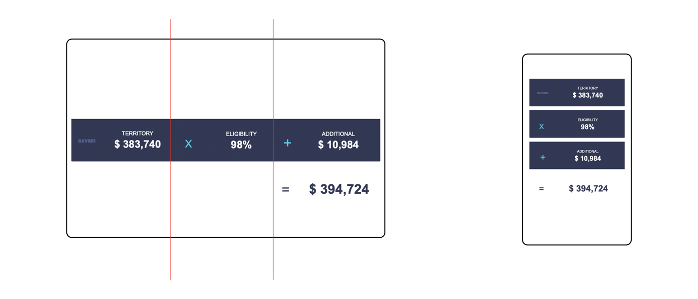
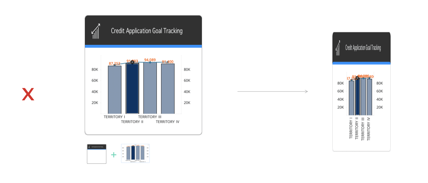
Have you ever built a dossier on a big screen and then realized many elements get cut-off in smaller displays? It’s a common design flaw! The key to fixing this problem is to give your dossier enough space to shrink and expand. Generally speaking, an overcrowded design is usually not flexible and will result in cut-off words, overlapping visualizations or images, and truncated text. The key takeaway: Less is more.
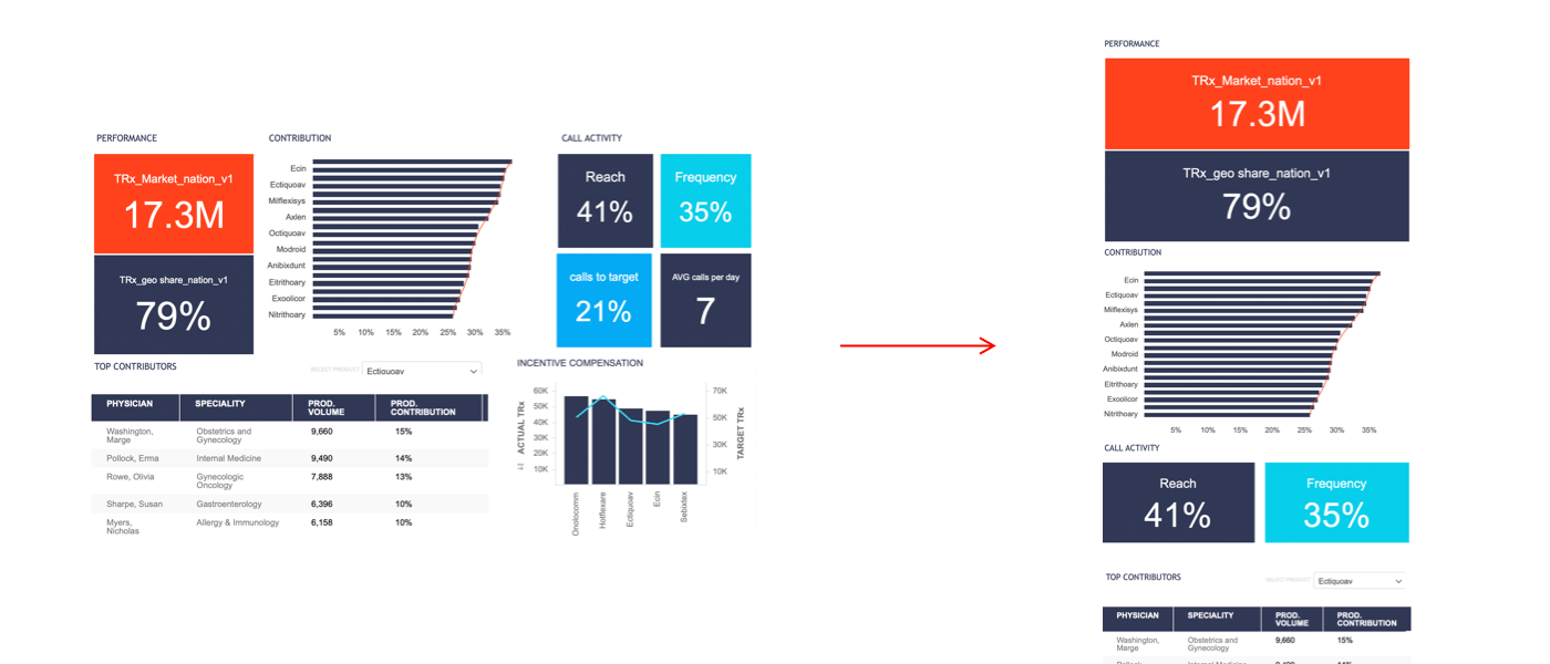
It’s best to choose only the most relevant information to appear on your dossier. This can be done by removing redundant attribute names, reserving adequate white space, and simplifying charts and number formats. Not only does this help with your designs, but it makes easier for your viewers to consume important information.
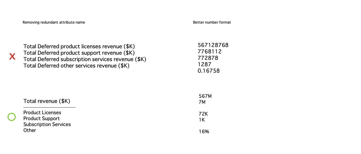
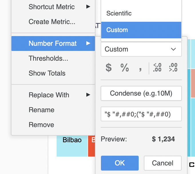
Long numbers usually get truncated on smaller screens. To avoid this, “Condense“ the number format. Simply right-click a metric and choose Number Format > Custom > Condense. You can then customize the formula. For example, if you want to display your numbers by thousands and add a $ to the number, change the formula to:
$[>=1000]#,##0,"K";0;[<=-1000]#,##0,"K"
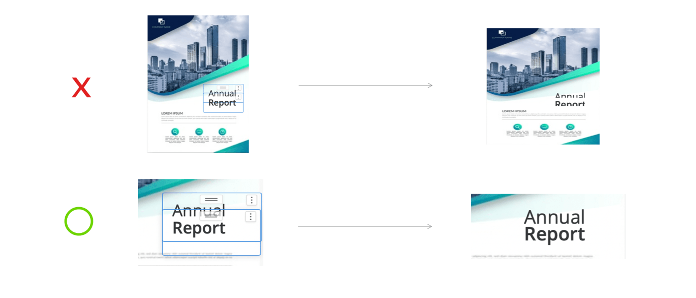
A fixed-size text in a small or tight textbox will most likely be cut off on small screens. Before we introduce special handling to improve the display, it is recommended to expand your textbox to avoid words from being cutoff.
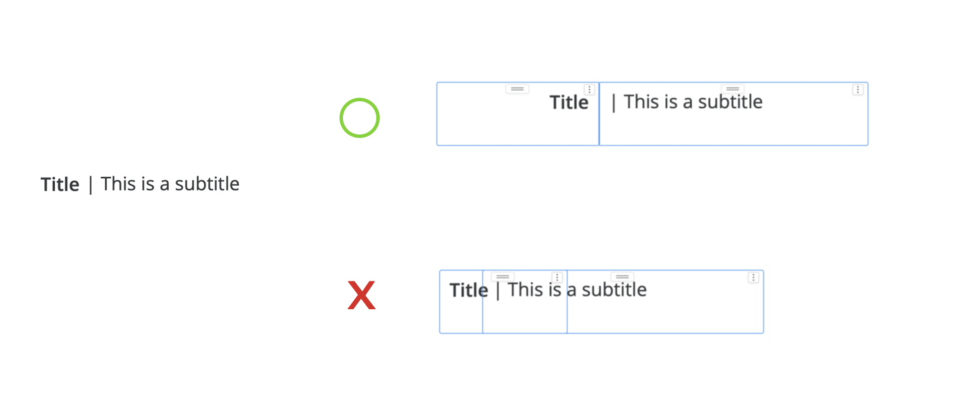
Case by case, there are multiple ways to create textboxes to fit your needs. In the example above, changing the text alignment will give the textbox combination more room to expand, bypassing the overlapping issue. There are several formatting settings available for each container. It’s best to play around with these settings to get the best overall results.
Successful responsive design depends on how you disassemble the visual elements. The more thought you put into dividing the assets, the more flexibility you add to the design, and the more likely your layout will respond correctly to other screen sizes.
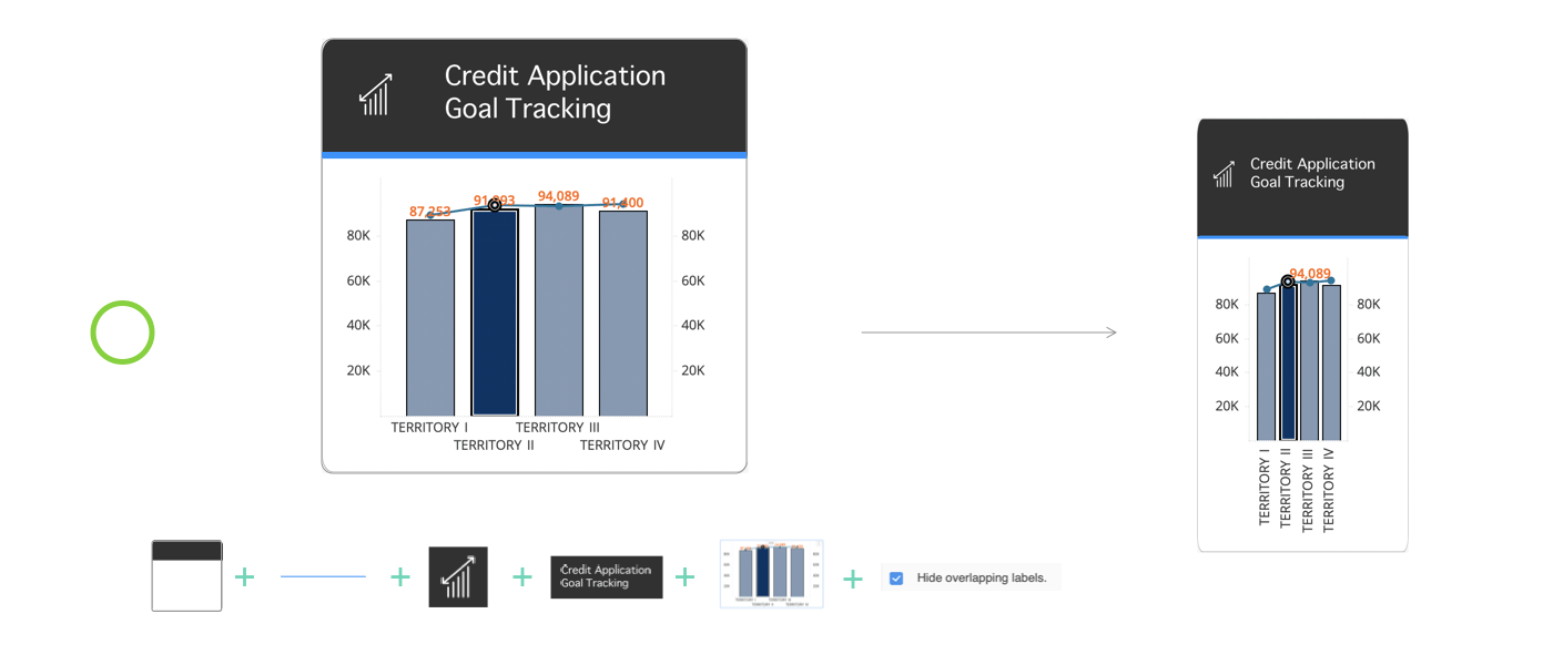
In the above example, the “Hide overlapping labels“ setting is enabled for the combo chart. Enabling settings like this will allow your dossier to adjust the visual placement according to different screen sizes.
Another thing to consider is that the “Square“ assets usually work better than rectangular ones for responsive design (when an image is set to “Fit to container“). They naturally maintain the most similar proportions on the screen across both portrait and landscape orientations. To learn more about responsive design, see Responsive Design - Best Practices and Considerations.
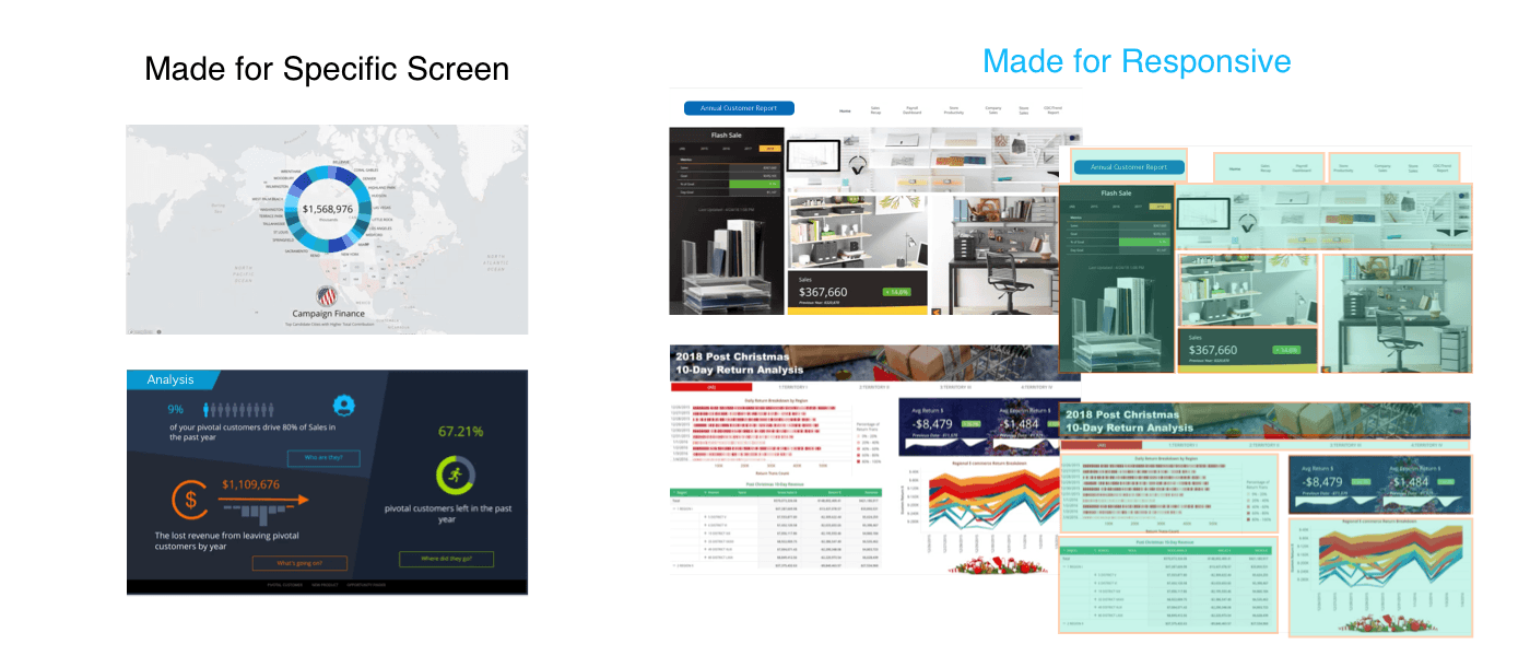
Building a responsive design without a blueprint can be painful. This typically happens because we’ve designed a large dossier first, then try to squeeze everything into a tiny mobile screen. The core of responsive design, however, is the “Mobile First“ approach. It is a good exercise to list your content, prioritize the items, and tell the story with the most relevant data. It doesn’t mean you have to always create a mobile design first, but you should have a good understanding of how the dossier may look on every other screen.
Most importantly, you must understand that not all designs work well on mobile devices. With more advanced planning, you will be able to create a fully functional, more flexible responsive free-form dossier.
Good luck!