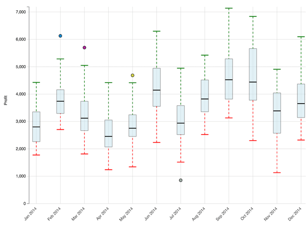
Explore the distribution of data based on five key calculations: minimum, first quartile, median, third quartile, and maximum. The "boxes" in a box plot visualize the likely range of variation (between the first and third quartiles) with a line indicating the median value. The "whiskers", which are lines extending to the minimum and maximum values on either side of the boxes, indicate variability outside the upper and lower quartiles. "Outliers", which are surprisingly high maximums or low minimums often found in real datasets, can be removed from the box plot or plotted as small circles.
Values are calculated according to the following formula:
Interquartile Range(IQR) = Difference(Q1(first quartile) , Q3(third quartile)
A value is an outlier if it is below (1.5 x IQR) of Q1 or above (1.5 X IQR) of Q3.
View the following image for reference:
Object requirements:
Minimum Strategy version: 10.2
Publisher: Strategy
Note: This feature can be used to turn the outlier feature on/off.
To install this visualization:
Ex: (<Strategy Installation Path>/plugins/)
Note that this visualization might not auto-size when exporting via PDF. As of Strategy 10.11, this visualization is provided out of the box. Feel free to use the out of the box plugin with Strategy 10.11 and above.
By downloading or using this visualization, you accept and acknowledge these terms.
This visualization is both intended as sample code and provided as a convenience to Strategy users. Strategy cannot guarantee that the code provided will apply to any Strategy releases and clients outside of the versions stated within this article. This sample is supported by Strategy Technical Support up to and including the basic visualization functionality listed in this article. Defects will be triaged by the Strategy team as they are raised. For users with active Strategy Technical Support contracts, contact Strategy Technical Support to raise these defects.
Anyone seeking to use this visualization is encouraged to review and adapt this sample based on user requirements. Contact Strategy Professional Services for assistance with these same adaptations. If users would like to provide feedback on or recommendations for this visualization, post in the comments section of this article.
