Starting with the release of Strategy ONE (March 2024), dossiers are also known as dashboards.
This example will show the spread and average of data points for one or more categories with the out-of-the-box Box Plot. The dataset contains information about movie ticket prices at theaters throughout India. Using a box plot with this data allows us to investigate how ticket prices are distributed across different cities. The article will review the different elements of the box plot and when you should the visualization for analysis.
Minimum Strategy version: 10.11
Download the .mstr file attached to the article to check out the "Box Plot Example" dossier.
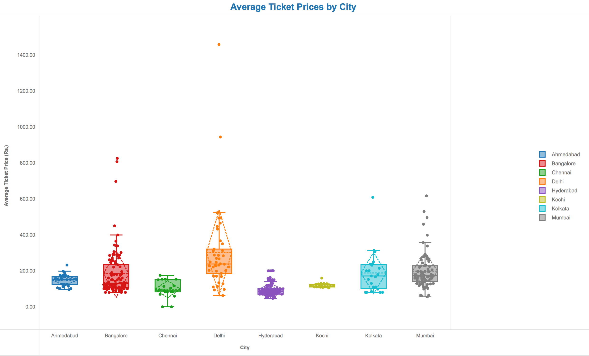
The dashed horizontal line represents the mean, or average value, of the data. The solid horizontal line inside the box represents the median. It is equally likely that a data point will fall above or below this value. The dashed diamond shows the standard deviation of the dataset. The top point is one standard deviation above the mean, while the bottom point is one standard deviation below. The bottom of the box represents the first quartile, or 25%, of the data. The top of the box represents the third quartile, or 75%, of the data.
The points outside of the box and whiskers are outliers.
In summary, here are a few insights we can gain from this specific box plot.
1) Ticket prices vary more in cities such as Bangalore, Delhi, Kolkata, and Mumbai.
2) Ticket prices are more consistent in Ahmedabad, Chennai, Hyderabad, and Kochi.
3) For consistently low movie ticket prices, Kochi and Hyderabad are good choices.
4) The average prices in Delhi and Bangalore are significantly higher than the median prices in these cities.
This indicates that many theaters there have low prices, but that a few high outliers are skewing the average.
Analyze using box plots by downloading MicroStrategy Desktop!
Interested in learning more about Dossier authoring? Visit the Learning Center on Community!