Starting with the release of Strategy ONE (March 2024), dossiers are also known as dashboards.
SYMPTOM
Users are unable to get a Heat Map visualization where the color targets the established threshold range. This is not an issue as the threshold uses the "Lowest%" or "Highest%" type which calculates the range by percentage of Lowest or Highest. It is necessary to change the threshold type to "Value" in this case.
STEPS TO REPRODUCE
1. Create a Visual Insight or a Dossier from Strategy Web.
2. Create a Heat Map visualization with the following:
- Two different values.
- Four different attributes to display, therefore three attributes will have the same metric value.
- A range of six thresholds to color from.
3. Under the format tab, click Data Exploration. Select the option “Show Metric Values”.
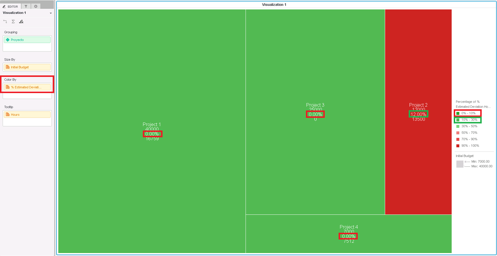
4. Check out how the color do not fit the threshold range.
5. Under the format tab, data exploration, click “Shape Color, Select Color Ranges” and define the threshold accordingly.
6. In the new pop-up window, by selecting both “Value” under “based on”, the behavior does change.
CAUSE
This is working as designed in Strategy 10.x.
The functionality "Lowest%" or "Highest%" calculates the range by percentage of Lowest or Highest, not assigning directly the value to the threshold range.
ACTION
There is no action to be taken. By changing the threshold type to "Value" the behavior gets as desired.
WORKAROUND
The current workaround is to manually change the threshold range to "Value" and customize it according to the required values. KB439754