Starting with the release of Strategy ONE (March 2024), dossiers are also known as dashboards.
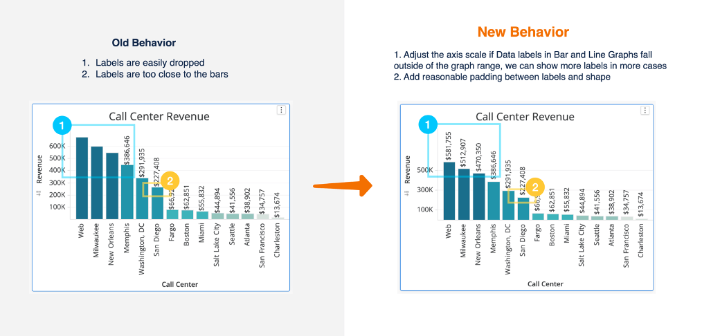
Previously, labels dropped when there wasn’t enough space. In Strategy 2020 Update 2, the axis scale adjusts if data labels fall outside the graph range to display more labels.
Example 1
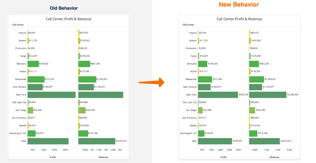
Example 2
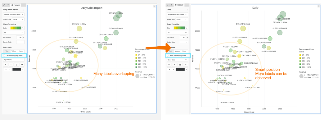
Previously, when users want all labels to display, even if it will introduce overlap, many labels are unreadable. Now, when users have Hide overlapping labels unchecked, the graph automatically picks better places to display labels, so more are readable.
Better use of container space, while still showing data labels.
For Strategy 2020 Update 2, we introduced a 30% rule–an improvement from the previous behavior which was inconsistent in some cases. With the 30% rule, it will consistently show data labels at 30% or less of the container.
Examples:
An analyst is building a visualization while maximized, and then when they minimize the container, they notice some of the labels drop. This means that the once the visualization is minimized, because the data label are now occupying more than 30% of the container, they are hidden, which is the expected behavior.
With this 30% rule in mind, consider tweaking your design to give the containers more space.
Hear from Strategy’s CTO, Tim Lang, on the top 10 features in Strategy 2020 Update 2 in this video.