Starting with the release of Strategy ONE (March 2024), dossiers are also known as dashboards.
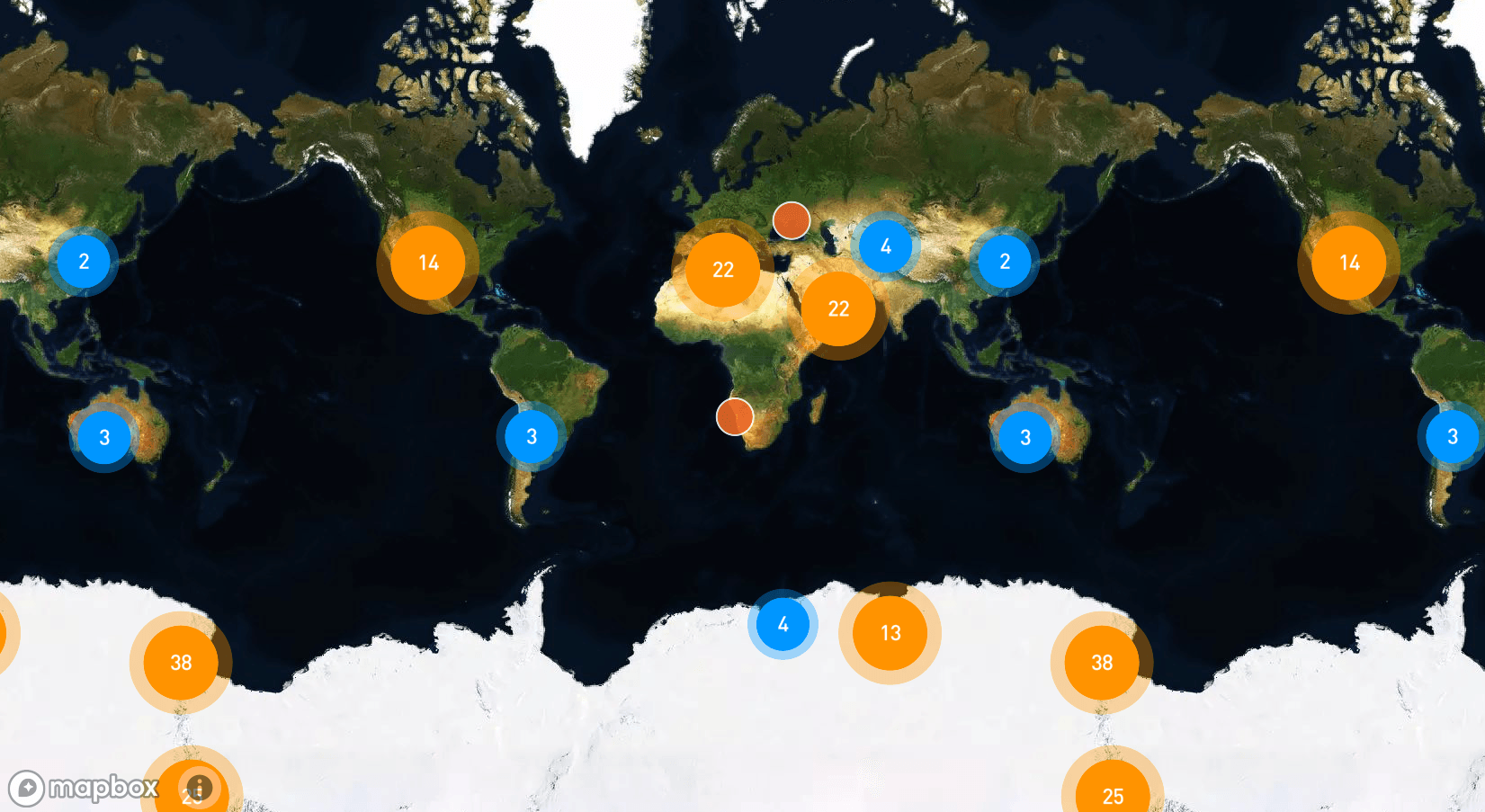
While looking to evaluate Sales revenue and top products for various regions across the globe, it is possible to use grid or KPI visualizations to display this information. However, maps allow to view KPIs and metrics across geography in order to get fast insights that help to drive decisions across the business.
What mapping options does Strategy support?
In the new era of modern analytics, organizations look to bring data to people and processes faster than before. To obtain more comprehensive insights, it is worth considering using a geographic lens. For instance, in the Sales scenario mentioned abovr, the Sales executive may have information about the top products based on revenue, but what they truly need to know is where these products are selling exceptionally well. By leveraging location-based data, executives can enhance their marketing campaign and conference planning. The importance of location-based data is increasing exponentially.
Strategy supports two types of maps that help make sense of geographic data: 1) ESRI and 2) Mapbox, which we also refer to as “Geospatial services.” In addition, Strategy connects seamlessly with leading GIS technologies such as ArcGIS Enterprise and Google Maps.
Is it possible to create multiple data layers using maps?
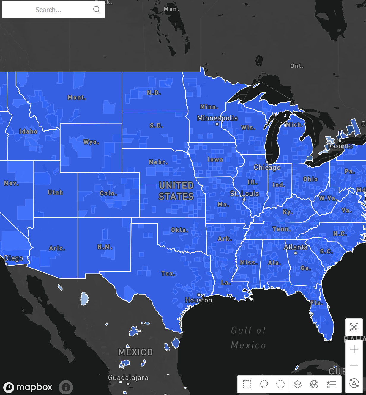
Yes - using multiple layers is the encouraged approach. Most mapping use cases involve more than one data layer on the map. Taking multiple layers to evaluate revenue for a non-profit campaign across state and city as an example - both Mapbox and ESRI options allow to author with two or more layers of data on the base map. This allows users to get insights from one map rather than creating two or more maps.
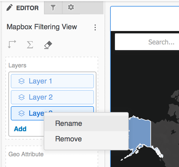
To create multiple layers, take the following steps:
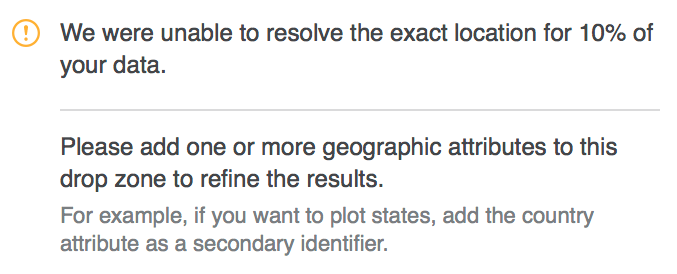
Note that sometimes users may receive the following information window message: "We were unable to resolve the exact location for 10% of your data. Please add one or more geographic attributes to this drop zone to refine the results. For example, if you want to plot states, add the country attribute as secondary identifier." This indicates that adding another geo-attribute could enhance the matched locations.
What’s the difference between ESRI maps and Mapbox geospatial services?
Both maps have their individual strengths and specific use cases.
ESRI maps are Strategy's out-of-the-box offering. ESRI maps are unique in that they allow users to plot data as pie charts or density maps, while Mapbox currently does not. An example use case could be using density maps to evaluate and visualize global population or energy usage within the United States. ESRI offering also supports ESRI shape files (.SHP) for custom shapes and is fully integrated within the Document authoring experience. With Document authoring, ESRI can be used to build affinity lines or path maps - it is possible to show flight connections in documents with affinity lines or exercise routes with path maps.
Users should select ESRI
when they want to: build documents, visualize networks with affinity lines in documents, create density maps, or plot data as pie charts.
On the flipside, Mapbox
provides high-performance zooming and advanced clustering for more insights. Mapbox also offers threshold formatting by attributes and more global coverage down to the zip code level. In fact, Mapbox adds about 50+ new countries to the map compared to ESRI. Typically, Mapbox is recommended when working with more global, larger datasets.
Users should select Mapbox when they want to: build advanced map interactions, build a more global analysis, use local language labels, or have faster rendering with large data sets.
Why is Mapbox faster than ESRI? There are two main factors.
Additionally, from the Mapbox website, "Our map renderer has been in development for over 10 years and uses the latest in OpenGL technologies. This leads to highly performant maps, allowing you to dynamically style and optimize your map based on your custom data."
Side-by-side ESRI and Mapbox comparison developed by our Product team:
Use Case | ESRI (OOTB, Free) | Mapbox (OOTB, Paid) |
Supported in Documents | Yes | No. |
Supported in Dossiers | Yes | Yes |
Supported in Library Mobile | Yes | Yes |
Supported in Strategy Mobile (Platform) | Yes | No |
Display affinity lines on map | Yes (Documents) | No. |
Display path maps | Yes (Documents) | No. |
Display base map, change map styles | Yes | Yes |
Plot data as bubbles, markers | Yes | Yes |
Plot data as area maps OOTB | Yes | Yes |
Plot data as pie charts | Yes | No |
Plot data as density maps | Yes | No |
Support for KML files | Yes | Yes |
Support for GeoJSON | No | Yes |
Support for ESRI .shp files | Yes | No |
Custom Shape Data Import with Dossier | No | Yes |
Multiple data layers for visualizations | Yes | Yes |
Enable and disable clustering at layer level | Yes | Yes |
Thresholds and conditional formatting for markers (thresholds by metric) | Yes | Yes |
Thresholds and conditional formatting for markers (thresholds by attribute) | No | Yes |
Zoom In/Out or Pan | Yes | Yes |
Quick Location Search | Yes | Yes |
Reset zoom to original view | No | Yes |
Global coverage down to postal code level for area | No | Yes |
Dynamic map layers based on zoom level | No | Yes |
Advanced clustering options | No | Yes |
Local language labels | No | Yes |
Change unit of distance | No | Yes |
Flexible map labels (show, hide, move to front) | No | Yes |
Ability to enable and disable tooltips on the map (Dossier) | No | Yes |
Rotate and tilt option in authoring interface (3-D appearance) | No | Yes |
On-Prem Support | Yes | No |
Light and Dark modes of base map styles | No | Yes |
Get started with Geospatial visualizations.
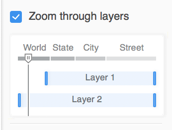
How to start using the progressive drill with Zoom once the map is built?
The drilling feature for zoom is available with Mapbox and allows users to create dynamic layers that enhance the overall appearance of maps by showing only relevant data. To specify the zooming behavior, take these steps in Workstation:
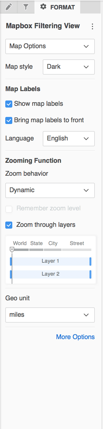
How to style the background of Mapbox visualization?
Mapbox allows users to choose from various base maps to help best visualize their data.
Tip: Dark base map selection provides a sleek, modern look for maps.
How to select the Marker type for the Mapbox visualization?
It is possible to add unique images as markers on maps.
Tip: Users start with a grid and apply an OOTB image-based threshold, then convert to a Mapbox visualization (Type = Marker) to display advanced markers.
Is it possible to change the map labels or bring the labels to the front?
This feature is unique to Mapbox. In order to use it:
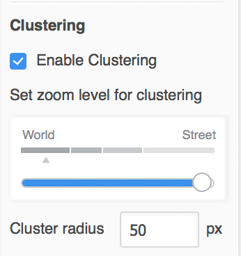
Where can clustering for the Map be enabled?
It is possible to organize the data on map in clusters for easier drilling.
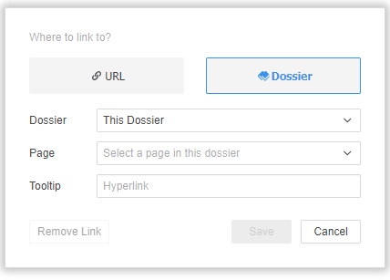
Is it possible to use another visualization to filter the Map?
Yes, users can now create contextual links within the dossier, or to another dossier.
Learning Resources
Interested in learning more about creating maps with Strategy? Visit the Learning Center on Community.