Starting in Strategy 2021 Update 5, there is an new out-of-the-box, feature-rich, Gauge visualization. We highly recommend using this visualization instead. It is located in the More section of the Visualization Gallery.
Capture a key metric using a dial with a needle that points to a specific point in a data range. A gauge chart resembles a speedometer or gauge, with the outer ring of the dial color-coded to provide additional context. For example, green can be used to indicate a good or acceptable value and red can be used to indicate a bad or unacceptable value.
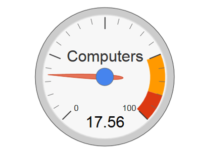
Gauge charts are often used on executive dashboards, with each displaying a single key measure and allowing executives to quickly determine whether key metrics are performing well or not achieving target values.
Minimum Strategy version: 10.2
Current visualization version: 1.0
Publisher: Strategy
By downloading or using this visualization, you accept and acknowledge these terms:
This visualization is both intended as sample code and provided as a convenience to Strategy users. Strategy cannot guarantee that the code provided will apply to any Strategy releases and clients outside of the versions stated within this article. This sample is supported by Strategy Technical Support up to and including the basic visualization functionality listed in this article. Defects will be triaged by the Strategy team as they are raised. For users with active Strategy Technical Support contracts, contact Strategy Technical Support to raise these defects.
Anyone seeking to use this visualization is encouraged to review and adapt this sample based on user requirements. Contact Strategy Professional Services for assistance with these same adaptations. If users would like to provide feedback on or recommendations for this visualization, post in the comments section of this article.