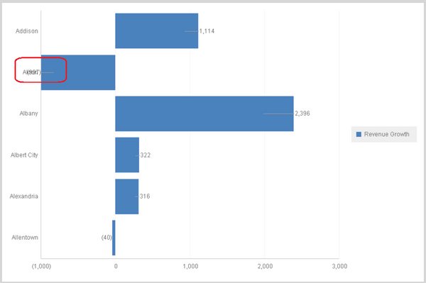
SYMPTOM:
When there are negative values for data labels for graph chart, the data label may overlap with X Axis and make the data label is not quite clear to recognize. Check below screen shot:
ACTION:
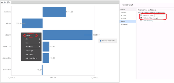
For Document:
In Editable mode, right click the graph and choose ‘Format’, and navigate to ‘Axes’. Set-up a customized value in ‘Minimum Value’ according to the minimum value of the graph.
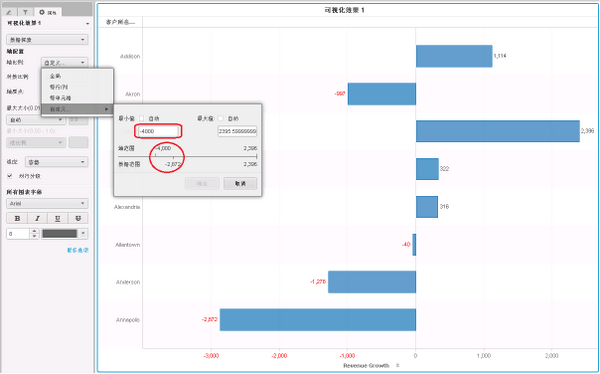
For VI dashboard:
In Properties, choose ‘Data Exploration’, and for Axis Configuration, choose ‘Customize’ for ‘Axis scale’. Set a value for Min which is less than the Minimum value of the graph