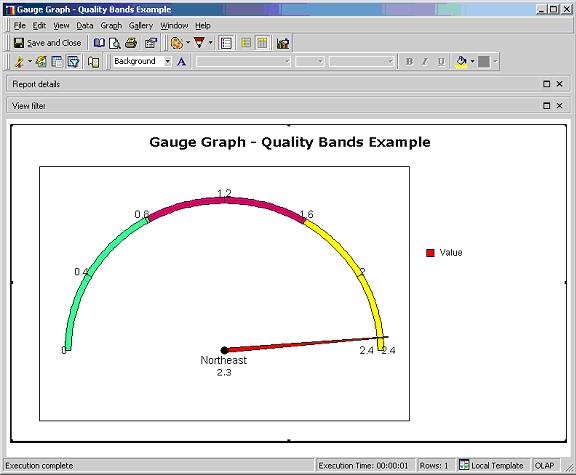
Quality Bands divide the semi-circle in a gauge graph into sections or bands. This will allow users to setup different colors in each band. For example, a user wants to divide a gauge graph into three bands and have 1/3 red, 1/3 yellow and 1/3 green. They can define the quality bands according to the metric value ranges that they would like to correspond to the colors. Then, they can right-click on each segment to format it with the desired color.
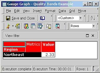
Consider the following example report in Grid mode:
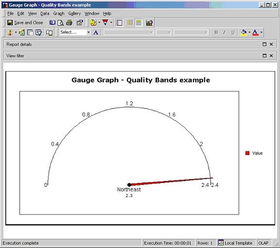
Users can select to display the report above in Graph mode with the Gauge style to obtain the graph below:
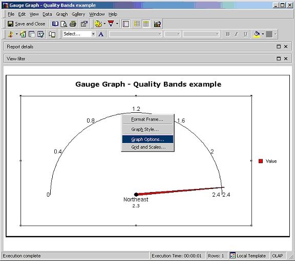
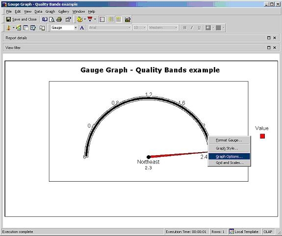
To display the band in different colors, users must increase the thickness of the band by right-clicking on the graph and selecting the Graph Options, as shown below:
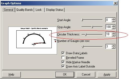
Once the Graph Options window appears, users can increase the "Circular Thickness," as shown in the screen shot below:
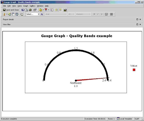
Once the "Circular Thickness" has been applied, the graph should look similar to the one below:
To divide the band into three segments, users can right-click and then select Graph Options to format it:
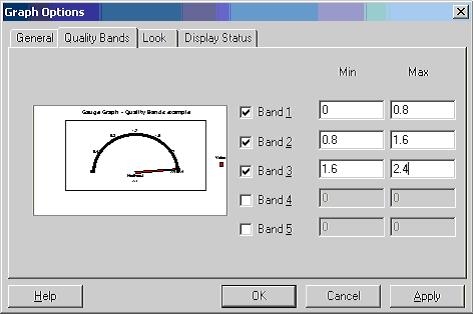
Under the Graph Options window, users can select the "Quality Bands" tab and then enter the values for the three bands, as shown below:
Afterward, users can select each of the bands in the graph to format it with the desired color. To do so, users can select each band and then right-click to select the "Format Gauge Range," as shown below:
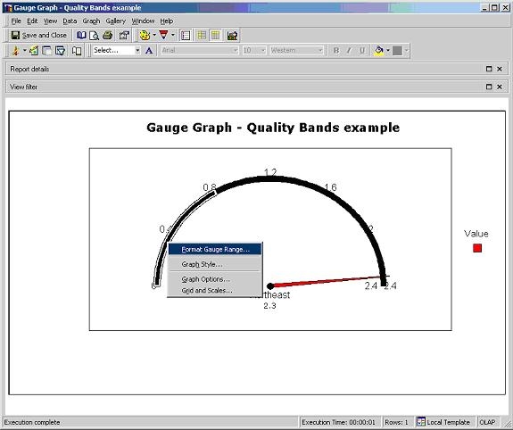
Note: The users might have to double-click on the selected segment to highlight it.
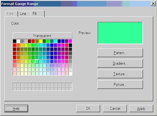
Once the Format Gauge Range window appears, users can then select the color for that segment of the band. Below is a screen shot of the Format Gauge Range window:
Users can repeat the step above to format all three segments of the band. Once the process is finished, users should see a graph similar to the one below: