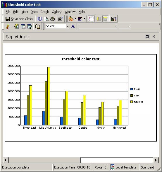
If users create a threshold where all values meet the target value, the color formatting applied to the cells that meet the target value will appear consistent on both the graph and the grid. For details on how to accomplish this, refer to the following Strategy Knowledge Base document:
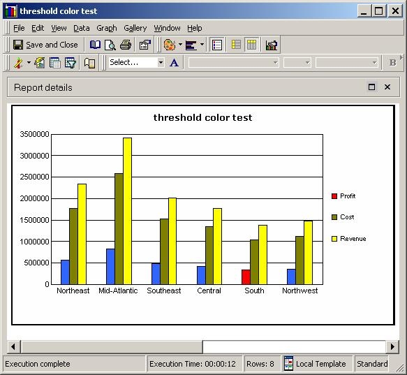
In this case, the color within the legend does not match the color assigned in the threshold formatting. However, this is by design. Consider the following example:
A user defines a threshold on the metric 'Profit' in which all values greater than $340,000 are formatted so that the color will be blue. The profit for the "South" region does not meet the threshold and is therefore shown in red to distinguish between the values that do and do not meet the target of $340,000:
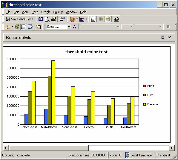
If users have a situation in which ALL values meet the target value criteria, as shown below, it is possible to change the color shown in the legend to match the color of the threshold formatting:
Right-clicking on the legend color box and selecting "Format Legend Marker…" yields an editor that allows users to select the same color used in the threshold formatting, as shown below:
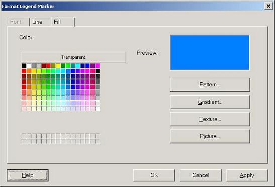
After the correct color has been selected, the legend will match the color selected in the formatting of the threshold.
Note: Users should be aware that changing the color of the metric in the legend will change the default color setting for the metric on the graph. This means that if there is a value for the metric that does not meet the threshold, it will appear in the same color as the values that do: