EducationSoftwareStrategy.com
StrategyCommunity

Knowledge Base

Product

Community

Knowledge Base

TopicsBrowse ArticlesDeveloper Zone

Product

Download SoftwareProduct DocumentationSecurity Hub

Education

Tutorial VideosSolution GalleryEducation courses

Community

GuidelinesGrandmastersEvents
x_social-icon_white.svglinkedin_social-icon_white.svg
Strategy logoCommunity

© Strategy Inc. All Rights Reserved.

LegalTerms of UsePrivacy Policy
  1. Home
  2. Topics

KB10923: How to create a Bubble Graph in MicroStrategy Developer 9.4.x-10.x


Stefan Zepeda

Salesforce Solutions Architect • Strategy


This article expalins how to create a Bubble Graph in MicroStrategy Developer

This graph style is the first graph found under the category of Bubble charts.
To set up a bubble graph, the template must consist of the following:

  • at least one attribute (More attributes can be used as each row will be its own data point)
  • at least three metrics
ka02R000000kcZ1QAI_0EM440000002FpQ.gif
  • Metric 1(Revenue) is for the Z-Axis
  • Metric 2(Units Sold) is for the X-Axis
  • Metric 3(Profit) is for the size of the bubble

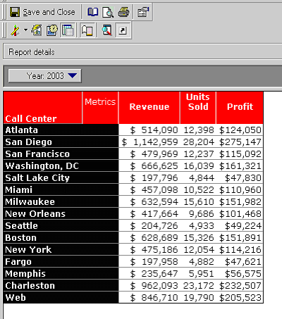
Below is the graphical representation of this grid:

ka02R000000kcZ1QAI_0EM440000002FpR.jpeg

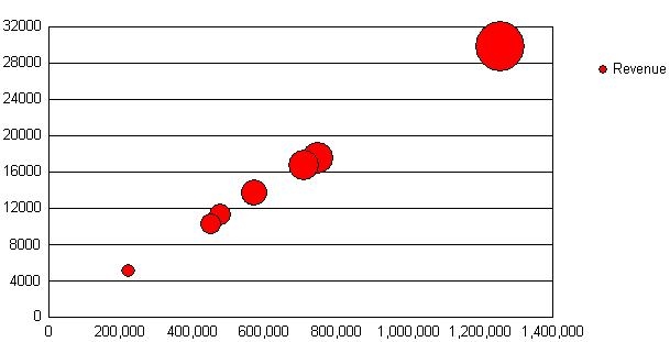
To have the attributes shown as the data markers, change the series to Set Series By Rows:

ka02R000000kcZ1QAI_0EM440000002FpT.gif

Below is the resulting graph:

ka02R000000kcZ1QAI_0EM440000002FpS.jpeg

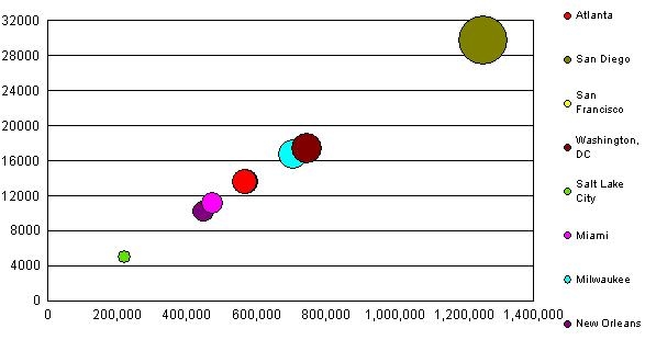
If multiple attributes are present in the rows, each row will appear as its own series. For example, Year and Calling Center will appear as 2004 Atlanta. To avoid this, use a Page By field to display each division separately, as in the image above. If the attribute is in the columns, such as Year, a bubble will appear for each year for every Calling Center but there will be no label for these years.
Other common modifications:

  • To make all the bubbles smaller or larger, go to Graph > Graph Options > General Tab and change the Size.
  • To change the number of bubbles per page, go to Graph > Preferences > General Tab and change the maximum number of series.
  • To label the X and Y Axis, go to Graph > Titles and Labels. The label must be entered manually.

Comment

0 comments

Details

Knowledge Article

Published:

April 13, 2017

Last Updated:

April 13, 2017