EducationSoftwareStrategy.com
StrategyCommunity

Knowledge Base

Product

Community

Knowledge Base

TopicsBrowse ArticlesDeveloper Zone

Product

Download SoftwareProduct DocumentationSecurity Hub

Education

Tutorial VideosSolution GalleryEducation courses

Community

GuidelinesGrandmastersEvents
x_social-icon_white.svglinkedin_social-icon_white.svg
Strategy logoCommunity

© Strategy Inc. All Rights Reserved.

LegalTerms of UsePrivacy Policy
  1. Home
  2. Topics

KB13797: How to Create a Gantt chart in MicroStrategy Developer 9.x?


Stefan Zepeda

Salesforce Solutions Architect • Strategy


Gantt charts (also referred to as project timelines) are bar graphs that help plan and monitor project development or resource allocation on a horizontal time scale. A Gantt chart is essentially a horizontal bar chart. It provides a graphical illustration of a schedule that can help users plan, coordinate, and track specific tasks in a project.

Gantt charts (also referred to as project timelines) are bar graphs that help plan and monitor project development or resource allocation on a horizontal time scale. A Gantt chart is essentially a horizontal bar chart. It provides a graphical illustration of a schedule that can help users plan, coordinate, and track specific tasks in a project. The data analyzed in a Gantt chart has a defined starting and ending value; for example, Project A begins 4/15/06 and ends 5/10/06.
In order to create a Gantt chart in Strategy Developer 9.x, the following points must be kept in mind:

  • A pair of metrics defines start and length pair which will be translated as a horizontal bar in the chart.
  • At least two metrics must be displayed in the columns:
    • MetricA will serve as the starting data point.
    • MetricB will serve as the length/duration from the starting point.
  • Multiple metric pairs can be added to the columns to represent more start-length pairs.

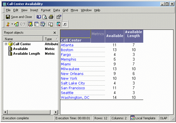
For example, the following Gantt chart displays the availability of different Call Centers in a 24 hour day:

ka02R000000kXzHQAU_0EM440000002FWd.gif

 
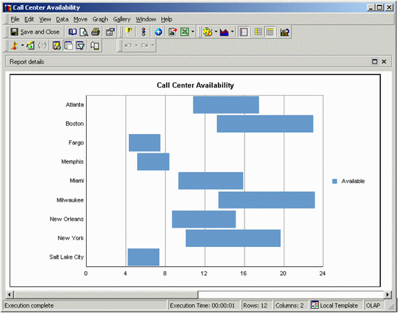
The above Gantt chart is comprised of the following objects:
 

  • Call Center - Attribute to represent the call centers.
  • Available - Metric that represents the start hour that this Call Center is available.
  • Available Length - Metric that represents the length of time that this Call Center is available.

Notice that in the Grid View of this report shown below, there exists:

  • Call Center positioned in the rows.
  • Available in the columns as the first metric (remember that the first/left metric denotes the starting point.)
  • Available Length in the columns as the second metric (remember that the second metric denotes the length/duration from the starting point.)
ka02R000000kXzHQAU_0EM440000002FWf.gif

Comment

0 comments

Details

Knowledge Article

Published:

June 12, 2017

Last Updated:

June 12, 2017