SYMPTOM:
A report is set to show as an histogram graph. This type of graph will group elements together that fall under the same metric value range. The following example shows a report with a percentage metric shown at a regional level.
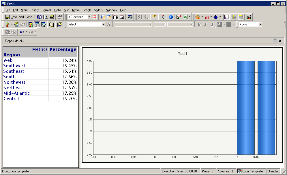
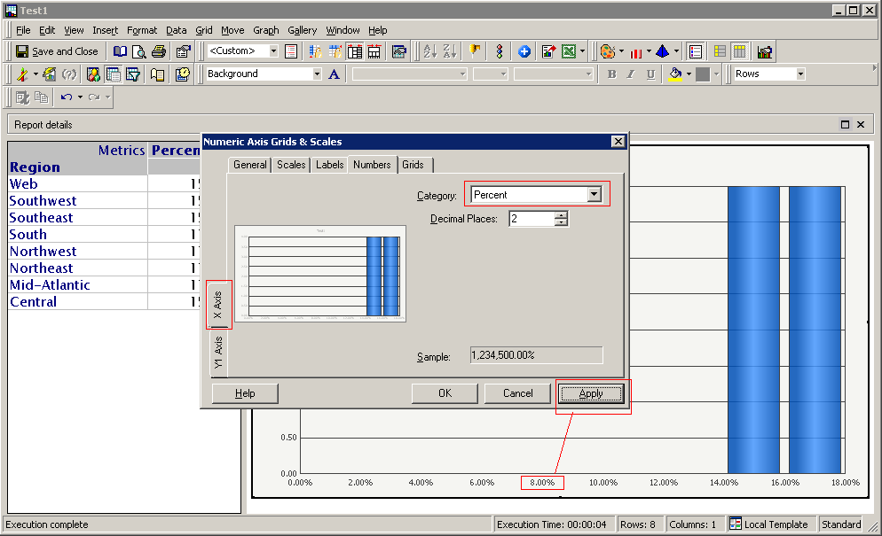
The graph shown above is divided into 9 sections, and will count how many elements fall in a certain range. The graph shown above shows a numeric formatting for both the X-axis and the Y-axis. If the formatting of the X-axis is changed from the Grid and Scales menu, the formatting will change after clicking the apply button as shown in the screenshot below.
After clicking the OK button the formatting will revert back.
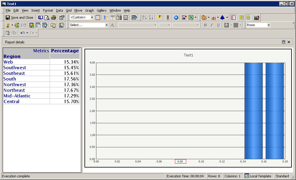
Changes done to the Y-axis will have an effect on the graph display formatting affecting both the X-axis and the Y-axis
CAUSE:
This is a known issue with Strategy 9.4.x-10.x
ACTION:
Strategy will continue to investigate and post updates as soon as they are available.
WORKAROUND:
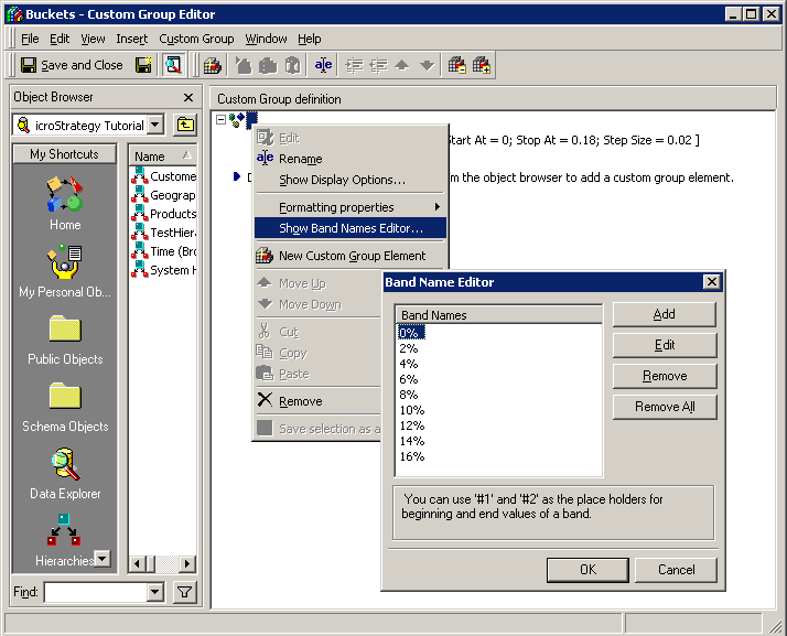
A custom group can be used to generate a histogram report by using custom group banding. If the range of values to be graphed in histogram report are known, the custom group can be defined by using a band size as shown in the following screenshot.
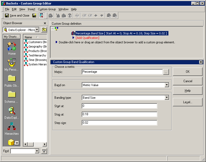
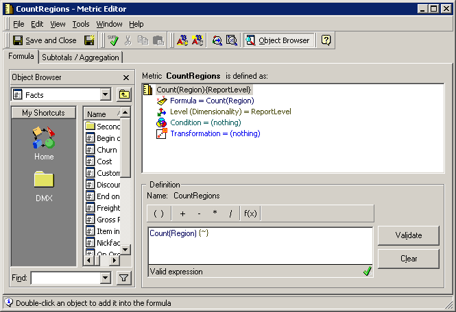
This custom group will generate bands of .02 size from 0 to .18. This will group the region elements into the specified buckets of the custom group. A count metric to determine how many Regions fall into a particular bucket is also needed, the definition of the metric is shown in the following screenshot.
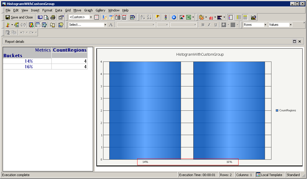
The report generated by using the custom group and the count metric will use a normal bar graph. It will display similar information as the graph shown in the first screenshot.
The labels on the X-axis can be manually modified to present the desired information in the desired format. These values can be modified in the custom group editor by going into the Band Name Editor as shown in the following screenshot.