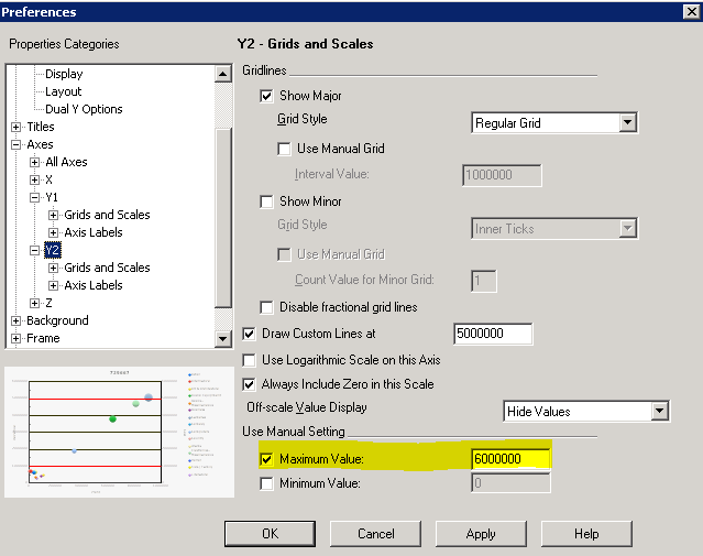
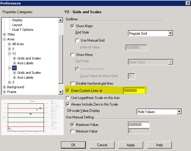
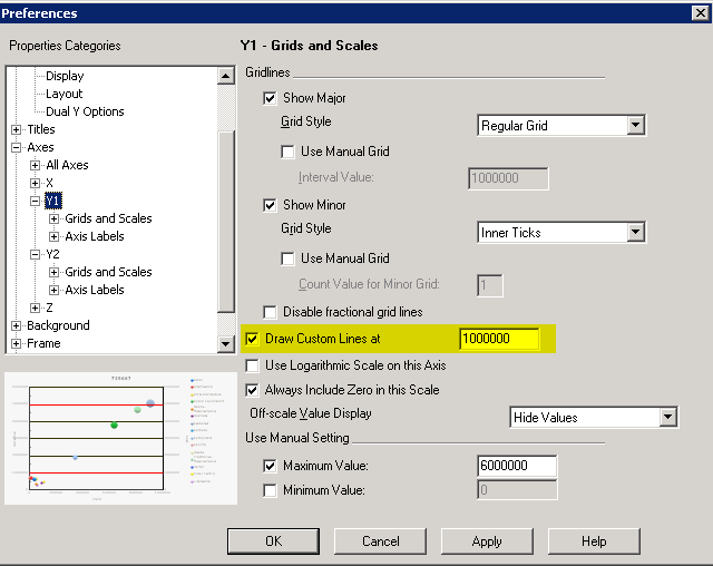
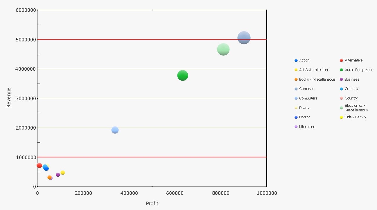
In some business scenarios, a need to add a pair of threshold lines in a bubble graph to distinguish expected and abnormal values may arise. Those located in between the lines are with expected values, and those locates outside the lines are abnormal. This tech note introduces a solution for this requirement.