EducationSoftwareStrategy.com
StrategyCommunity

Knowledge Base

Product

Community

Knowledge Base

TopicsBrowse ArticlesDeveloper Zone

Product

Download SoftwareProduct DocumentationSecurity Hub

Education

Tutorial VideosSolution GalleryEducation courses

Community

GuidelinesGrandmastersEvents
x_social-icon_white.svglinkedin_social-icon_white.svg
Strategy logoCommunity

© Strategy Inc. All Rights Reserved.

LegalTerms of UsePrivacy Policy
  1. Home
  2. Topics
  3. KB239110: How to design document to perfectly fit multiple device screens with manage views in MicroStrategy Mobile application 10.x

KB239110: How to design document to perfectly fit multiple device screens with manage views in MicroStrategy Mobile application 10.x


Tianfeng (Jimmy) Jiang

Quality Engineer, Principal • MicroStrategy


This document demonstrates how to design document to perfectly fit multiple device screens with manage views in MicroStrategy Mobile application 10.x
The following article demonstrates how to design document to perfectly fit one device screen in both portrait and landscape view:
KB238917: How to design document to perfectly fit iOS device screen in both portrait and landscape view in MicroStrategy Mobile application 10.x
It's also possible to do that for multiple devices with manage views. For more details on manage views, refer to article below:
KB47490: Manage Mobile Views in MicroStrategy Mobile 9.4.x and 10.x
Basically, the document should be designed as below:
  • Create two layouts, one for portrait and the other for landscape. 
  • Set proper document page size, body height and size of other objects in each layout by following KB238917 to make the document fit both portrait and landscape view for one device.  
  • Add multiple managed views. Each view is specially designed with proper resolution for each device. 
  • In each added view, change body height and size of other objects to make the document fit screens for each device. 
The following steps show how to design such document for iPhone 7 and 4s in details:
  1. Get resolution for iPhone 7 and 4s:

    iPhone 7 : 750*1334
    iPhone 4s: 640*960

  2. Follow article KB238917 to design a document which could perfectly fit iPhone 7 device screen in both portrait and landscape view:
  3. The document should contain just one view with two layouts for iPhone 7 after step 1 is finished. Go to Tools>Manage Views, duplicate the current view and rename them to "iPhone 7 view" and "iPhone 4s view". Set resolution of each one as shown below:

    iPhone 7 view: 1334*750
    iPhone 4s view: 960*640
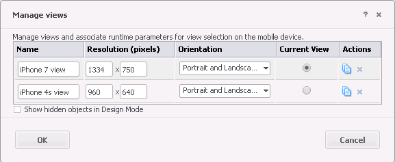
ka04W000001Eu9fQAC_0EM44000000Q8uQ.png

Select "iPhone 4s view" as Current View, hit on OK button. Then, all the modifications below only apply on "iPhone 4s view". 

ka04W000001Eu9fQAC_0EM44000000Q8uk.png
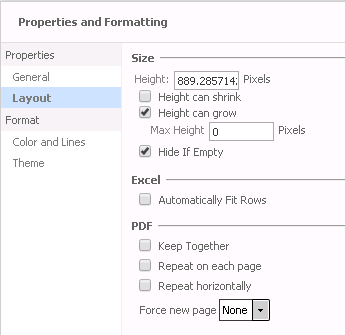
When rendering the document in portrait on iPhone 4s, the document width (750 pixels) would fit to the screen width (640 pixels). So in Layout1, right click on Body, go to Properties and Formatting and set Height to 1078 = (960-40)*750/640 as shown below: 

Note: To best design layouts for Android devices, due to the high variability in the sizes of Android devices, we recommend using tools, such as the Layout Inspector in Android Studio, to detect device sizes.

ka04W000001Eu9fQAC_0EM44000000Q8uz.png

  1. Note:
  2. Change size of other objects like panel stacks, grids and text boxes in Layout1 so that they would display properly in iPhone 4s.
  3. When rendering the document in landscape on iPhone 4s, the document width (1334 pixels) would fit to the screen width (960 pixels). So in Layout2, right click on Body, go to Properties and Formatting and set Height to 889 = 640*1334/960 as shown below:
ka04W000001Eu9fQAC_0EM44000000Q8vT.png

  1. Change size of other objects like panel stacks, grids and text boxes in Layout2 so that they would display properly in iPhone 4s.
The following table summarizes all the parameters in one sample document with one rectangle shape which could fill the whole screen:


Resolution

Page Size

Body Height

Rectangle Size

Layout1

Layout2

Layout1

Layout2

Layout1

Layout2

iPhone 7 view

1334*750

750*1294

1334*750

1294

750

750*1294

1334*750

iPhone 4s view

960*640

750*1294

1334*750

1078

889

750*1078

1334*889


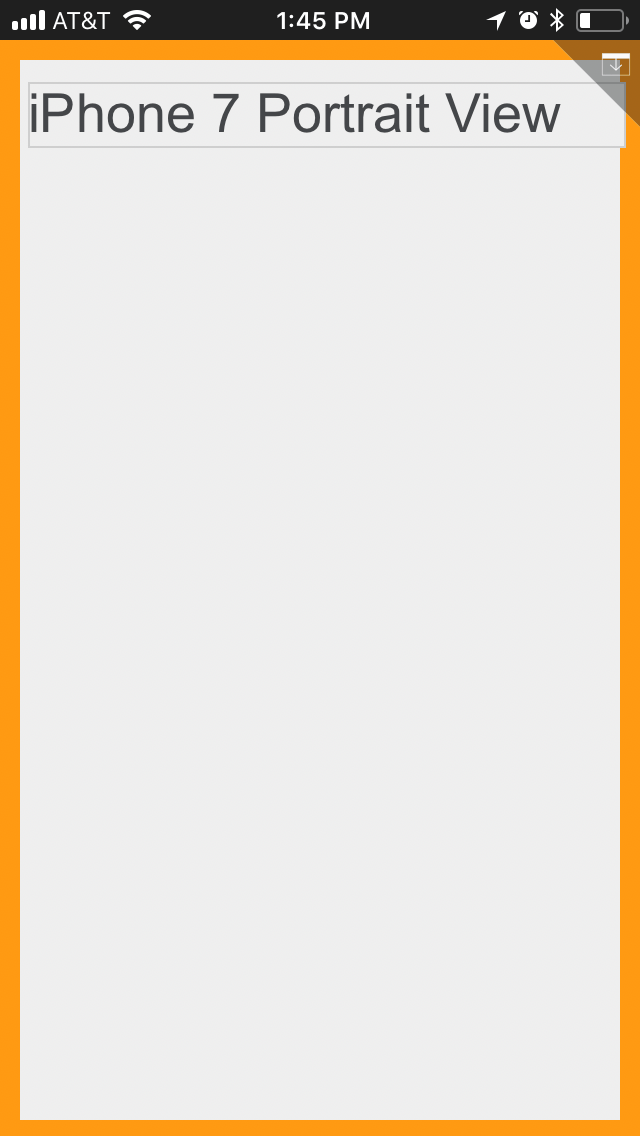
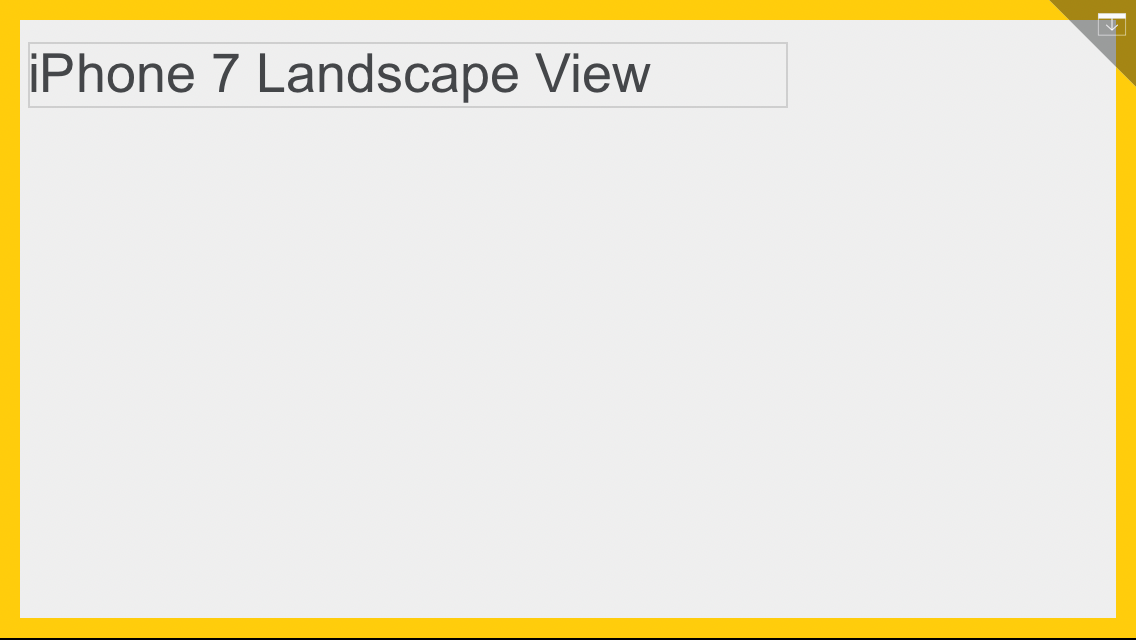
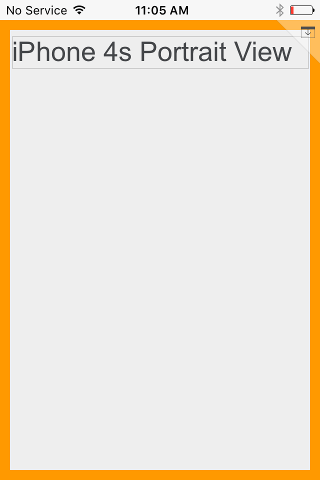
Below screenshots show how this document renders in iPhone 7 and 4s:
ka04W000001Eu9fQAC_0EM44000000Q8vx.png
ka04W000001Eu9fQAC_0EM44000000Q8w2.png
ka04W000001Eu9fQAC_0EM44000000Q8vs.png
ka04W000001Eu9fQAC_0EM44000000Q8vn.png

Comment

0 comments

Details

Knowledge Article

Published:

May 7, 2021

Last Updated:

January 31, 2024