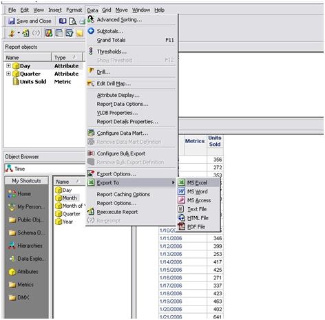
SYMPTOM:
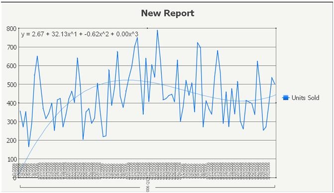
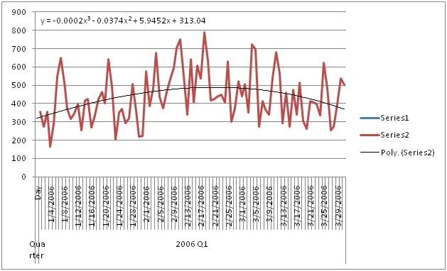
Users notice that the Trendline in a graph looks different in Microsoft Excel to the one generated in Strategy Developer 9.x/10.x as shown in the images below:
Strategy Developer 9.x
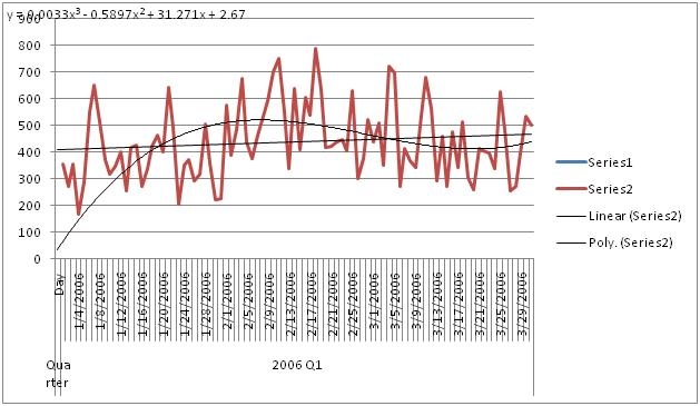
Microsoft Excel

STEPS TO REPRODUCE:
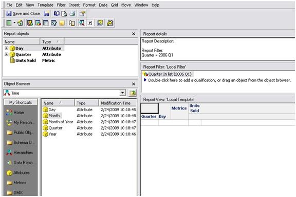
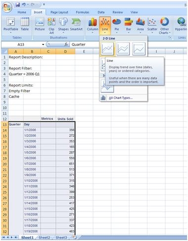
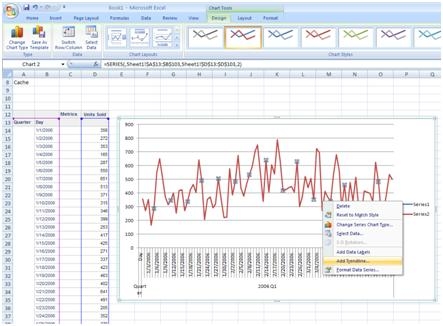
Execute in Strategy Tutorial:

CAUSE:
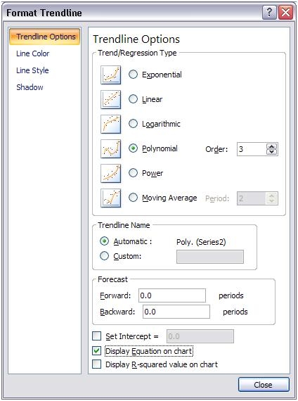
Microsoft Excel and Strategy Developer 9.x/10.x calculate the Trendline differently.
ACTION:
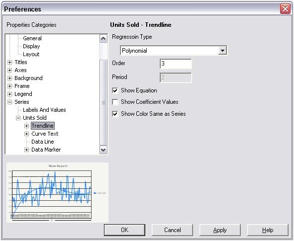
In Microsoft Excel:
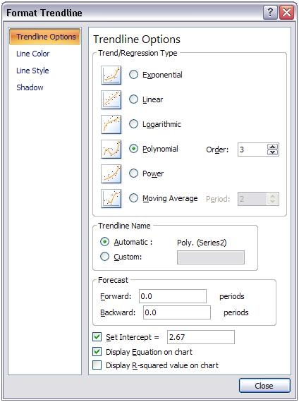
Note: The formula may still show different due to the decimal values, but the result now should be the same.