SYMPTOM:
In Strategy Developer, one or more of the bars from a Horizontal Clustered Bar Graph Report appears in a color different from what they are supposed to. This happens when the Maximum Number of Categories setting is increased and the Apply Rounded Effects to all series property is selected.
In order to reproduce this issue in the Strategy Tutorial project follow these steps:
1. Create a report with Month in the rows and Category and Revenue in the columns.
2. Add a filter to display only Books and Electronics.
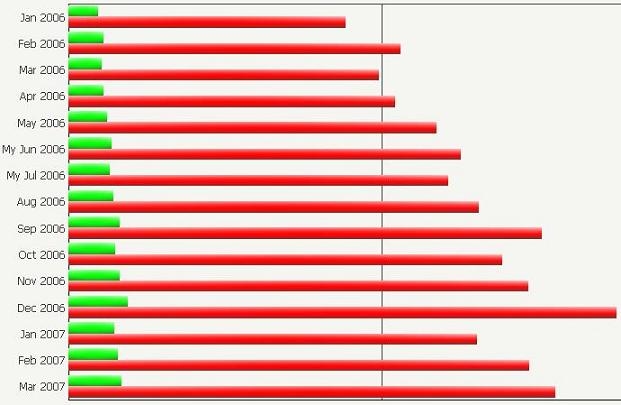
3. Execute the report in graph view in Desktop and selected Horizontal Bar - Clustered.
RESULT: the colors displayed will be correct.
4. Go to Graph > Graph Options... > Options > General. Change the maximum number of categories value to 32.
5. Make sure that the option 'Apply rounded effects to all series' is selected.
6. Apply and re-execute.
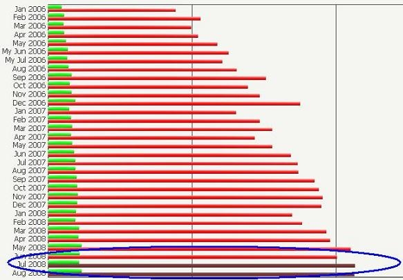
RESULT: you will see that some of the bars will be displayed with an additional color to the 2 it should have.
CAUSE:
This is a known issue in Strategy Developer and has been logged with our Technology Department.
ACTION:
Strategy will continue to investigate and post updates as soon as they are available.
