EducationSoftwareStrategy.com
StrategyCommunity

Knowledge Base

Product

Community

Knowledge Base

TopicsBrowse ArticlesDeveloper Zone

Product

Download SoftwareProduct DocumentationSecurity Hub

Education

Tutorial VideosSolution GalleryEducation courses

Community

GuidelinesGrandmastersEvents
x_social-icon_white.svglinkedin_social-icon_white.svg
Strategy logoCommunity

© Strategy Inc. All Rights Reserved.

LegalTerms of UsePrivacy Policy
  1. Home
  2. Topics

KB35077: How to create a dual axis stacked bar graph with a trend line representing a subtotal in Microstrategy Developer 9.x - 10.x


Stefan Zepeda

Salesforce Solutions Architect • Strategy


This technical note provides instructions to create a dual axis stacked bar graph representing metric values and a trend line representing a subtotal in Microstrategy Developer 9.x - 10.x

 
The following procedure provides instructions for creating a dual axis stacked bar graph representing metric values and a trend line representing a subtotal in Strategy Developer 9.x - 10.x, using Tutorial project.
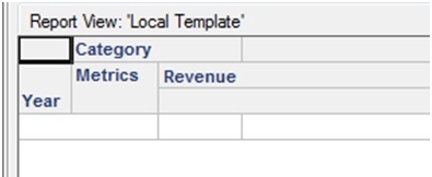
  • Create a report with 'Year' attribute on rows and 'Category' attribute and 'Revenue' metric on the column as shown below.
     
ka02R000000kW4CQAU_0EM440000002DtR.jpeg
  • Run the report and add the Subtotal by going to Data menu -> Grand Totals. The output the report is shown below.
     
ka02R000000kW4CQAU_0EM440000002Dta.jpeg
  • Go to the Graph view and select 'Vertical Bar:DualAxis Stacked' graph type. The Graph options that need to be changed in order to achive the dual axis stacked bars for 'Revenue' metric values and a trend line for 'Total Revenue' subtotal are described in subsequent steps. 
     
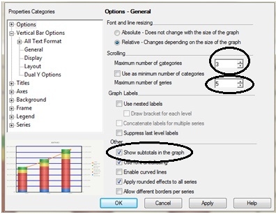
  • Go to Graph menu -> Graph options -> Options and change the 'Maximum number of categories' and 'Maximum number of series' values as shown below. Also check the 'Show subtotals in the graph' checkbox if it is not already checked.
     
ka02R000000kW4CQAU_0EM440000002Dte.jpeg
  •  
    'Maximum number of categories' value is set to 3 to display all the 'Year' values (2007, 2008, 2009) on x-axis and 'Maximum number of series' value is set to 5 to display all the categories revenue (Books, Electronics, Movies, and, Music) and a 'Total' revenue on y-axis.
     
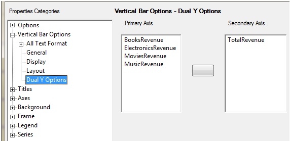
  • In the same window, go to Vertical Bar Options -> Dual Y Options. Make sure to display all the categories revenue on the primary axis and Total revenue on the secondary axis as shown below.

ka02R000000kW4CQAU_0EM440000002Dti.jpeg
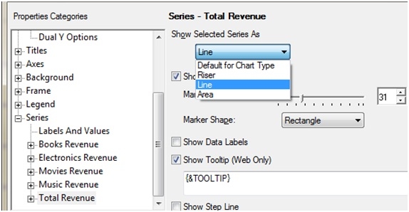
  • Finally go to Series -> Total Revenue and change the Show Selected Series As 'Line' from the dropdown menu as shown below. Press OK.

ka02R000000kW4CQAU_0EM440000002Dtj.jpeg
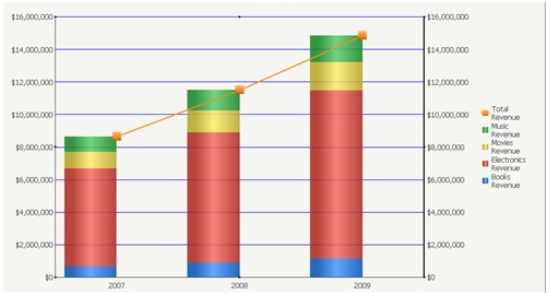
  • The graph should display as shown below.
ka02R000000kW4CQAU_0EM440000002Dtg.jpeg

 
As shown in the graph, the revenue values for all the categories for each year are shown as Vertical Stacked bars whereas Total revenue values for all the categories are shown as the Trend line across all the years.


Comment

0 comments

Details

Knowledge Article

Published:

May 10, 2017

Last Updated:

May 10, 2017