The Graph Matrix visualization is a powerful and interactive visualization that displays data using a variety of graph/grid styles. This new visualization for Visual Insight is introduced in Strategy Web 9.3.0.
Minimum object requirements for each Graph Matrix visualization style
The table below contains example images and data requirements for each graph style available for the Graph Matrix visualization.
Graph Style | Requirements | Example |
Line You can display the data as a vertical or horizontal line graph, to allow users to view lines representing metric values for each element of an attribute. | To create a graph using the Line graph style, place report objects on the Drop Zones panel, as follows: · To display a vertical line graph: a. Place at least one attribute in the X Axis area. b. Place at least one metric in the Y Axis area. · To display a horizontal line graph: a. Place at least one metric in the X Axis area. b. Place at least one attribute in the Y Axis area. |
|
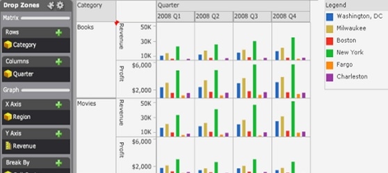
Bar You can display the data as a vertical or horizontal bar graph, to allow users to view bars representing metric values for each element of an attribute. | To create a graph using the Bar graph style, place report objects on the Drop Zones panel, as follows: · To display a vertical bar graph: a. Place at least one attribute in the X Axis area. b. Place at least one metric in the Y Axis area. · To display a horizontal bar graph: a. Place at least one metric in the X Axis area. b. Place at least one attribute in the Y Axis area. |
|
Scatter You can display a scatter plot that allows users to visualize the trends of two different metrics for a set of attribute elements. | To create a graph using the Scatter graph style, place report objects on the Drop Zones panel, as follows: 1. Place at least one metric in the X Axis area. This metric determines the position of each bubble on the X-axis of the graph. 2. Place at least one metric in the Y Axis area. This metric determines the position of each bubble on the Y-axis of the graph. |
|
Bubble You can display a bubble plot that allows users to visualize the trends of three different metrics for a set of attribute elements. | To create a graph using the Bubble graph style, place report objects on the Drop Zones panel, as follows: · Place at least one metric in the X Axis area. This metric determines the position of each bubble on the X-axis of the graph. · Place at least one metric in the Y Axis area. This metric determines the position of each bubble on the Y-axis of the graph. · Place one metric in the Size By area. This metric determines the size in which each bubble is displayed. |
|
Grid You can use the Grid style to allow users to identify trends across combinations of data. Each marker in the grid can be automatically sized or colored based on the value of a metric. For example, in the image to the right, a separate bubble is displayed for each combination of region and product category. Bubbles representing large revenue values are displayed in dark green, and bubbles for smaller revenue values are displayed in light green. | To create a graph using the Grid graph style, place report objects on the Drop Zones panel, as follows: 1. Place at least one attribute in the X Axis area. A column of bubbles will be displayed for each element in this attribute. 2. Place at least one attribute in the Y Axis area. A row of bubbles will be displayed for each element in this attribute. |
|