This article describes how a graph with too many data points can be reorganized to be displayed properly.
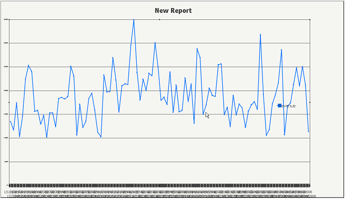
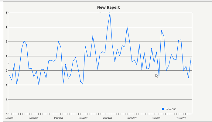
In the following example, see the line graph that displays Revenue over many days. The data labels for days become hard to read as they overlap each other. It is possible to choose to display every other label, or define a certain interval at which to display labels. This is done by manually setting the number of category labels to display. To do this, take the following steps.
Step 1.
Create a report with Day and Revenue. View it as a line graph. It should look similar to the image above.
Step 2.
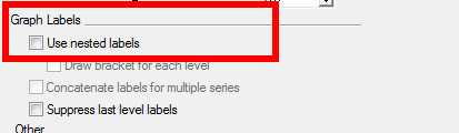
Go into Graph Options and under Options > General, uncheck 'Use nested labels.'
Step 3.
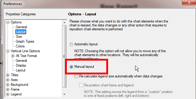
In Graph Options, under Options < Layout, choose to use 'Manual Layout.'
Step 4.
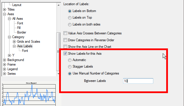
In Graph Options, under Axes > Category > Axis Labels, check 'Show Labels for this axis' and 'Use Manual Number of Categories.' The user can also define the interval at which the label will appear. Putting 10 into the box will display every 10th label.
Step 5.
The graph should now be formatted as below.
Note: This does not change the amount of data actually displayed on the graph, it just adjusts the amount of labels that are shown.