Maps are excellent to filter other visualizations – they give a familiar interface for users to navigate and select what they are interested in.
You can use ESRI maps as a selector to filter or highlight other visualizations, following the steps below:
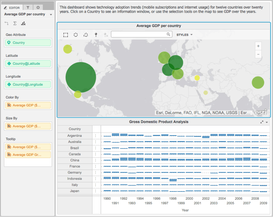
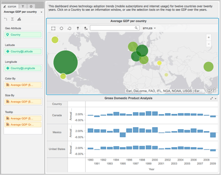
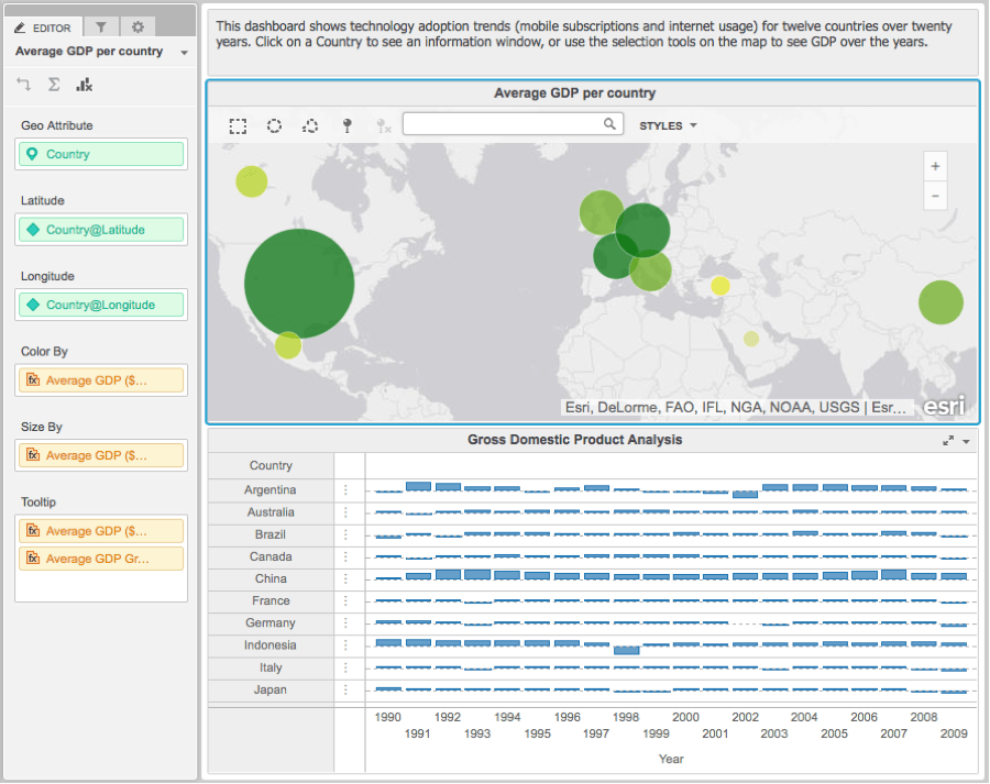
1. Lets take the example dashboard below. The map shows average GDP of each country. The bar graph shows the gdp over the years.
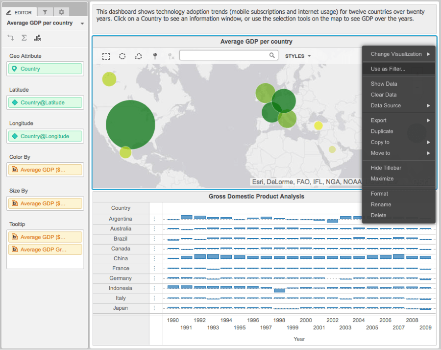
2. Click on the map dropdown menu and select “User as filter”.
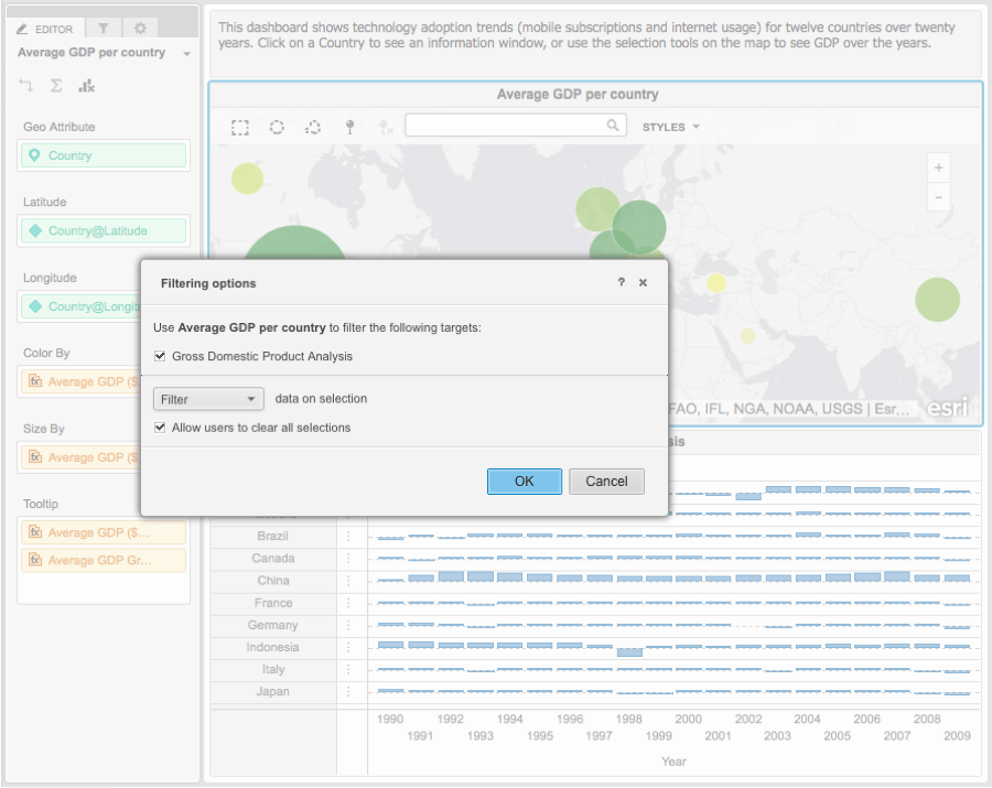
3. This will bring up a dialog box as shown below. If you want to filter out the other visualizations, leave the dropdown at “filter”. If you want to only highlight the corresponding data points in the other visualization, change the dropdown to “highlight”. Make sure all the visualizations you want to be affected by the selection on the map are checked. In this dashboard, we have only one other visualization, the “Gross Domestic Product Analysis”.
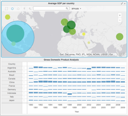
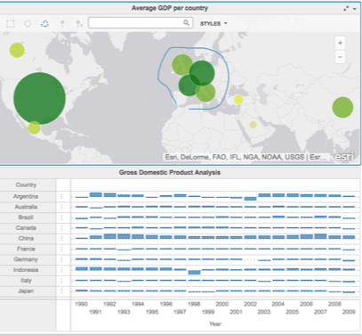
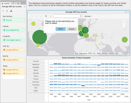
4. Once you have set up filtering, there are 4 ways to select data point son the map: (a) Use the square lasso tool to lasso multiple points; (b) Use the circular lasso tool to select multiple data points – this is especially useful for example when selecting a certain radius around a particular point; ( c) Use the freeform lasso tool to select datapoints in a freeform area; (d) Use the individual element selection tool to select individual data points on the map.
Rectangular lasso: rectangular lasso icon in the map toolbar
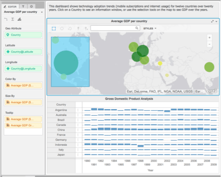
Circular and freeform lasso: circular and freeform icons on the map toolbar
Single element selection: icon on the map toolbar
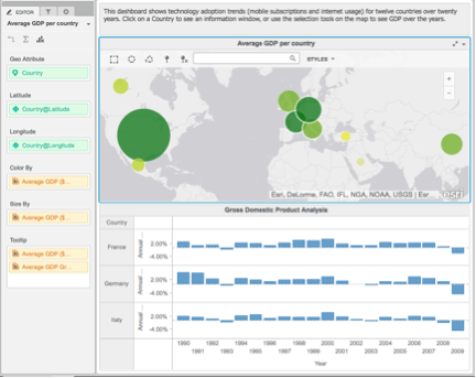
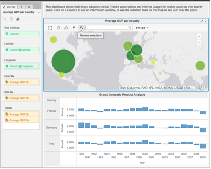
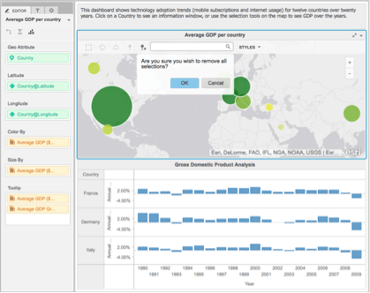
5. You can also clear all selections by clicking on the remove selections icon in the map toolbar.
Result of clearing all selections:
KB438387
