EducationSoftwareStrategy.com
StrategyCommunity

Knowledge Base

Product

Community

Knowledge Base

TopicsBrowse ArticlesDeveloper Zone

Product

Download SoftwareProduct DocumentationSecurity Hub

Education

Tutorial VideosSolution GalleryEducation courses

Community

GuidelinesGrandmastersEvents
x_social-icon_white.svglinkedin_social-icon_white.svg
Strategy logoCommunity

© Strategy Inc. All Rights Reserved.

LegalTerms of UsePrivacy Policy
  1. Home
  2. Topics

KB44237: Thresholds display incorrectly on a graph when the "Use as minimum number of categories" and "Draw Categories in Reverse Order" check boxes are checked in Graph Options in MicroStrategy Developer.


Stefan Zepeda

Salesforce Solutions Architect • Strategy


The issue where thresholds display incorrectly on a graph when the "Maximum number of categories" is either greater or less than the amount of rows returned from the report in grid view, and when the "Draw Categories in Reverse Order" and "Use as Minimum Number of Categories" options are selected can be seen in this article

The issue where thresholds display incorrectly on a graph when the "Maximum number of categories" is either greater or less than the amount of rows returned from the report in grid view, and when the "Draw Categories in Reverse Order" and "Use as Minimum Number of Categories" options are selected can be seen through the following steps:
 

  • A report is created from the Strategy Tutorial project and executed in Strategy Developer containing the Day attribute and the Revenue metric.
  • A report filter is added that filters between two dates, and how much revenue was generated by a particular item
    For this example, a report filter was defined between 6/1/2012 and 7/24/2013, and the item that was selected was defined as 100 Places to Go While Still Young at Heart.
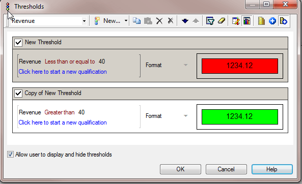
  • Thresholds are added to the report to fill the background of values that are less than or equal to 40 red, and fill the background of values that are greater than 40 green.
  • Additionally, the button to enable thresholds on a graph is toggled on so that these colors will be applied to the bars in the vertical bar chart that will be created
  • Furthermore, the advanced sorting option was used to sort the rows on Date ID in Descending order for this report, but the sorting did not appear to resolver or alter this error in any way
  • The report is executed and returns 23 rows
     
ka02R000000kXSLQA2_0EM440000002CjG.png
ka02R000000kXSLQA2_0EM440000002Civ.png
  • Change the view of the report to Graph View, and select the default Vertical Bar Chart: Clustered
  • Go into Graph Options and set the "Maximum number of categories" to 23 -- the same number of rows that were returned in the grid view
  • Check the checkbox that says "Use as minimum number of categories"
  • Notice there are 23 bars that correspond to a row in the result set from the grid
     
ka02R000000kXSLQA2_0EM440000002CjL.png
  • Go back into Graph Options, and increase the "Maximum number of categories" to 24
  • Notice that there is now an empty space where the 24th category is placed at the end of the graph, and that Desktop keeps the other bars in tact by keeping the thresholds displayed properly
     
ka02R000000kXSLQA2_0EM440000002CjJ.png
  • Go into Graph Options again, and go into Axes > Category > Axis Lables and check the "Draw Categories in Reverse Order" checkbox
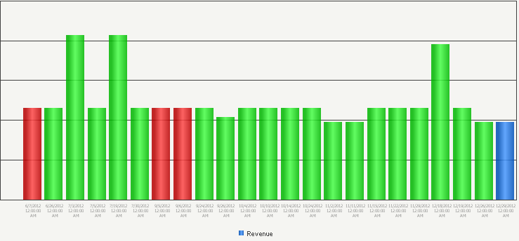
  • Notice that with the reverse setting in place, the empty space is now at the front, but it also removed one red column and turned the last column blue
    The threshold setting applied in the report appears to perform incorrectly in this instance
     
ka02R000000kXSLQA2_0EM440000002Ciu.png
  • Lastly, return to Graph Options once more and go back to Options > General
  • Notice the graph preview at the bottom left of the Graph Options window, and now test increasing and decreasing the "Maximum number of categories"
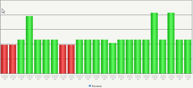
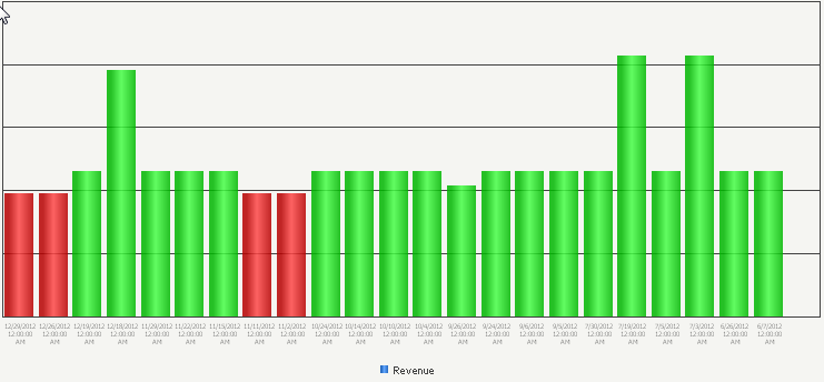
    Here are some screenshots to show how the graph does not display the thresholds properly when the "Draw Categories in Reverse Order, and "Use as Minimum Number of Categories" settings are checked
  • Graph displays properly when maximum number of categories is set to the number of rows in grid view, and thresholds appear to display properly as well
    The graph below has max categories set to 23, "Use as Minimum Number of Categories" is checked, and "Draw Categories in Reverse Order" is checked
     
ka02R000000kXSLQA2_0EM440000002Cj6.png
  • Graph starts to display incorrectly when max categories are increased
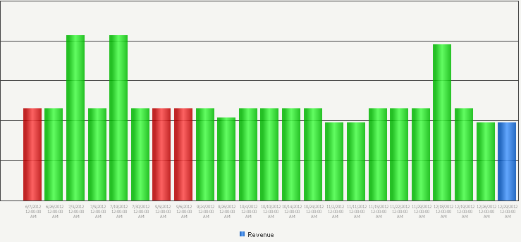
    Max categories increased to 24
     
ka02R000000kXSLQA2_0EM440000002CjH.png
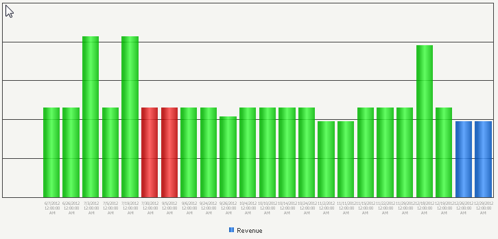
  • Max categories increased to 25 and 26 respectively
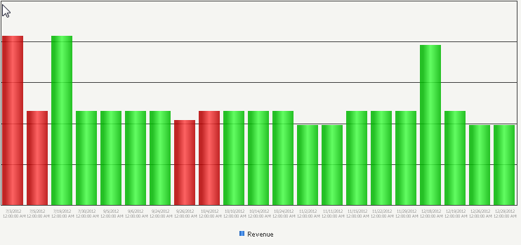
  • Notice there are empty spaces where bars should be in the front of the graph, and that the bars at the very end lose their threshold colors by becoming blue
    Also notice that the tall bar in the second screenshot below takes on the red threshold when it is far greater than 40, which is what the threshold was originally set to
     
ka02R000000kXSLQA2_0EM440000002Cj7.png
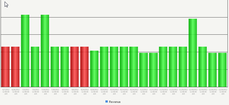
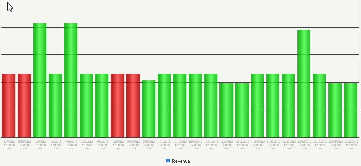
  • Now return the max categories back to 23, and notice the behavior of the graph when the categories are decreased
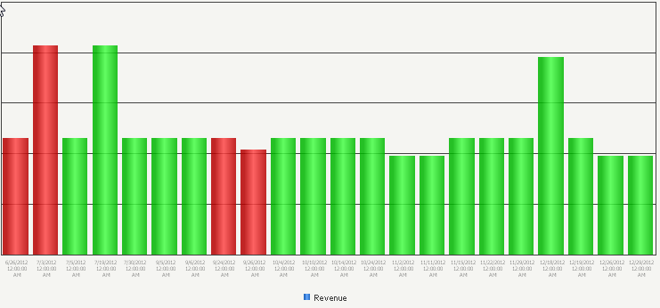
  • Notice that the red bars merely shift to the right by one bar each time the max categories is decreased by 1
  • Also notice that the tall bar in the second and third screenshot below takes on the red threshold when it is far greater than 40, which is what the threshold was originally set to


ka02R000000kXSLQA2_0EM440000002CjA.png
ka02R000000kXSLQA2_0EM440000002CjK.png
ka02R000000kXSLQA2_0EM440000002CjI.png

 
CAUSE
 
This is a known issue with Strategy Developer.  Thresholds display incorrectly on a graph when the "Maximum number of categories" is either greater or less than the amount of rows returned from the report in grid view, and when the "Use as minimum number of categories" and "Draw Categories in Reverse Order" checkboxes are checked in Graph Options.


Comment

0 comments

Details

Knowledge Article

Published:

June 15, 2017

Last Updated:

June 15, 2017