There may exist a requirement where the bars that appear on a Gantt chart (or other graph types) need to be configured to either be combined or disconnected to better show the data to the desired audience. This can be achieved by using the Overlap feature for graphs.
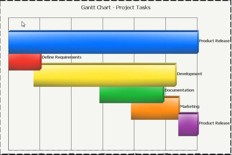
Consider the following example Gantt chart named "Gantt Chart - Project Tasks" which can be found in Strategy Tutorial:
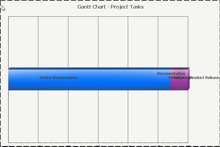
In this example the bars do not overlap, but appear to be side-by-side to one another. Connecting the bars for a different appearance or requirement can be achieved using the Overlap setting, which can be accessed in Graph Options, Gantt Options, General, and is shown below:
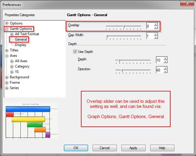
The Overlap slider has a range of values from -100 to 100 where 0 is the middle point. Moving the slider to the right increases the values to 100, whereas moving the slider to the left decreases the values to -100. By default this option is set to 0, which shows the bars as disconnected. Moving the bar to the right, towards the 100 makes the bars disconnected -- less overlapped -- whereas moving the bar to the left, towards the -100, makes the bars connected -- more overlapped.
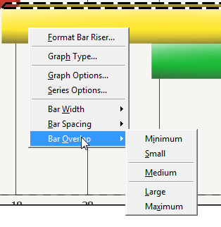
In addition, the Overlap setting can be adjusted using a shortcut method via right-clicking the bars on the graph, selecting Bar Overlap, and selecting one of the following settings:
The effects of these settings vary between graphs, as well as when combined with other graph options (notably the Bar Width and Bar Spacing options), and can be useful when there are multiple sets of data for a particular attribute element. For example, if an element of the Employee attribute has multiple hire and end dates if they happened to join the company at one time, leave the company, and then re-join at a later date. A brief overview and example of the settings are described below:
Minimum overlap makes the bars appear as if they are touching in this example, but can also appear as disconnected in other graphs. This was what the graph originally appeared to be set as:

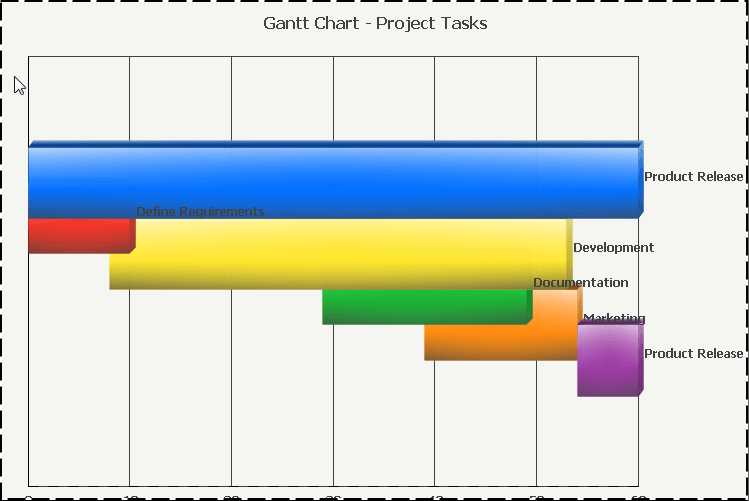
Small overlap makes the bars appear to be slightly merged in this example. Notice the minor changes below, most notably where the red bar slightly overlaps the yellow:
Medium overlap shows the bars closer together in this example, but the bars may appear to be touching or semi-connected with this setting as well in other scenarios. Notice the changes for this example below:
Large overlap shows the bars connected, but not completely -- as in not fully merged together. This can be seen with the yellow and orange bars below:
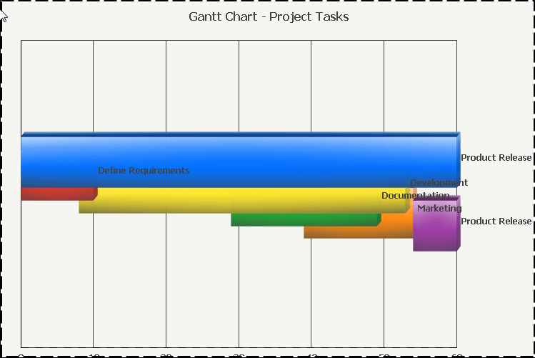
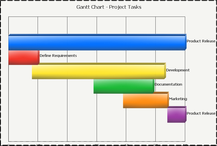
Maximum overlap makes the bars connected, and resembles a stacked horizontal bar graph. This achieves an overlapped state which may achieve specific reporting requirements in certain scenarios: