EducationSoftwareStrategy.com
StrategyCommunity

Knowledge Base

Product

Community

Knowledge Base

TopicsBrowse ArticlesDeveloper Zone

Product

Download SoftwareProduct DocumentationSecurity Hub

Education

Tutorial VideosSolution GalleryEducation courses

Community

GuidelinesGrandmastersEvents
x_social-icon_white.svglinkedin_social-icon_white.svg
Strategy logoCommunity

© Strategy Inc. All Rights Reserved.

LegalTerms of UsePrivacy Policy
  1. Home
  2. Topics

KB46307: Size of pies in pie matrix graph changes with the size of data labels in Flash view mode in MicroStrategy Web 9.2.1.


Community Admin

• Strategy


In MicroStrategy 9.2.1, a user can create a matrix of pie graphs with data labels. While the data labels for these graphs are small in size, the size of each pie is uniform, as seen below.

SYMPTOM:
 
In Strategy 9.2.1, a user can create a matrix of pie graphs with data labels. While the data labels for these graphs are small in size, the size of each pie is uniform, as seen below.
 

ka04W000000OgcIQAS_0EM4400000026GR.png

 
If the data contains larger numbers, the labels size increases, and the pie graphs become smaller in order to compensate, which is expected behavior. This is seen below.
 

ka04W000000OgcIQAS_0EM4400000026GP.png

 
However, the user may encounter a situation where even though the data labels are small, the pies change to different sizes for no discernible reason, as seen below.
 

ka04W000000OgcIQAS_0EM4400000026GS.png

 
STEPS TO REPRODUCE:

  1. Navigate to Subject Areas > Customer Analysis > "Yearly Revenue Growth by Customer Region".
  2. Convert this report into a document.
  3. Use "Customer Region" as attribute and "Revenue" as metric.
  4. Configure this grid as a pie graph.
  5. Add a filter panel with a checkbox selector based on Customer Region.
  6. Run in Interactive/Editable Mode.
  7. In the checkbox selector, select Mid-Atlantic, Northwest, and Southwest.
  8. Observe the pie chart size.
  9. Add South to the checkbox selector.
  10. The size of the pie chart shrinks in order to make room for the additional data label.
  11. In some cases, where the orientation of the labels are above and under the pie charts, they may compress the pie charts differently to give them that random size look.

CAUSE:
 
This is working as designed in Strategy Web 9.2.1. The size of the pie chart will always have to share the space available with its label. If the label is located directly above or under, the label area will push the size of the pie chart. As the labels move toward the sides of the pie, they take up less space. A request has been logged to address this issue.
 
ACTION:
 
Contact Strategy Technical Support for an update on this issue.
 
WORKAROUND:
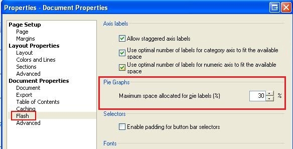
The size that the labels take up can be controlled with the following document property, available only in Strategy Desktop 9.2.1:
Tools > Document properties > Flash > Pie graphs: Maximum Space allocated for pie labels (%)

ka04W000000OgcIQAS_0EM4400000026GM.jpeg


Comment

0 comments

Details

Knowledge Article

Published:

June 13, 2017

Last Updated:

June 13, 2017