This document demonstrates how to design a document that can perfectly fit multiple iPad screens with manage views using Strategy Mobile app (Strategy 2019 Update 1).
Basically, these are the key factors that matter the document display on different iPad screens:
1) Layout size
2) View resolution
The following steps explain how to design a document with the out-of-the-box navigation bar for iPad Air 2 landscape mode and have that document also displayed well on all devices.
Step 1. Get the physical resolution and scale factor for all iPad/iPhone models from here:
https://developer.apple.com/design/human-interface-guidelines/ios/visual-design/adaptivity-and-layout/
https://developer.apple.com/design/human-interface-guidelines/ios/icons-and-images/image-size-and-resolution/
Calculate the logical resolution in the way that divide the physical resolution by the scale factor. For iPad Air 2, the physical resolution is 2048 * 1536 and the scale factor @2x. The calculated logical resolution is 1024 * 768. Or, you could quickly reference all these values from here: http://iosres.com/.
Step 2. Create a document with out-of-the-box navigation bar and only enable landscape orientation.
To achieve this, go to “TOOLS>Document Properties>Mobile (under Layout Properties group)”. Change the “Supported Orientations” to “Landscape only”:

Go to “TOOLS>Document Properties>Document (under Document Properties group)” and make sure the property “Always open this document in full screen mode” is unchecked:

Step 3. Design the document so that it perfectly fits iPad Air 2 landscape mode. To achieve this, make sure your layout width is exactly the same as the device’s logical width while the layout height equals the logical height minus top status bar and navigation bar:
• Layout width=1024.
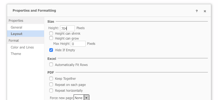
• Layout height=768-20-44=704. right click on “Body” section, go to “Properties and Formatting” and set Height:

Note:
If you have more than one sections in this document, e.g. “Page Header” and “Body” as in below screenshot, their total height instead should equal 704:

Step 4. Set the view resolution to the device’s physical resolution. Go to “TOOLS>Manage Views” and make sure the view’s resolution is set to the physical resolution of iPad Air 2:

Automatic scaling:
Run this document on iPad Air 2, it will fit the screen pixels perfectly. Run the same document on other iPads, for example 12.9-inch iPad Pro, it will be scaled up to fill the 12.9-inch screen.
Below screenshots show how the same document renders on iPad Air 2, iPad Pro 11-inch and iPad Pro 12.9-inch.

Note:
1. Similarly, if you design a document for 12.9-inch iPad Pro respecting its physical resolution, run the document on iPad with smaller screen size, like iPad Air 2, it will be scaled down to fill the small screen size.
2. You may notice from above screenshots that the document is stretched a little bit on iPad Pro 11-inch which makes the text “Airline Airport App” looks shorter but wider. This is because iPad Pro 11-inch has a different aspect ratio than any other iPad model. If you would like a pixel perfect display on it, you should add a new view specific to its physical resolution (2388 * 1668). This view will not be scaled which means you will also need to change the size of objects like panel stacks, grids and text boxes in that view so that they could fill in the new layout size:
• Layout width=1194; layout height=844-20-44=780
• View resolution=2388 * 1668
3. To calculate the height of the layout, besides the top status bar and navigation bar, you should also minus the height of navigation bar, page by bar and navigation tab bar, if any:
| |
| |
| |
| |
| |
In fact, the out-of-the-box bars on iPad vary on different iOS version and different device model, but when designing a document for iPad, you should refer to the above table and calculate the layout height. Strategy Mobile app will handle these subtle differences and scale the content automatically to fill the screen at runtime.
4. A view can only be scaled in one orientation that specified through the “Manage views” editor. If “Landscape or portrait” is selected for a view, it will only be scaled in the orientation concluded from the view resolution.
Suppose in the above example and in step 2, the “Supported Orientations” of this document is set to “Portrait and Landscape”, then you will be able to rotate the device and display this document in portrait mode also. However, the view will not be scaled in landscape orientation because its orientation is set to “Landscape only” in step 4. Even if the view orientation is set to “Landscape and portrait”, the view will not be scaled in portrait because its width (2048) is greater than the height (1536).
