Starting with the release of Strategy ONE (March 2024), dossiers are also known as dashboards.
A line chart, also referred to as a line graph, is a type of chart which displays information as a series of data points called 'markers' connected by straight line segments. It is a basic type of chart common in many fields. Line charts are most often used to visualize data that changes over time.
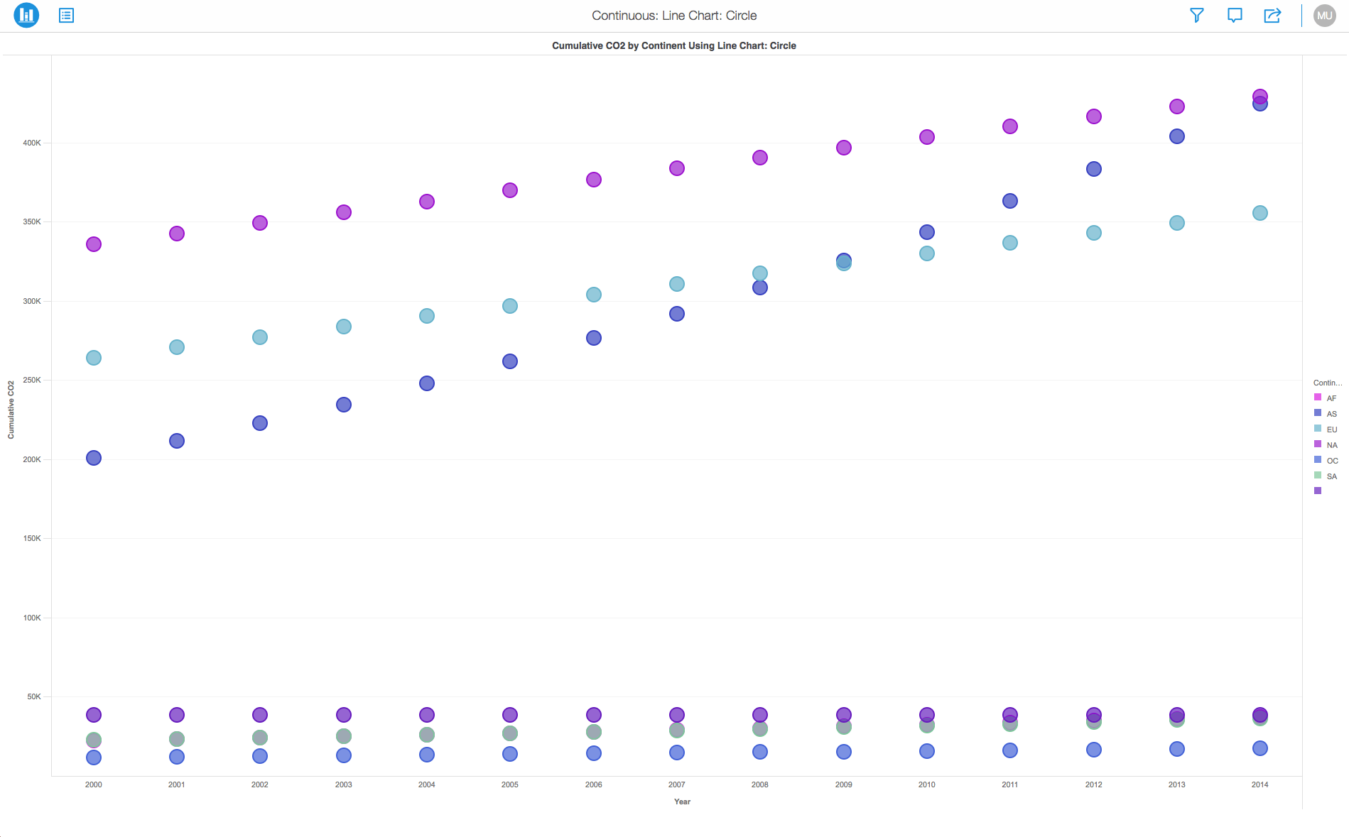
If you have a line chart, you can change the look of the data markers to make them easier to distinguish. You can assign different marker types (Squares, Circles and Rings) or add a metric or attribute for color thresholds. Using a color thresholds helps in distinguishing these markers from each other. Adding colors to markers and helps to enhance the overall experience of analyzing your data.
The Line Chart is similar to the Scatter Plot except that the measurement points are ordered (typically by their x-axis value) and joined with straight line segments. Feel free to use a combination of both charts.
Minimum Strategy version: 10.2
Publisher: Strategy
To view this dossier with the visualization:
Create > Upload Strategy File > View Dossier.
Analyze using line charts by downloading MicroStrategy Desktop!
A project in beta by ferdio, (2017, December 4th).
Retrieved from http://datavizproject.com/
Interested in learning more on Dossier authoring? Visit the Learning Center on Community!