Starting with the release of Strategy ONE (March 2024), dossiers are also known as dashboards.
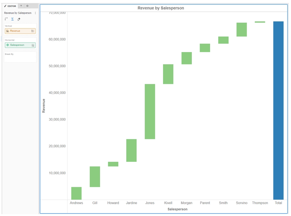
Waterfall
This new built-in visualization can be leveraged to show the cumulative effect of sequentially introduced positive and negatives values, leading to a final value. The color on this chart shows how the initial value is affected by a series of intermediate positive and negative values. Intermediate values can either be time-based or category-based. Like other built-in visualizations in Strategy, users can format and customize the chart as needed. The properties panel offers formatting options to customize colors for positive values, negative values, or totals. Analysts can use a waterfall chart for use cases such as visualizing revenue from a specific product type, R&D spending vs. marketing spending, profits and losses over a period of time, or a price waterfall.
For more information about Waterfall visualization please enter the following link:
https://www2.microstrategy.com/producthelp/10.11/Dossier_Authoring/WebHelp/Lang_1033/Content/Introduction_to_Waterfall_Chart_Visualizations.htm
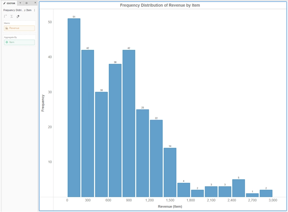
Histogram
The histogram visualization, available as a built-in visualization with Strategy dossiers, can be used to graphically reveal the underlying frequency distribution of a metric. The data is divided into intervals, called bins. Each bin displays the number of occurrences of the values in the data set that is contained within that bin. In a histogram, the height of the bar indicates the frequency of the values in that bin.
Authors can use a histogram for the following use cases, among others: count the frequency of observations in a range of interest, or determine the most frequent value in a dataset.
For more information about Histogram visualization please enter the following link:
https://www2.microstrategy.com/producthelp/10.11/Dossier_Authoring/WebHelp/Lang_1033/Content/Introduction_to_Histogram_Visualizations.htm
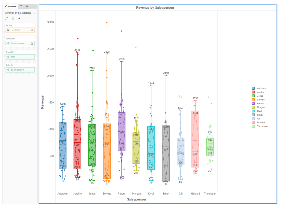
Box Plot
The box plot is now available as a built-in visualization with dossiers. It is a popular way to display the distribution of data based on quartile and median values of a metric, as well as visualize outlier values.
This visual is a standardized way of displaying the distribution of data based on five data measurements: the minimum, the first quartile, the median, the third quartile, and the maximum. The boxes in a box plot are the first and third quartiles of the data with a line indicating the median value. The whiskers indicate the minimum and maximum with lines extending to the minimum and maximum values on either side of a box.
For more information about Box Plot visualization please enter the following link:
https://www2.microstrategy.com/producthelp/10.11/Dossier_Authoring/WebHelp/Lang_1033/Content/Introduction_to_Box_Plot_Visualizations.htm
KB440714