Starting with the release of Strategy ONE (March 2024), dossiers are also known as dashboards.
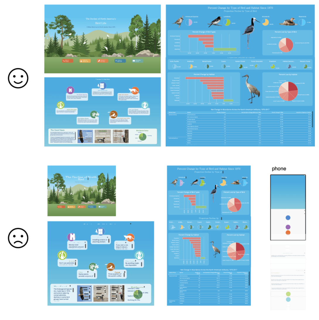
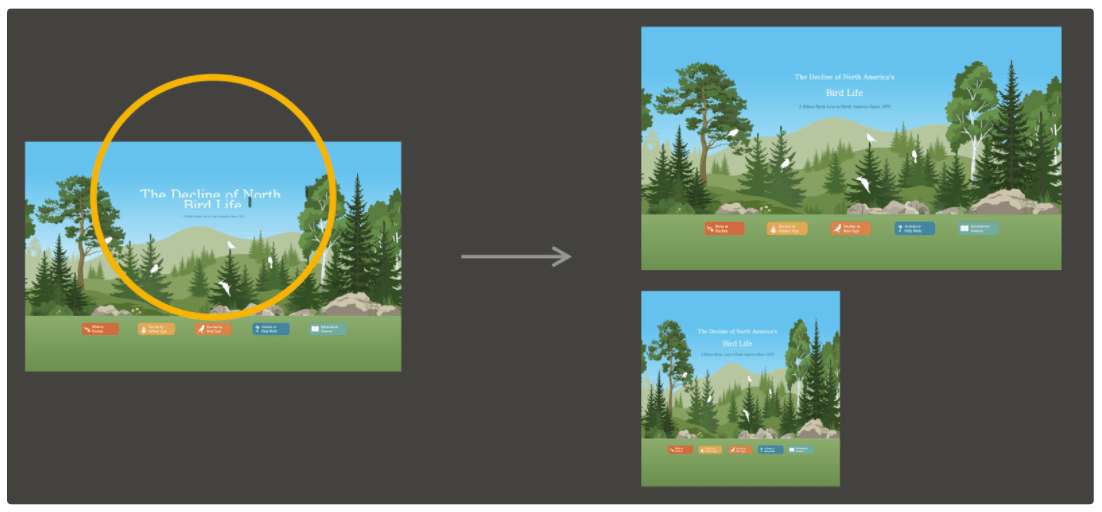
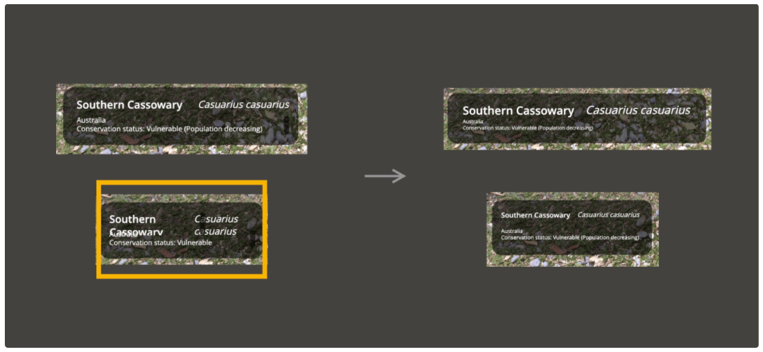
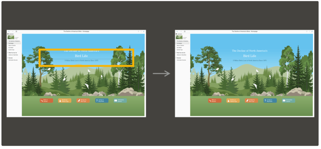
Your users might be viewing dossiers on a big TV screen, on a 13” laptop, on a 9.7” iPad in portrait orientation, or even casually scrolling through the content on their 6” smartphones. Creating one design to fit any screen size was never an easy task. Dossier authoring comes with many features to help you create a flexible layout. The more screen resolutions you support, the more audiences you will be able to reach. In the following example, our analyst created a design that looks perfect, when viewed at exactly the right size. She later discovered it looks distorted on other screens. Let’s dive into some of the best practices to optimize this dossier.
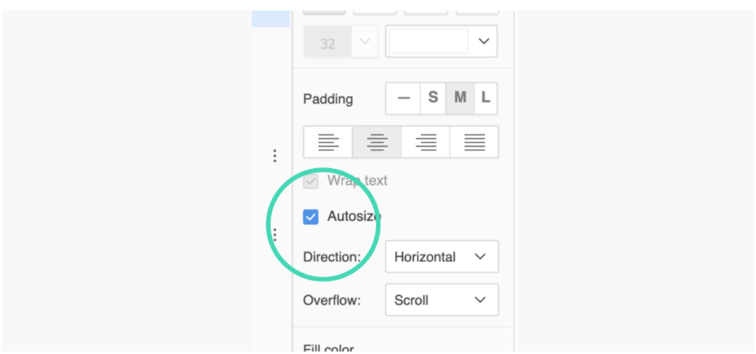
In the latest release, dossier authoring introduced the ability to autosize the font. This helps the text automatically adjust its size to fit into the responsive textbox. Please note there is a minimum size (6pt) to ensure readability. A scrollbar might be displayed if the font size shrinks to the minimum limit and the content is overflowing. The “Wrap text” setting turns on by default when using autosize.
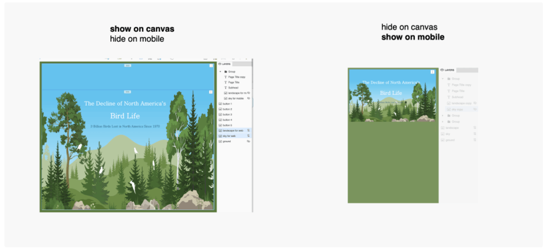
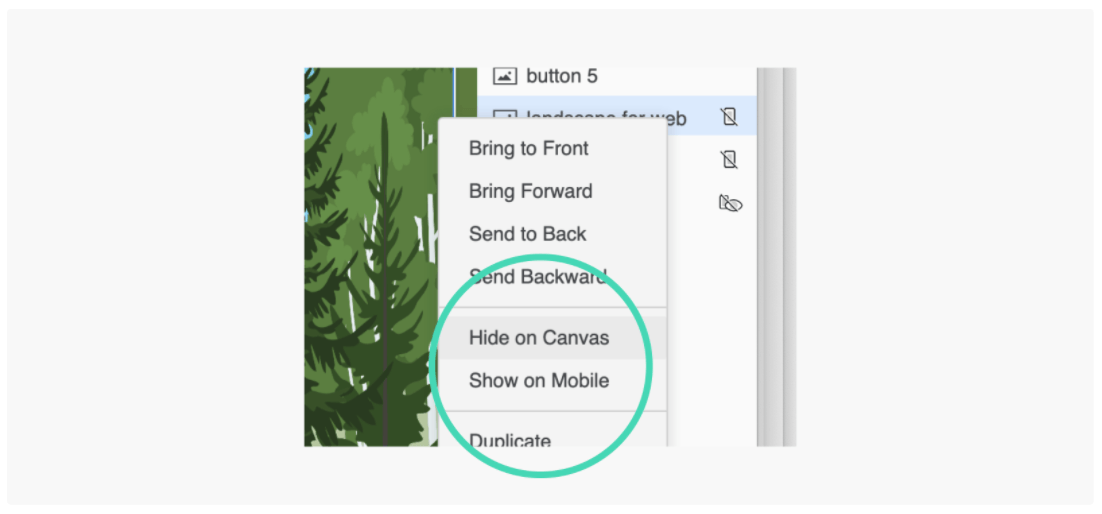
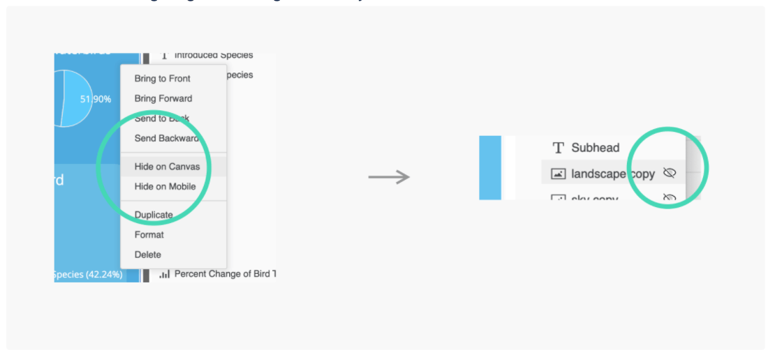
Form-factor show/hide gives the author control of what contents to display on each device. In this case, I created two background image layer groups to address desktop and mobile separately. You can right-mouse click on a layer in the Layers panel to set that layer’s visibility. Hide on Mobile, as the name implies, allows you to hide select containers from the mobile viewing experience. Maybe you have a detailed grid that is better consumed only in desktop width. Hide on Canvas has two powerful use cases: 1) you can temporarily use it while authoring to help adjust and format overlapping containers, and 2) customize your desktop view. It is a useful authoring aid when you have highly layered dossiers and it is difficult to select the right container. Be sure to turn visibility back on before moving on since, when saved with the dossier, it allows you to customize the Desktop view. Maybe you have a navigation bar (formatted textboxes acting as links) that is only intended for mobile devices. For more information about hiding containers on mobile and Desktop views, read our documentation.
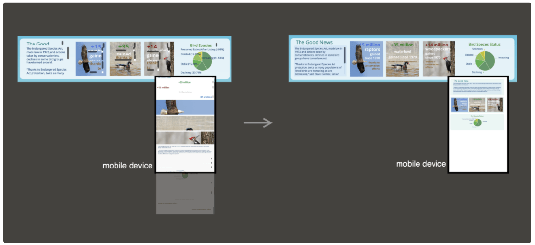
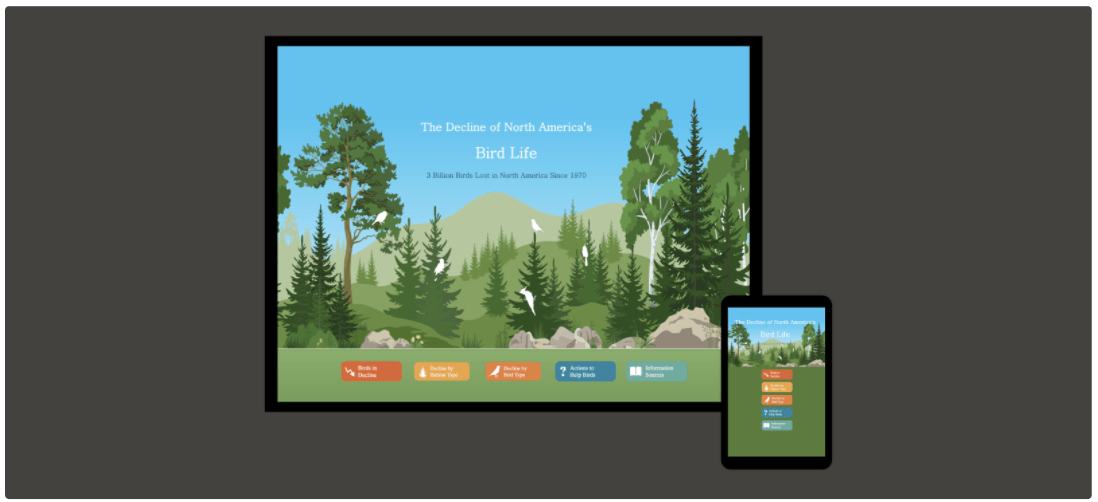
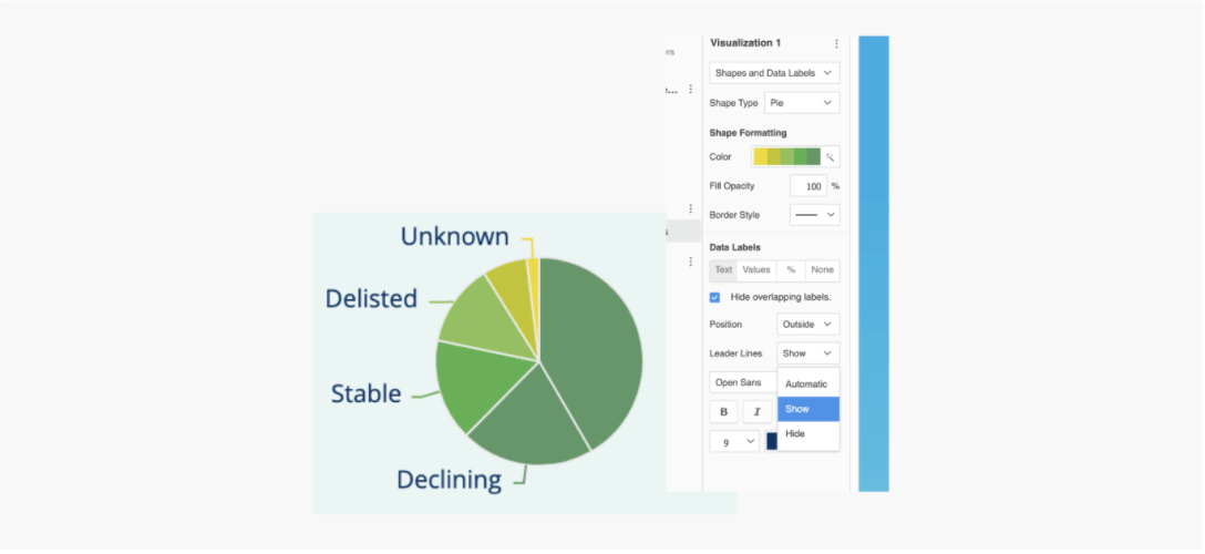
In a responsive view, each visualization fills the width of the entire screen by default at smaller widths. Grouping elements helps you to ensure contents are organized in the same way as they are when viewed on the web. I’ve posted a separate article to detail how responsive layout works. In the above example, I separated contents into each responsive group, set text to autosize font, chose a more concise data label (right-mouse click the pie and choose text, %, or values), and added a background fill to the scrollable textbox. All these techniques contribute to a design that responds better to the user’s behavior and environment based on screen size, platform, and orientation.
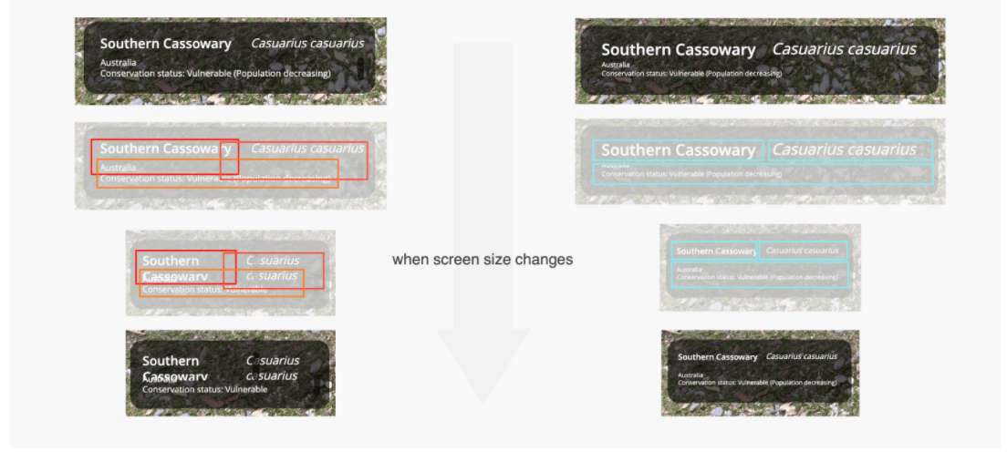
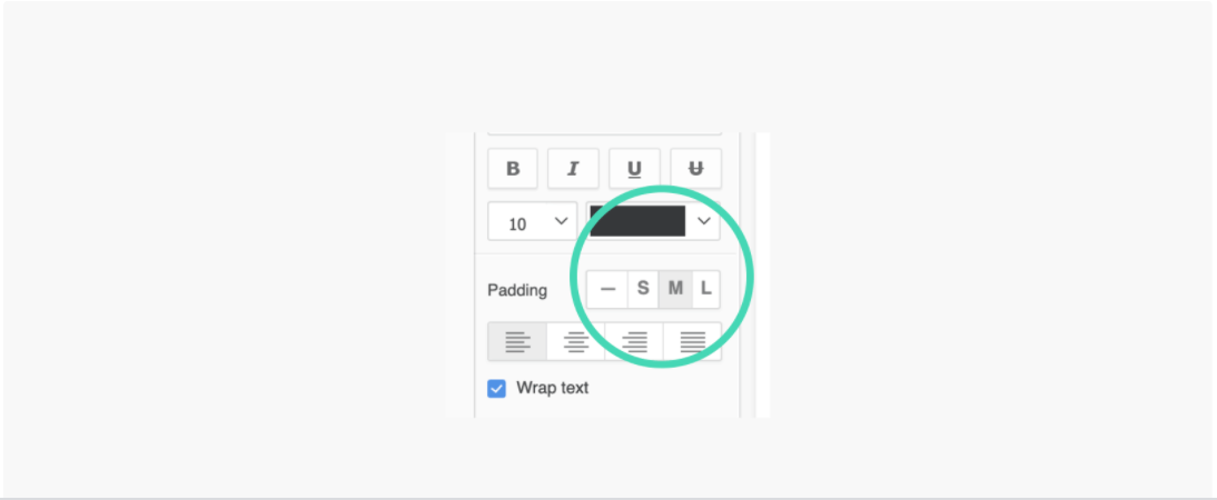
It is important to understand that text is placed inside the textbox. To avoid overlapping when the screen size changes, it is always better to align rather than overlap the textboxes and leave enough room for them to stretch. You can also play around with the new padding settings to increase or reduce the gaps between textboxes.
When building a professional dossier application, it is common to have an overwhelming number of elements in your Layers panel. Here are a few tips:
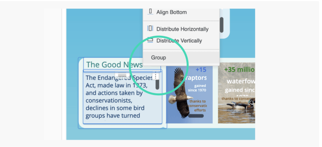
Grouping layers to rearrange
Grouping a set of layers helps to bring all selections to the front. Arranging layers is much easier if they are in the same grouping level.
Show/hide layers on the canvas
If there is a layer overlapping another, making it hard to select the layer underneath, you can temporarily hide a container layer in the Layers panel to reach the one you want. This feature is accessed through right-clicking on the layer.
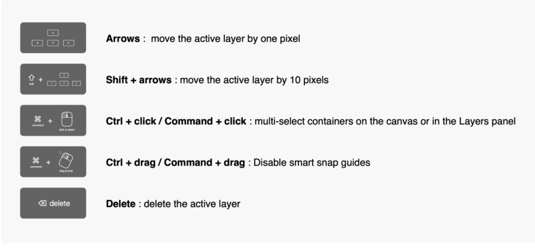
Below are some keyboard shortcuts to fine-tune the layers' positions.
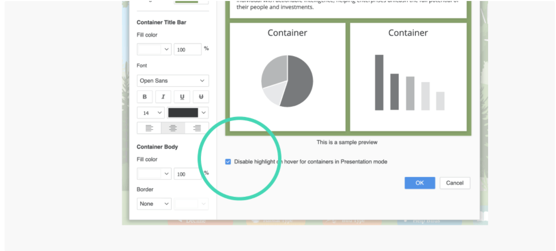
The highlight on hover is enabled in Presentation mode by default to indicate the viewer’s mouse focus. This feature, however, might be distracting when designing or viewing a Free-form layout. You can disable the setting from the menubar: Format → Dossier Formatting → Disable highlight on hover for containers in Presentation mode.
In conclusion, these are just a few tips to optimize your dossiers. It can be easy to make mistakes without understanding how responsive grouping works and which settings influence the visual display. Mastering these techniques will prepare you to create a robust design for many different screen sizes.
As always, please feel free to leave a comment and let me know what you think. Thank you!