Starting with the release of Strategy ONE (March 2024), dossiers are also known as dashboards.
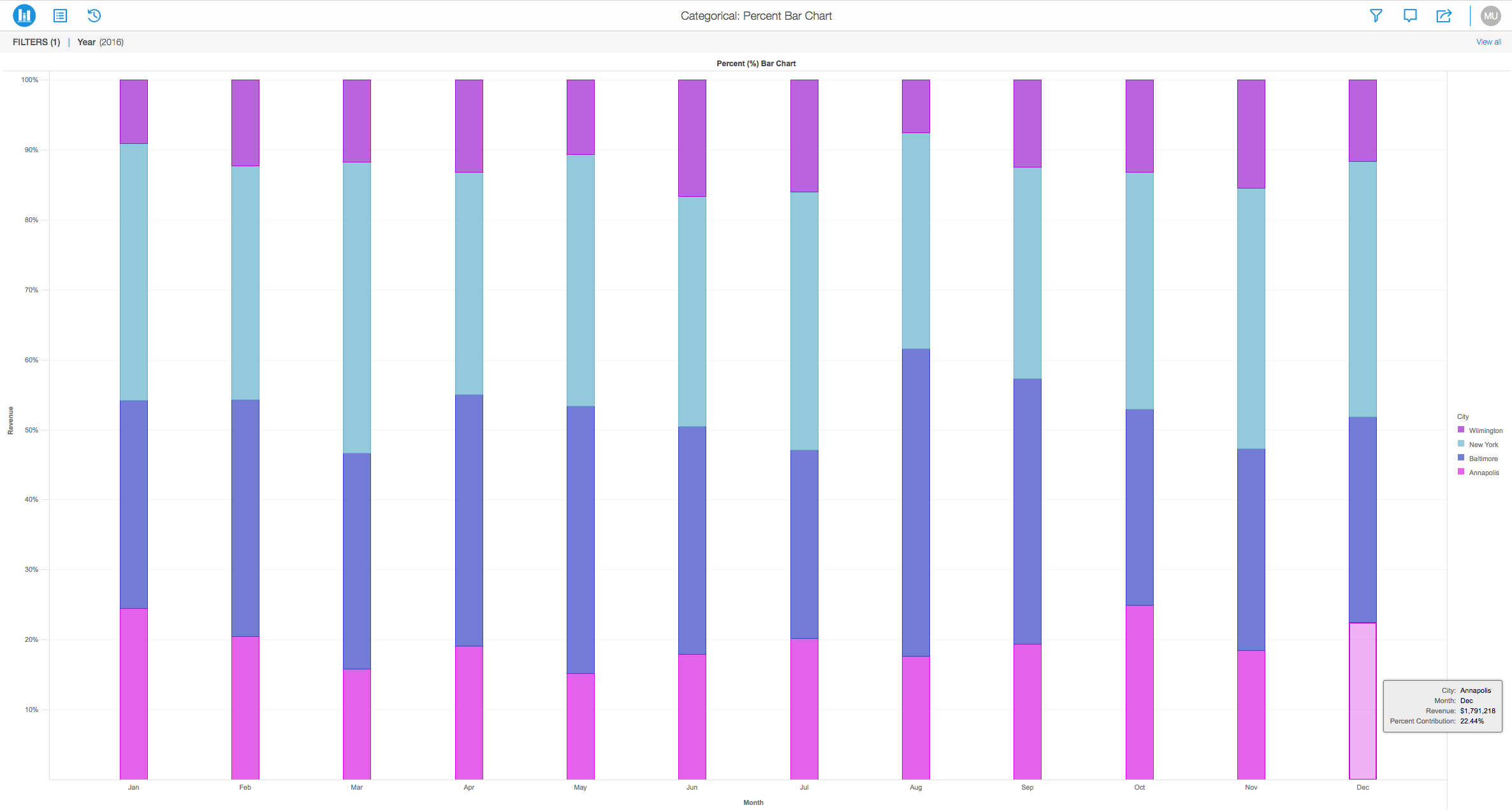
The Percent Bar Chart is another type of a bar graph that represents percentages of various attributes that are compared in a stacked fashion. Below, you can view that the bar chart is a 100% stacked bar chart that shows the relative percentage of multiple data series in stacked columns. It is also known as the "100% Stacked Bar Chart" due to the fact that is shows the percentage values relative to multiple data series stacked on top of each other. In this example, the total of stacked columns will always equal 100%.
View the 100% Stacked Bar Chart:
Object requirements:
Minimum Strategy version: 10.2
Publisher: Strategy
Installation Instructions:
To view this dossier with the visualization:
Analyze using bar charts by downloading MicroStrategy Desktop!
View References:
1. A project in beta by ferdio, (2017, December 4th). Retrieved from http://datavizproject.com/
2. Bar Chart, Wikipedia, (2017, February). Retrieved from https://en.wikipedia.org/wiki/Bar_chart#Grouped_or_stacked
Interested in learning more about Dossier authoring? Visit the Learning Center on Community!