Starting with the release of Strategy ONE (March 2024), dossiers are also known as dashboards.
A pie chart is another important chart type used in conducting visual analysis. It is divided into sectors, illustrating a quantitative proportion. Though one of the most basic visualizations, it enables key stakeholders to analyze data quickly and efficiently. The following are components needed to form a pie chart with Strategy:
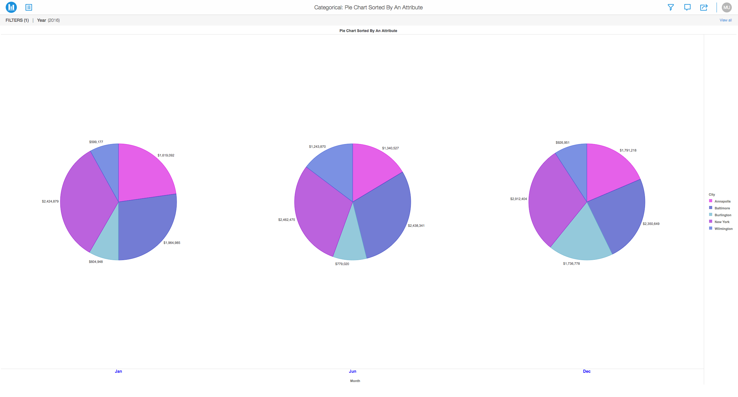
With the image below, you can view three different pie charts sorted by calendar months:
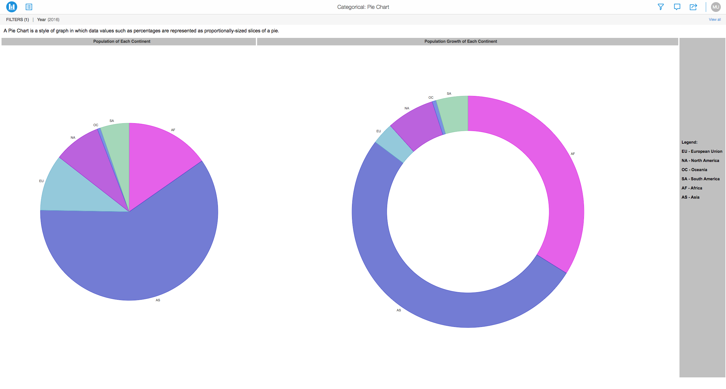
In a pie chart, the central angle and area is proportional to the quantity it represents. Strategy provides a multitude of different variations in the way it can be represented.
For example, the pie chart may be formatted in the "ring" format.
Minimum Strategy version: 10.9
Publisher: Strategy
To view this dossier with the Pie Chart visualization:
Analyze using pie chart by downloading MicroStrategy Desktop!
1. A project in beta by ferdio, (2017, December 4th). Retrieved from http://datavizproject.com/
2. Pie Chart, Wikipedia, Retrieved from https://en.wikipedia.org/wiki/Pie_chart
Interested in learning more about Dossier authoring? Visit the Learning Center on Community!
Feel free to visit our Documentation page for more examples and use cases.