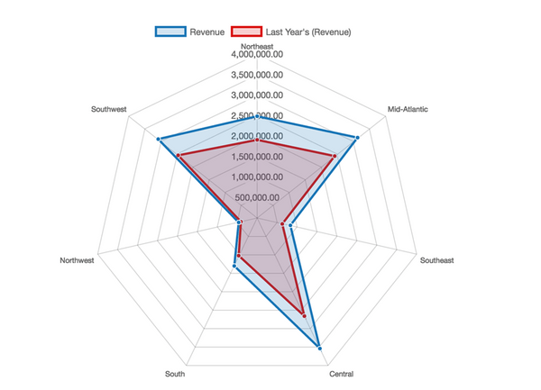
Compare the values of multiple quantitative variables, visualized as overlapping polygons that resemble a spider web. Each variable in a Radar Chart is represented by an axis radiating from the center of the two-dimensional chart, with each axis equidistant from the other. The values to be compared on each axis are connected by lines and the enclosed areas can be filled with a transparent color to enhance the comparisons. The position and angle of the axes are not important.
Radar charts are useful for determining which variables in a dataset have similar values and which are outliers, and to display performance by visualizing which variables rank highest or lowest in a dataset. Radar charts are also a great way to compare members of a dimension in a function of several metrics. For example, when users are selecting a health plan, you can provide a radar chart to let them compare different plans across metrics such as deductibles, premiums, and maximum out-of-pocket costs.
To make the Radar Chart most effective and easiest to read, you should limit the number of variables used.
Object requirements:
Minimum Strategy version: 10.2
Current visualization version: 1.0
Publisher: Strategy
By downloading or using this visualization, you accept and acknowledge these terms.
This visualization is both intended as sample code and provided as a convenience to Strategy users. Strategy cannot guarantee that the code provided will apply to any Strategy releases and clients outside of the versions stated within this article. This sample is supported by Strategy Technical Support up to and including the basic visualization functionality listed in this article. Defects will be triaged by the Strategy team as they are raised. For users with active Strategy Technical Support contracts, contact Strategy Technical Support to raise these defects.
Anyone seeking to use this visualization is encouraged to review and adapt this sample based on user requirements. Contact Strategy Professional Services for assistance with these same adaptations. If users would like to provide feedback on or recommendations for this visualization, post in the comments section of this article.