Starting in Strategy 2021 Update 1, there is an new out-of-the-box, feature-rich, Sankey visualization. We highly recommend using this visualization instead. Starting in 2021 Update 5, the Sankey visualization is located in the More section of the Visualization Gallery, instead of the Custom section.
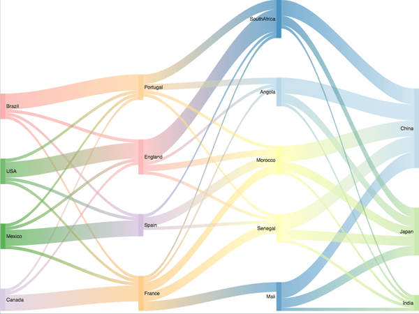
Visualize the flow from one set of values to another to gain insight into relative contributions. Sankey diagrams visually emphasize the major transfers or flows within a system, helping users locate dominant contributions to an overall flow.
Sankey diagrams are a great choice when you want to show a many-to-many mapping between two domains - such as retail categories and individual items - or multiple paths through a set of stages - such as how traffic flows from one page to another on a web site.
A fun fact about this visualization is that it is named after Captain Sankey, who created a diagram of steam engine efficiency that used arrows with widths proportional to heat loss.
Object requirements:
Minimum Strategy version: 10.2
Current visualization version: 1.0
Publisher: Strategy
By downloading or using this visualization, you accept and acknowledge these terms.
This visualization is both intended as sample code and provided as a convenience to Strategy users. Strategy cannot guarantee that the code provided will apply to any Strategy releases and clients outside of the versions stated within this article. This sample is supported by Strategy Technical Support up to and including the basic visualization functionality listed in this article. Defects will be triaged by the Strategy team as they are raised. For users with active Strategy Technical Support contracts, contact Strategy Technical Support to raise these defects.
Anyone seeking to use this visualization is encouraged to review and adapt this sample based on user requirements. Contact Strategy Professional Services for assistance with these same adaptations. If users would like to provide feedback on or recommendations for this visualization, post in the comments section of this article.