Starting with the release of Strategy ONE (March 2024), dossiers are also known as dashboards.
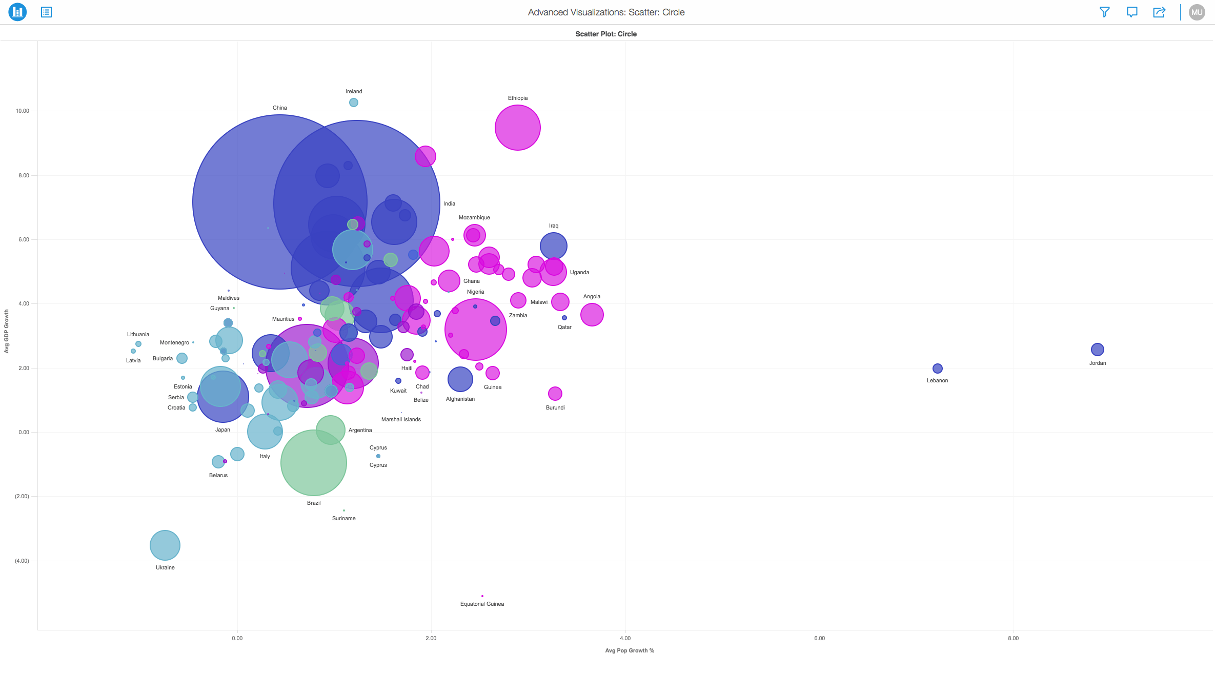
Scatter Plots, also referred to as or scatter graphs or "Bubble Charts" here at Strategy, are types of mathematical diagrams that uses Cartesian coordinates. This kind of plot can help you identify the relationship that exists between different values. Scatter Plots and Bubble Charts are a great way to display a large number of related data based on size or color.
For example you may choose one metric to "Size By" and another to color the circles to make visual analysis easier.
Scatter Plots (Bubble Charts) can use various symbols like circles to visualize data. The symbols help to represent three dimensions of data. Every object with its triplet (v1, v2, v3) of related data is plotted as a circle that expresses two of the values through the disk's xy location and the third through its size. View the image below to better understand the visualization:
Minimum Strategy version: 10.9
Publisher: Strategy
To view this dossier with the Scatter Plot Circle visualization:
Analyze using scatter plots by downloading MicroStrategy Desktop!
A project in beta by ferdio, (2017, December 4th). Retrieved from http://datavizproject.com/
Interested in learning more about Dossier authoring? Visit the Learning Center on Community!