EducationSoftwareStrategy.com
StrategyCommunity

Knowledge Base

Product

Community

Knowledge Base

TopicsBrowse ArticlesDeveloper Zone

Product

Download SoftwareProduct DocumentationSecurity Hub

Education

Tutorial VideosSolution GalleryEducation courses

Community

GuidelinesGrandmastersEvents
x_social-icon_white.svglinkedin_social-icon_white.svg
Strategy logoCommunity

© Strategy Inc. All Rights Reserved.

LegalTerms of UsePrivacy Policy
  1. Home
  2. Topics

Solution for showing Bar Charts and % Change Arrows inside Grids


Chris McGovern

Senior Consultant • Strategy


This is a method to get horizontal bar charts and % change arrows within a grid in a Report Service document and Dossier.

Starting with the release of Strategy ONE (March 2024), dossiers are also known as dashboards.
Credit to Remco Leguijt for initially sharing this solution.

ka0PW0000001JRIYA2_0EM44000000RCnF.png


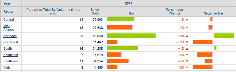
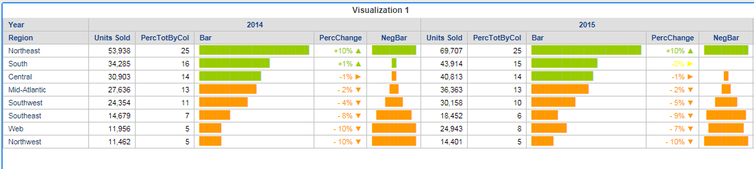
This is a method to get horizontal bar charts and % change arrows within a grid. It is based on Strategy Tutorial.
To start, build a report with the attributes Region and Year and the Units Sold metric. Run the report.

Create a derived metric Percentage Total By Column


Use the formula:


Trunc(((100*[Units Sold])/Sum<UseLookupForAttributes=True>([Units Sold]){@cols}))

Format as Fixed with no decimal places.

Create the Bar derived metric


The Repeat String (

RepeatStr(
String, 
Times
)
function will repeat the full block character according to the value of value in the second part of the formula. The full block character can be created in a Word document by using the shortcut key 2588, Alt+X or by inserting a symbol and searching for the Full Block character.

RepeatStr("█", [Percent to Total By Columns (Units Sold)])

The bar formatting can be changed using thresholds; for example, increasing the size of the font will make the bar taller and wider, switching to Courier New will make the bar narrower; aligning left will left align the bars.

ka0PW0000001JRIYA2_0EM44000000RBh6.png

Create the Percentage Change derived metric with arrow thresholds


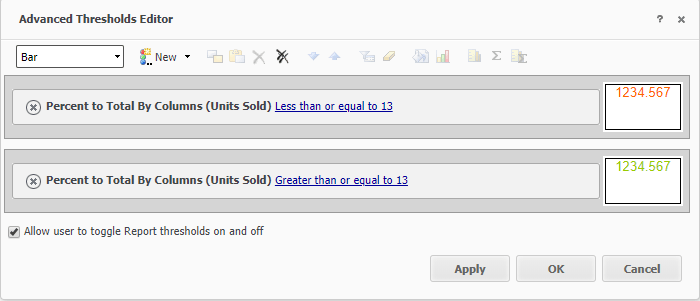
This is an example expression and not a real Pct Change formula. The expression generates some small numbers which are partly negative in this specific demo scenario. A real example would be something like change vs LY.
 
Use the formula:


0.01*([Percent to Total By Columns (Units Sold)]-15)

Custom format the metric using:

[<-0.01]- #,##0%" ▼";[<=0]-#,##0%" ►";[>0]+#,##0%" ▲"

 
The metric should be formatted with a red colour. Then apply thresholds to set a small orange and green range. This is because metric formats are easier to define than thresholds, and having more thresholds has a bigger impact on response times.

ka0PW0000001JRIYA2_0EM44000000RBhB.png

Create the negative bar


Create a derived metric and use the formula:


Concat(IF(([Percentage Change]>0), 
Concat(RepeatStr(" ", Abs(Floor((100*[Percentage Change])))), " "), ""), 
RepeatStr("█", Abs(Floor((100*[Percentage Change])))), IF(([Percentage Change]<0), 
Concat(" ", RepeatStr(" ", Abs(Floor((100*[Percentage Change]))))), ""))

The concat statement is based on two IF statements.
For the first: if the percentage change is greater than 0, the formula inserts blank spaces and then full block characters. For the second: if the percentage change is less than 0, the formula does the same, but in reverse i.e. the formula inserts full block characters and then blank spaces.
 
There’s an additional space character concatenated in the negative bars expression. It was needed because otherwise the chart did not look as nice.
 
Format as Courier New and align centre.
 
Add thresholds:

ka0PW0000001JRIYA2_0EM44000000RBhG.png

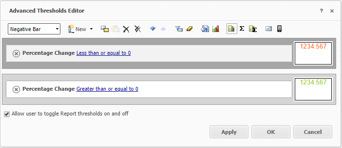
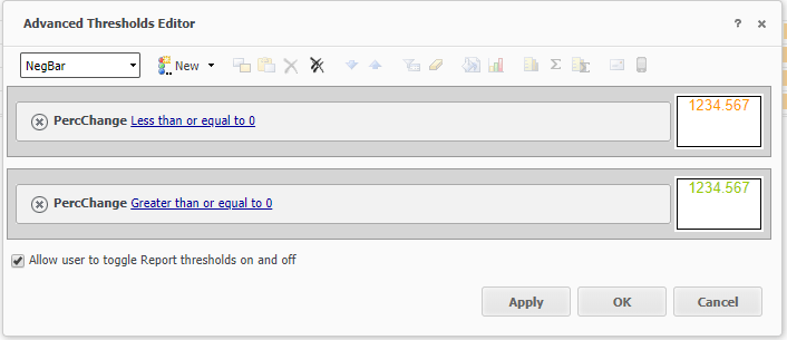
The Negative Bar doesn’t work in dossier using this formula, but the other examples work fine as below.

ka0PW0000001JRIYA2_0EM44000000RBhL.png


Comment

0 comments

Details

Example

Published:

November 2, 2018

Last Updated:

March 21, 2024