Starting with the release of Strategy ONE (March 2024), dossiers are also known as dashboards.
A stacked bar chart is another type of bar graph which allows comparison of components across categories. It is a graph that is used to break down and compare the parts of a whole. Data is plotted using horizontal or vertical bars stacked from left to right. Each bar in the chart represents a whole, and segments in the bar represent different parts or categories of that whole. Different colors are used to illustrate the different categories in the bar.
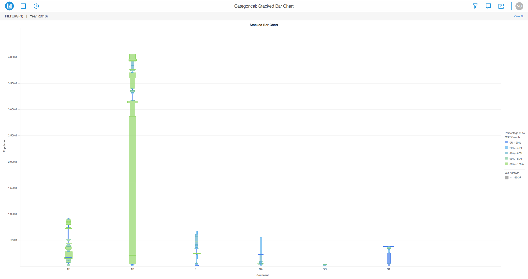
View the image below to analyze the population distribution of different countries separated by continents.
For example: Notice that India and China have the highest population values compared to other countries.
Object requirements:
Minimum Strategy version: 10.2
Publisher: Strategy
To view this dossier with the visualization:
Analyze using bar charts by downloading MicroStrategy Desktop!
1. A project in beta by ferdio, (2017, December 4th). Retrieved from http://datavizproject.com/
2. Bar Chart, Wikipedia, (2017, February). Retrieved from https://en.wikipedia.org/wiki/Bar_chart#Grouped_or_stacked
Interested in learning more about Dossier authoring? Visit the Learning Center on Community!