Starting with the release of Strategy ONE (March 2024), dossiers are also known as dashboards.
SYMPTOM
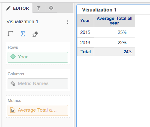
On Strategy Web, in version 10.9 and above, in a Dossier, on a grid visualization, there is a "show totals" button : it allows when enabled to add a "Totals" line that sum up (or calculate an average when it is about percentage) the figures of the previous line :
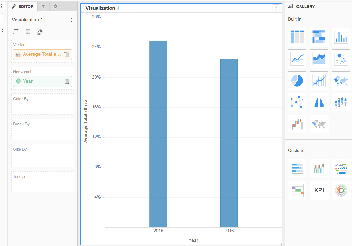
But when switching from the grid visualization to the bar chart visualization, this Totals figure disappear :
STEPS TO REPRODUCE
1. Go to Strategy web
2. Create a Dossier
3. Add a metric and an attribute
4. Press on the Sigma (Σ) sign to "show totals" : it adds a line with the total of the above figures (if it is percentage, it does an average)
5. Switch to "Bar chart" visualization
6.The "total" line disappears
CAUSE
This is working as designed, since this visualization is a basic chart graph. There are other advanced bar graphs available in the visualization gallery that can fulfill this requirement ,.
ACTION
Please select one of the following other graphs that takes the "Totals" line into account :
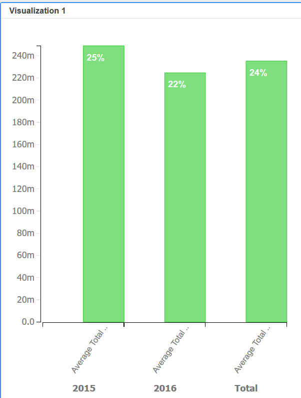
- Waterfall (built-in visualization) : : this design includes a total of figures (but not the average so not to be used with percentage)
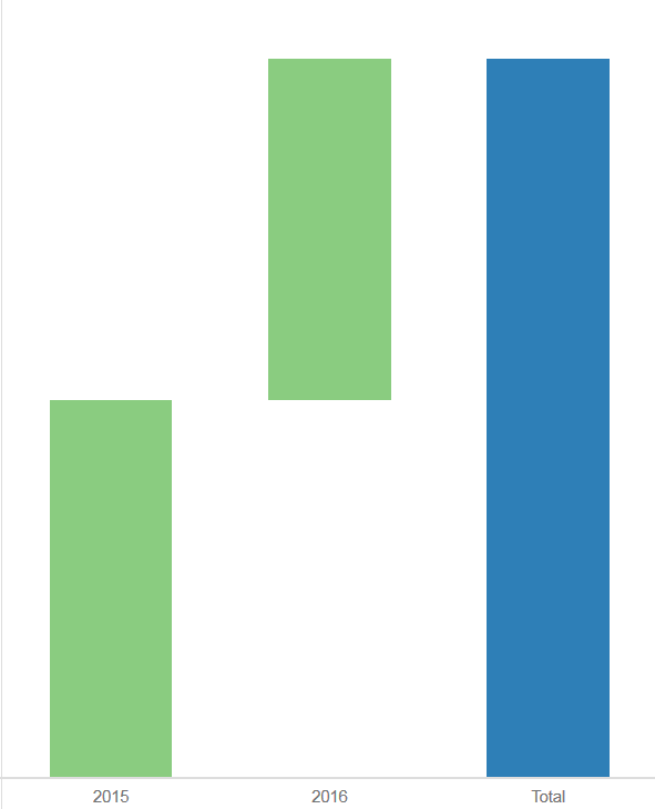
- D3Waterfall (custom visualization) : it can be downloaded in the Data Visualizations Gallery. This chart allows to keep the "Totals" figure as a bar. It adapts the calculation to a sum up if its figures, or to an average if it is percentages (see screenshot below).