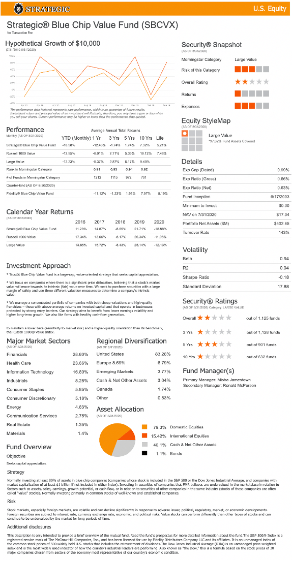
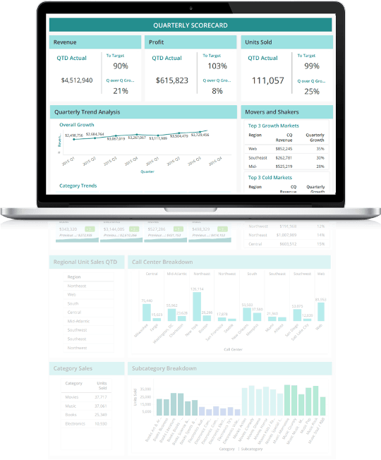
To reiterate, a general best practice for any interface design, is to arrange elements on the canvas that best match the natural reading pattern of the human reader. Users generally read from left to right, and then repeating each level from top to bottom, in what is known as a “F” or “Z” pattern. When designing content meant to be read such as dossiers, it is generally best to reserve the top-left section of your interface for your most important piece(s) of information. The next most important items should then occupy the top middle, and then top right sections of your interface with respect to their priority. This philosophy continues as the user reads down each line and from top to left again, until they reach the bottom right portion of the canvas, which should be reserved for the item with least significance to comprehending the story behind the dossier.
A pitfall to avoid when designing a dossier that is meant to scroll is to bury below the fold any content that is necessary to interpreting the total story of the dossier. Remember that your highest priority items should be near the top in the event that a user does not even have time to scroll and can only take a quick glance at the story with the time that they have available in their viewing session. Items that carry less significance should be placed below the fold as content buried here with the expectation that many users may not bother to scroll that far in their reading session. The items here should only add further context or complement what already exists above the fold. In short, authors should limit the amount of content that is necessary to complete the story of that dossier view, that resides below the fold while promoting key essential story elements to the top.
Lastly, as a best practice, when designing a dossier using vertical scrolling, bear in mind that users may not know that they even have the ability to scroll on the interface. Therefore, for content that is above the fold, a hint should be designed into the dossier that signals the user that there is more information below, encouraging them to scroll to see it. This can simply be achieved by designing the top portions of the full content below the fold, to appear halfway displayed above the fold. Users would then naturally be curious about the remainder of the dossier element that is not fully displayed in the initial view and would instinctively scroll down to see the remainder of the content that makes up the bottom sections of your content.
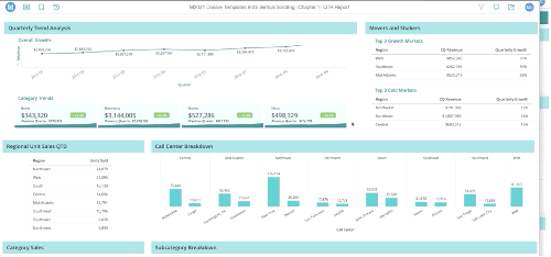
In this dossier, a user could not tell that there is more content on the interface
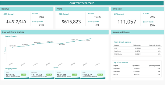
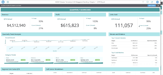
However, by adjusting the dossier layouts to give users a sneak peek of the elements below the fold, user are encouraged to scroll
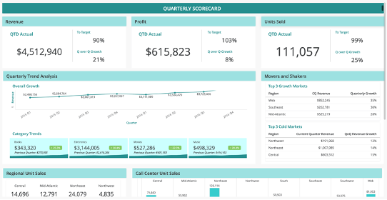
In this dossier, a use can easily scroll from top to bottom with no interruptions
However, in this view, the screen's cursor gets caught on the scrollbars of the visualizations on the right
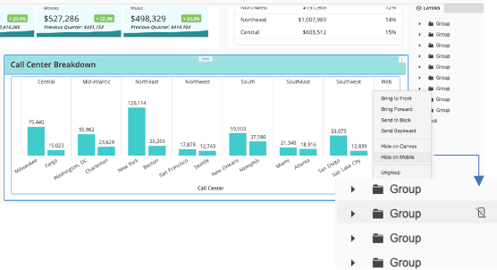
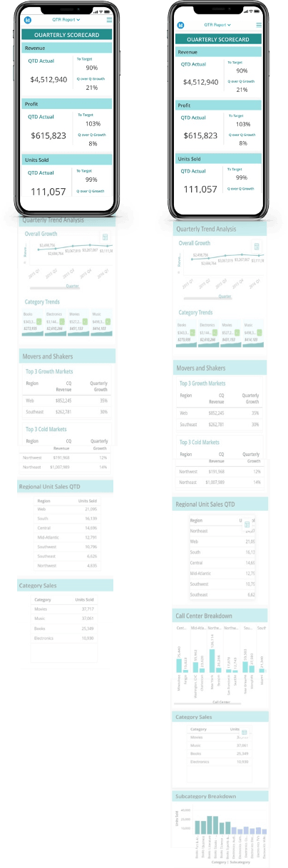
To hide an element or group on the canvas, simply right-click on its name from the dossier layers panel, then proceed to click Hide on Mobile. When an object or group on the dossier canvas is hidden from mobile successfully, a small icon will appear next to its name. This object/group will now be hidden on mobile clients. Now when the dossier loads on a mobile device, the end result will resemble something like the below images.
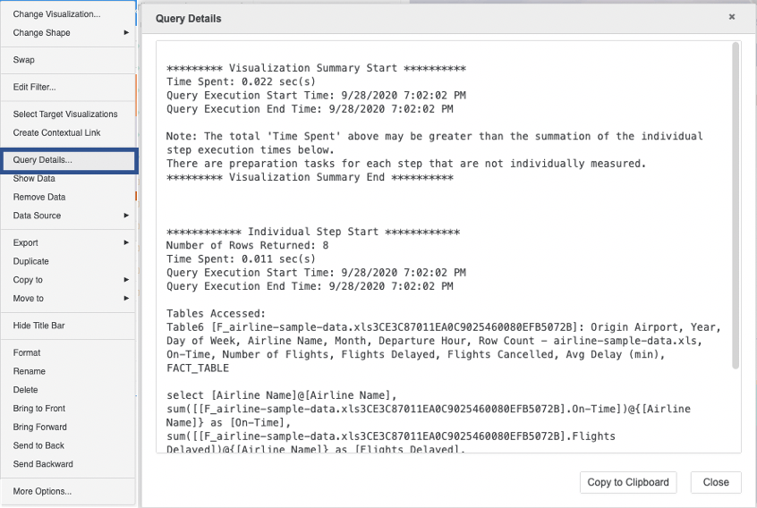
3. Work within each frame, either at the dataset level or the visualization level, to optimize the run time for that container.
4. Lastly, with each change, collect a new result using Integrity Manager or your enabled statistics, with the intent of achieving an execution time below the original baseline.
5. Repeat as many times as necessary for each frame until you achieve your desired expectation time.
