Starting with the release of Strategy ONE (March 2024), dossiers are also known as dashboards.
We've seen both types of dashboard, or dossier, designs. The first that can functionally articulate a story, but with a greyscale color palette, does not guide consumers down the intended flow of consumption, leaving them to read each and every visualization on the canvas to grasp the story. The second that has so many colors included in the design, where users initially marvel at the design, but are overwhelmed when trying to understand the story of that dossier, eventually opting to not use it. As modern business intelligence technologies advance, the best UX / UI practices must evolve with it, so that designers and business sponsors may design content that can tell a robust story with as little time and effort invested on their end users' part. After all, you want your users spending the majority of their time making decisions rather than deciphering the intended story behind each dossier.
This article aims to provide dossier designers best practices for strategically using color in their dossiers. You can explore the following topics to effectively illustrate a story with a well designed view.
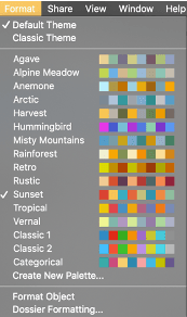
As of Strategy 2020, the dossier authoring experience currently offers 16 out-of-the-box (OOTB) color palettes, as seen in the below image. These preset color palettes were carefully crafted by our internal design teams and when used in your dossier design, help set the tone for the content that the user is going to be exposed to. There has been extensive research conducted on the psychology of color and what each hue conveys emotionally to the end user. When picking a color palette, remember to choose a set that complements and enhances the story that is being told through the real star of the show: the data!
Below is a summary of the signals each color broadcasts in a dossier.
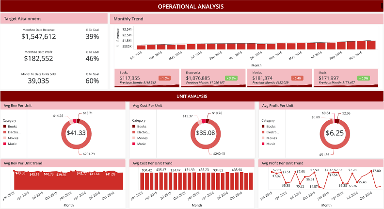
Red, in a traditional business sense, universally conveys to the user a decline, or a danger notice. As the hottest color on the spectrum, red generally draws attention much easier than most other colors, and when used in conjunction with numbers, generally conveys a negative outlook or perspective on the story being told.
Outside of the data context, red is one of the more intense emotional colors to the human eye, where some designers may use the colors to convey strong feelings of action, power, or aggression. Red, also my favorite color, is a favorite for signaling messages of intense passion or love, depending on the context.
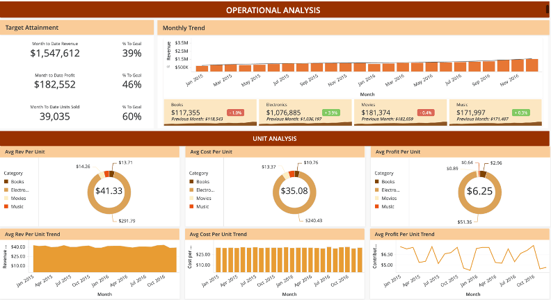
Orange carries a lot of the same attention-grabbing qualities as one half of the primary colors used to make it: red. However, orange is not as deep as red and leverages the more energetic primary color of yellow, and therefore can be used effectively to communicate intense and positive messages. Designers use orange in the design to imbue feelings of excitement, energy, and warmth, along with the story your data is telling. If you want your users to read the story of your dossier and walk away feeling invigorated, orange is your color. Lastly, orange is a staple festive color that complements any design that call for elements of seasonality (specifically summer and autumn).
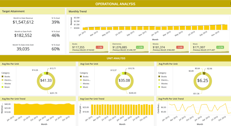
Yellow, being the primary color that makes up half of orange, enjoys many of the same benefits of orange in that this color signifies energy, excitement, and innovation. Yellow also serves as a color signifying caution or warning. Many dossiers that use in their visualizations a traffic light alerting system will use yellow as a means of signaling that if X isn't done, Y will turn red, which is what the consumer of the dossier would want to avoid by taking an action. Despite yellow being a bright and versatile color, designers should use the color with discretion, just like its fellow primary color red, yellow attracts much attention to the user's eyes which can take away attention from other areas of the dossier. Also consider that brighter saturations of yellow can easily cause visual fatigue to the user and can become distracting.
The first of the cool colors–green is universally recognized in business as an indicator of good news. When KPIs increase or when a specified target is attained or on a healthy pace, numbers that show green tell us that we're moving in the correct direction. When used outside the numbers and included in the design, green triggers emotional connections to nature, good luck, health, and growth–all positive and calming feelings communicated to your user. While green is one of the "safer" colors in your dossier's color palette, authors must take care to consider how to draw attention to positive areas of interest on the interface, without overusing the color or detracting from the message the data is trying to convey.
The color blue generally symbolizes peace, calmness, and reliability. Designers should consider blue when the overall theme of their content is to put the end user at ease and leave them assured by the story that is being communicated through the data. When using blue with your actual data, this color is a great substitute for green, for communicating positive growth or good news. Blue also has the advantage over green, in that it is a more accessible color and can be better distinguished in a dossier design to a colorblind consumer. Lastly, when coloring the numerical values of your data, lighter shades of blue, resembling ice, could also signal stagnation or no movement after extended periods of time. Keep this tip in mind if the story your users consume should evolve and change dynamically as the data changes.
The final color we'll briefly describe is purple, the last of the cool colors and a combination of the emotional red and the calming blue. This color triggers spirituality, royalty, and deep thought. When using purple in the design, it's common for users to trigger their deepest levels of thinking and relaxation. However, a warning for designers is to be careful with purple, as an overuse of the color will cause your audience to daydream and not focus on proceeding in the story illustrated by your dossier. Consider using purple sparingly in conjunction with other colors on your palette
When using a dossier, if you do not see an OOTB color palette that is feasible for you, or conflicts with your organization's branding requirements, there's no need to worry. Strategy's Dossier Authoring experience allows users to create their own customized color palette using Strategy Workstation. After creating and saving a custom color palette, when a designer wants to create a new dossier, Workstation will remember your selected palettes so that you may reuse and recycle your carefully crafted choices for future dossier development.
If you find yourself designing a new color palette from scratch, keep the below best practices in mind:
While color is one of the best ways to bring a dossier to life, using too many different colors on the spectrum could potentially cause fatigue to the end user when consuming the story. The average user can only keep so many bits of information in their mind as they navigate a dossier, so it's best to keep the color scheme simple by selecting no more than 3 hues. Strategy recommends that when choosing your colors, to keep the 60-30-10 rule in mind. Begin by choosing a dominant color which will dictate the look and feel of 60% of your dossier, or the majority of the interface. Then, choose 2 additional colors that will comprise of the remaining 30% and 10% respectively. Based on your preference, the other colors could also be analogous or adjacent to your dominant color's relative position on the wheel, which lend itself to improving the overall consistency of your dossier design. For example, for a dossier with a primarily red color scheme, orange might be a good accent color to the dominant hue.
Furthermore, based on the designer’s preference, one of the two additional colors could be also be complementary, meaning they exist on opposite ends of your color spectrum with respect to your selected dominant color. Following our above scenario, red and blue are not only opposite of each other, but also represent a cool color complimenting a warm color. In a dossier that’s red dominant with accents of orange, using a blue hue on specific metrics will capture your audience’s attention as it contrasts against the overall color scheme.
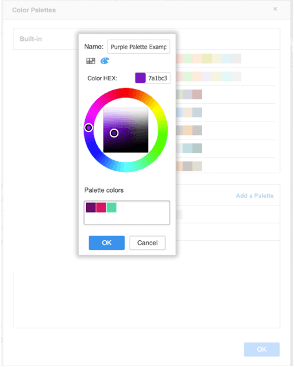
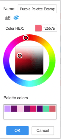
In the example above, for designers who want or need to use purple as their dominant color, they can select their preferred tone of purple on the dossier color palette creator. This selected hue would then make up 60% of your dossier’s design. For our next hue, we may consider an adjacent color on our wheel. The 2nd magenta color illustrated in the screenshot is adjacent to our originally selected purple hue and can be used to accent elements of our dominant color, but taking no more than 30% of the overall color scheme. The 3rd color selected could be complementary, meaning that it falls on the opposite end of our color wheel. In this case, we chose teal to be our complementary 3rd color. This teal would then appear the least (10%) in our dossier’s design, but due to the vast difference between it and the dominant hue, it stands out the most. When highlighting data of interest on your dossier, it may be worthwhile to use this third color to demand a user’s attention, due to it being so different from the remainder of the dossier’s design.
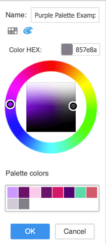
To fill out the remainder of the color palette, for each color chosen, use the dossier authoring interface's color wheel to modify the saturation levels for each color. We recommend having color variations based on both the saturation (color intensity) of your selected hues, as well as the brightness (amount of white/black mixed in) to round off your color scheme. Assuming you have started your design with 3 colors in mind, use your dossier's color wheel interface to fill out your palette. As of today, you can create up to 16 colors for each custom palette. However, we recommend filling out no more than 12. Later on, if the designer feels the selected colors are not sufficient, they can always go back and add more. In the example on the left, continuing from our above purple palette, we have adjusted the saturation and brightness of our 2 most dominant colors to fill out our palette. We now have a mix of high and low saturations of purple, as well as various levels of brightness of the hue.
As the old saying goes, black goes with everything. In a dossier design, similar philosophy could also be applied to the neutral colors, grey and white. All of these colors are versatile and fit into most color schemes effectively in a dossier. For example, greying elements out pushes context to the background, signifying that it is not as important, or requires less attention in the dossier story. Black fonts can be used to signify elements of moderate importance, while colored data dominates the user's attention and is where they will actually focus.
When using thresholds in a grid, the golden rule that less is more applies here as well. At some point in time, we have all been victim to the Christmas tree grid with a color for each dimension, or band, on a number scale. There is extensive research available which tells us that the overuse of color can have the opposite of the designer’s intended effect of communicating the story. When exposed to multiple colors that have meaning attached to the data, users can easily be overwhelmed by the amount and differences in color, which can result in dashboard fatigue.
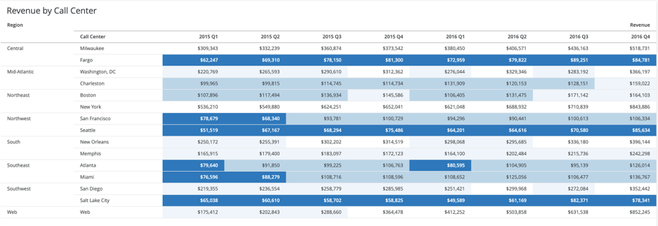
Many traditionalists in the design world still make use of the traffic light system for their thresholds in a grid object. While the traffic light system can fundamentally work, as it tells the user that there are both good and bad points in the data, it does add a degree of noise when interpreting the data in a grid, having to identify and translate the meaning of two or more distinct colors, rather than one.
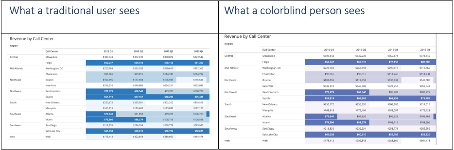
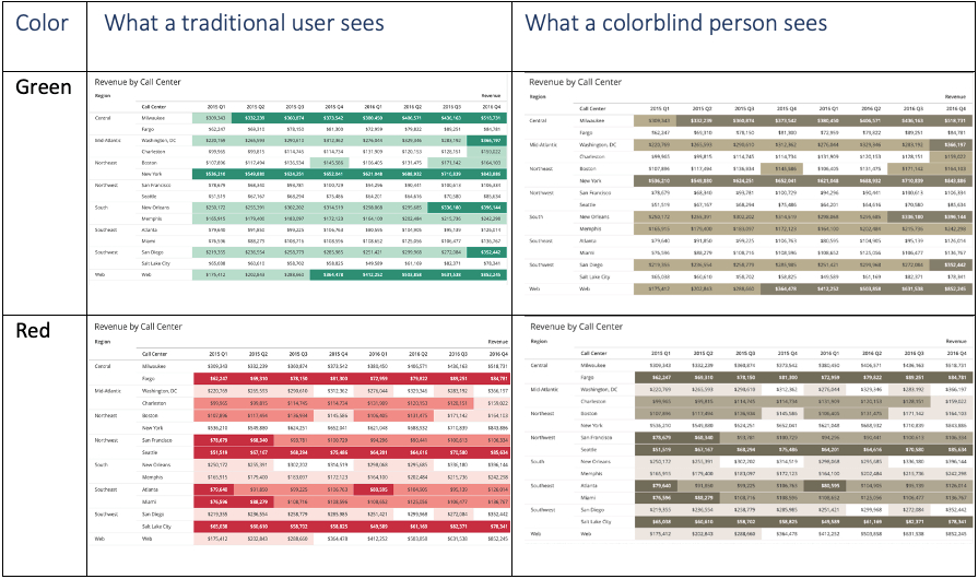
More importantly however, the traffic light thresholding model does not account for the population of users affected by colorblindness. Research shows that 1 of every 10 males suffers from some form of colorblindness, with the most common being the inability to distinguish between red and green hues. While a traditional user might see the image on the left, someone with red-green colorblindness would see the right.
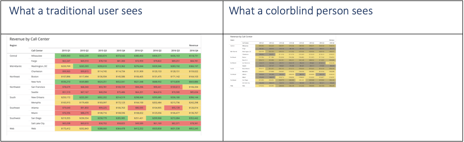
Looking at the above image, neither color can distinguish themselves well enough from each other to a potentially colorblind user, which detracts from the story that is trying to be communicated through the dossier. To prevent the potential confusion caused by the traffic light system, we may consider a one-color system instead for grids.
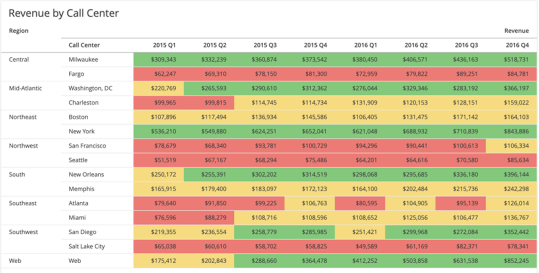
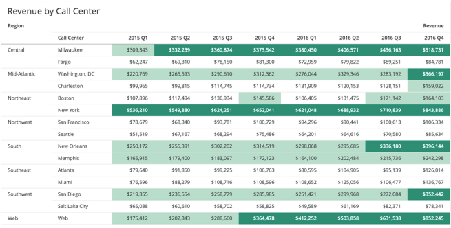
When using thresholds, consider a monochromatic or single-color scale, where instead of changing hues (colors) based on a metric's conditional criteria, we instead adjust the saturation or brightness of the color to signify importance. In the below example, we use a neutral tone of blue and in this case, we are interested in seeing the lowest revenue figures by call center. The centers in the lowest percentile have the deepest shade of blue and additionally, have bolded white font that contrasts against the fill color. Most users that see this will have their attention dominated by the data that differs the most from the rest of the design. The resulting effect is that instead of going row by row in a grid with no thresholds or jumping around to “hunt the reds” in the traffic light system, a user will spend the majority of the time in this grid on the records that have the deepest saturation and contrast between the text and fill. For other bands in our number scale, from most to least important, each less important range fades into the grid background.
The benefits of a monochromatic scale extend to colorblind users as well. In the below examples, we see the difference between what a traditional and a colorblind user experience. The areas that demand attention in the grid will be equivalent for both user types, with no part of the story being lost.
In some use cases, a user may need to read the dossier’s story with an emphasis on the positive aspects. In this case, we could use a mono green scale to highlight the strongest areas of the business. In this example, the highest revenue figures are highlighted with a deep green and bold white, dominating the user’s attention. Those records that are less significant are shaded but with a color that is closer to white.
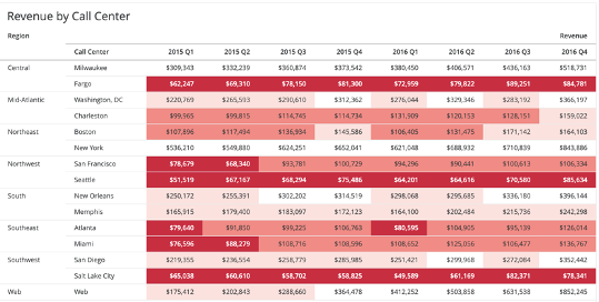
In other cases, a user may need to read the dossier’s story from the opposite perspective, with emphasis on the negative aspects. Here, we use a mono red scale to highlight the weakest areas of the business. In this example, the lowest percentile revenue figures are highlighted with a deep reed and bold white, dominating the user’s attention. Those records that are less significant are shaded, but with a color that is closer to white. Since this view is focused on the negative, we may consider more color bands so that we can highlight areas that are approaching the danger zone but are not quite there yet.
As a reminder, no matter which color scheme suits your use case, mono color scales in grid objects are generally more accessible than their 2 color counterparts.
Concluding our conversation of grid thresholding, we reiterate that instead of relying on diverging colors (red/green) to represent positive and negative values in a grid object, to instead consider a single color scale. Monochromatic scales allow us to navigate the desired good and bad parts of the grid's story by following the saturation or brightness levels. They also are more accessible to users that may have additional needs to accommodate colorblindness.
There's nothing wrong with using color, or even multiple colors, in a graph such as a bar, line, or pie chart. Colors in graphs are good, in that they help us distinguish different dimensions or categories of data from one another. When used consistently across a dossier or even multiple dossiers, colors can expedite the time to consume data by associating themselves to the dimensions of data they represent. However, just like with grids and the overall design color scheme, too many colors used in graphs can detract from the story that a particular visualization is trying to communicate.
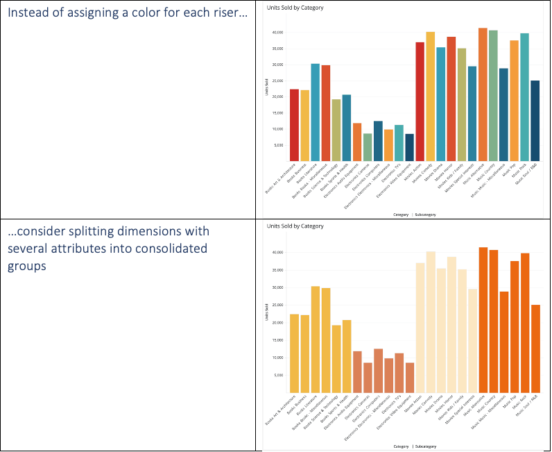
When using bar or pie chart visualizations in particular, it's common to associate one color to each dimension in the visualization. However, when we have a large amount of different dimensions that we can break by, for each additional color beyond 4 added, a cognitive tax is levied on the user's mind, which slows down their ability to effectively consume the data visualization being shown. Furthermore, a user will struggle to remember the color associations of each dimension if they are used in other visualizations within the dossier. Generally speaking, your user should not have to keep referring to a legend to translate the colors into meaning. Remember, the different dimensions are not the main characters in your story, rather the value of whatever KPI is being measured per category.
As a pro tip, if you have multiple dimensions in your visualization, determine if they can be strategically grouped by a higher level in that attribute's hierarchy. For example, New York, Boston, and Philadelphia are different cities which may be different dimensions for one attribute. However, all of these states geographically are in the American Northeast region, so it would be plausible to group all of these cities into the same color.
In the example below, we have 4 primary categories of items, each with multiple subcategories beneath them. Instead of assigning a unique color to each subcategory, we could easily group them into their parent category so that a user is still able to lean on the color association without having to spend too much time processing the meaning behind additional, but maybe unnecessary, colors.
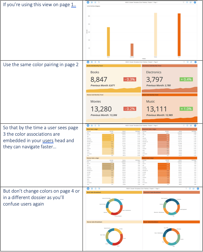
Should the different categories appear multiple times throughout the dossier, it's strongly advised to keep this consistency in the color mapping across all visualizations. Any effort your end user has to expend to re-associate colors with context is energy wasted trying to understand your dossier's story. Minimize this risk by keeping the color associations for different categories in your dossier consistent. It would be wise to additionally consider using the same color association in other dossiers that have those same dimensions as well. This is so your entire business can be on the same page and have a consistent color association between particular dimensions of data, meaning everyone can read the same common language and no context is lost due to color.
You may decide to forgo splitting bar risers or pie slices by color completely and have a consistent color usage across every dimension. This is absolutely fine as well and draws further focus to the actual data being presented in each visualization. However, to take this concept a step further and make it easier for your users to get to the point, as a designer, you might consider the use of highlighting the bar or slice that carries an actionable insight.
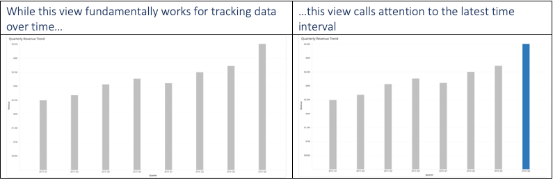
Instead of having an all vanilla set of bar risers, consider highlighting the riser that calls for your immediate attention. In the left part of the example below, there’s nothing wrong with this view as it accomplishes the job of plotting the metric over time. However, most users would read this graph from left to right, consuming all data points for each bar riser. In this example, we can use color to guide the user and give them a reference point from which they should view the dossier. In the right part of the example, we see that the last, or most recent time interval, is highlighted. In most scenarios, users may be interested in knowing their most recent data and using it as a benchmark for how they analyze that same metric against other prior time intervals.
In the above example, we simply highlighted the most recent time interval. Users might work backwards through each time interval to understand the story. We can help the user out even more by guiding them to compare the most recent, as well as an equivalent prior time interval. In the case below, we want to analyze the past quarter with that same quarter in the previous year.
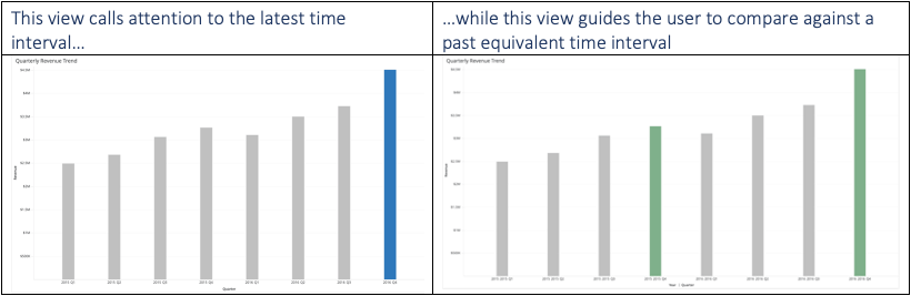
If we look at the above example, on the right, the user is guided to compare both highlighted risers against one another, which cuts down the time needed to compare intervals of interest. The highlighter approach doesn’t just work with point in time data. It can also be applied to categorical data as well. In the example below, we may want to emphasize the analysis of a particular category as part of an ad hoc analysis.
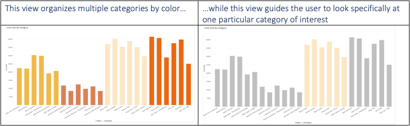
Both views, once again, do the same thing. However, the right view gives priority to the category that is meant to be highlighted. There may be some cases where a filter is more appropriate to accomplish the same thing. You should however consider this approach when it is still necessary to surface all of the other dimensions in the visualization container, just so that the user may keep them as a reference.
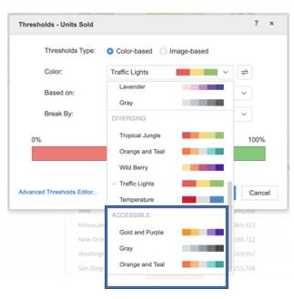
We've briefly mentioned above the importance of designing with accessibility in mind, as we touched on red-green colorblindness. Strategy's dossier authoring mode provides 3 OOTB accessible color palettes for grid thresholds that designers can use to ensure that all colors are legible to those who are colorblind. For more information on designing accessible dossiers, click here.
We hope that the information here has been helpful to you as you design your dossier(s). Colors are one of the easiest ways to bring dossiers to life when used strategically. Conversely, the overuse of color can derail the storytelling your dossier object is meant to express.
As you're creating robust dossiers with clear attentiveness to color, feel free to share them with us as part of our monthly DossBoss challenge. Further information can be found here.
Good luck and have fun creating!