Starting with the release of Strategy ONE (March 2024), dossiers are also known as dashboards.
New Features & Functionality
The Dunder Mifflin Dossier
This awesome Dunder Mifflin dossier was built with an original dataset, curated right in headquarters. This is the second post in our weekly series of winning dossiers from Strategy's internal "So you think you can dossier" contest. This specific dossier was chosen due to its unique, creative visualizations and data, as well as the amount of data utilized. Way to go, David Rudman! David is an Associate Product Manager here at Strategy. Feel free to use the dataset he created to make your own Office dossier.
Why did you choose this dataset?
"For this dossier, I wanted to create something similar to an executive performance dashboard. I didn’t want to use real data or make up data with no context, so I used my extensive Office knowledge, random data and attribute elements from Mockaroo, as well as some exhausting manipulation in excel to create a realistic Dunder Mifflin sales dataset," remarked David when interviewed about the dossier.
What visualizations did you choose and why?
"I wanted this dossier to be representative of something that Dunder Mifflin would use at their corporate office, so I mostly used bar charts and maps."
What questions were you asking while creating the dossier?
"What office performed the best? Why was the Stamford office closed and merged with Scranton? Which salespeople were the best performing?"
More information about the dossier
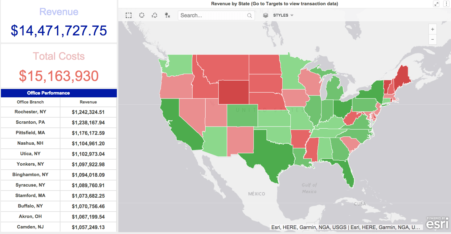
This Executive Overview quickly shows KPIs by branch and which states are bringing in the most revenue.
You can right click on each state and go to targets to jump to a filtered page with transaction level data.
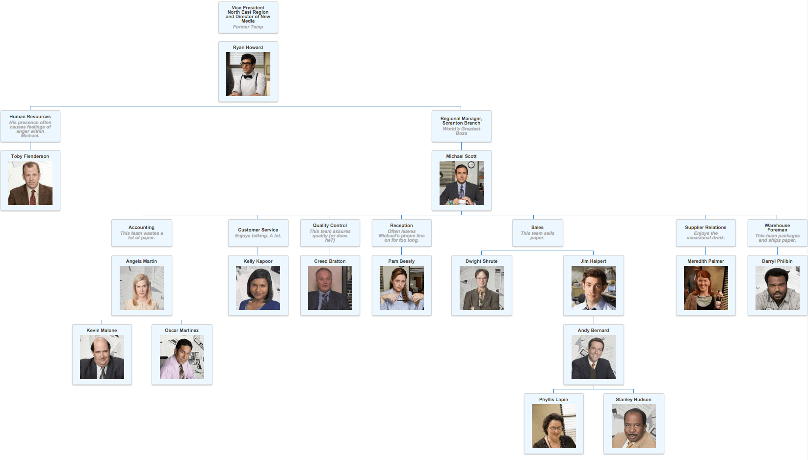
This visualization shows you the hierarchy of the Scranton branch, with information on employees, like Creed Bratton on the Quality Control team "assures quality (or does he?)". You'll need to download the org chart plug-in to view.
Check out this Community post to install this visualization:
https://community.strategy.com/article/Org-Chart
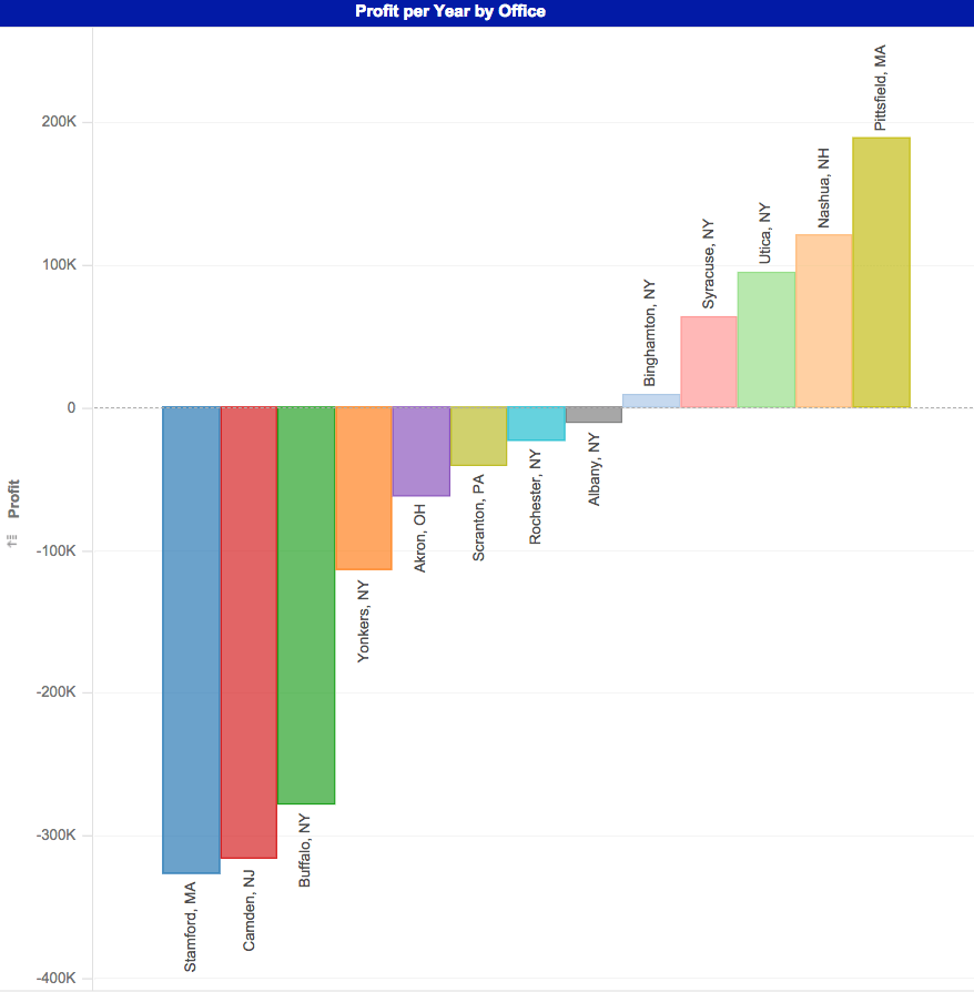
This bar chart shows that some offices operate at a profit loss, like the Stamford office--resulting in the need to merge them with the Scranton office.
What did you learn about this dataset through your dossier?
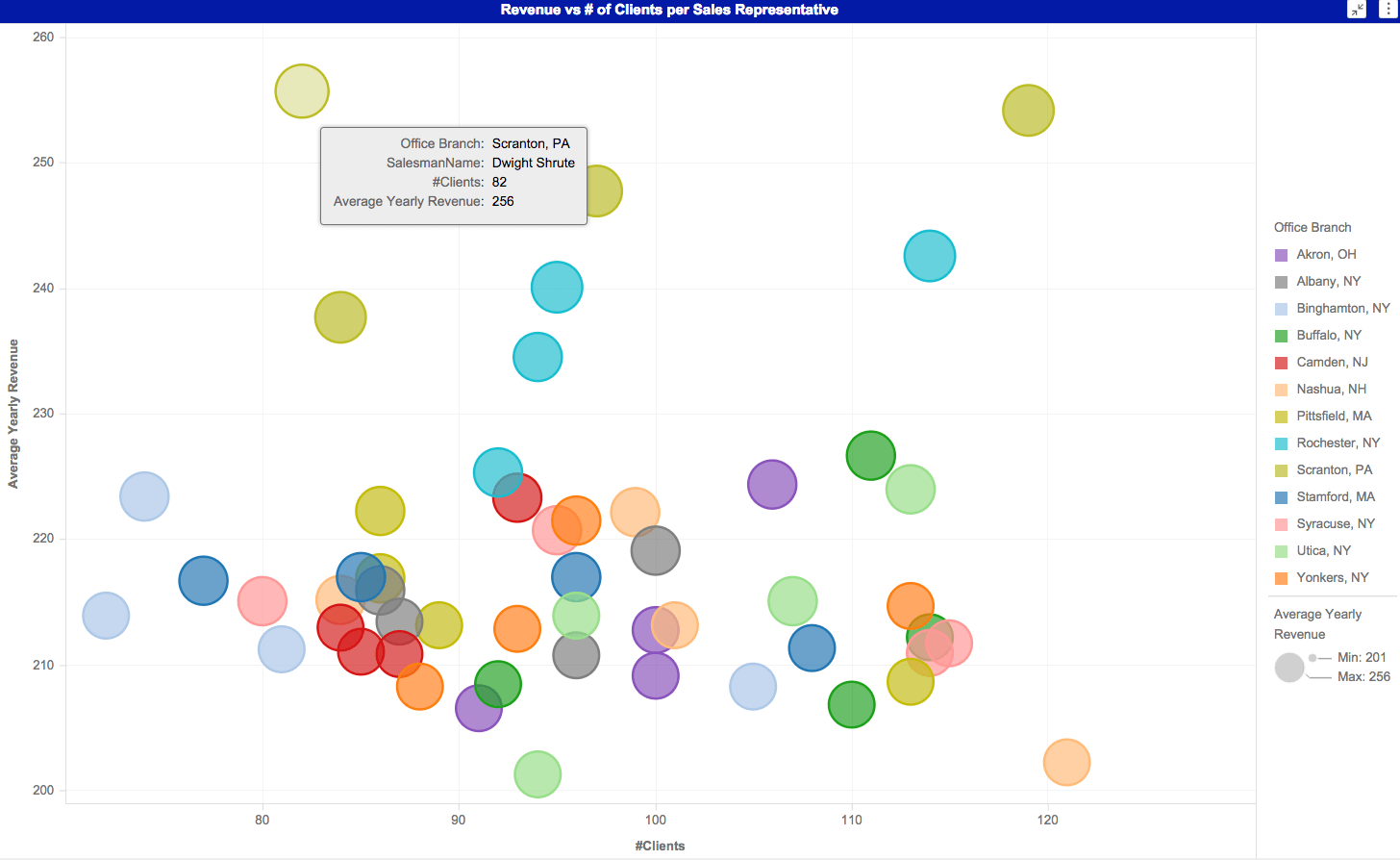
It seems that David did learn something through the dossier. Check it out, "I learned that Dwight Schrute is the best salesman at Dunder Mifflin, but his nemesis, Jim Halpert has the honor of most clients... which must really bother Dwight."
Download the dossier to check out the other visualizations and interact with the data. And, as always, feel free to share your feedback below! To view any custom visualizations used, download from the Visualization Gallery.
This dossier was created on Strategy version 10.11. Make your own dossier with MicroStrategy Desktop!
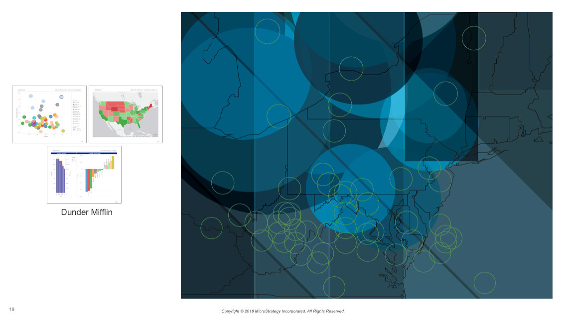
Here's the dossier-inspired artwork created by the Creative Services team.