SYMPTOM:
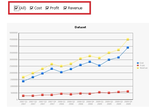
When running a Report Services document or Graph Reports, users notice that the color assigned to a series is not consistent and changes depending on the information that is displayed on the graph in Strategy 9.4.x-10.x. An example is shown below with selectors:
When the user selects to display all metrics in the metric selection selector, the Cost series is shown in blue, the Profit series is shown in red, and the Revenue series is shown in yellow:
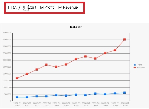
When the user decides to only display metrics Profit and Revenue in the graph, and does so by unselecting metric Cost from the selector; the user notices that the color of the Profit series changes from red to blue, and the color of the Revenue series changes from yellow to red:
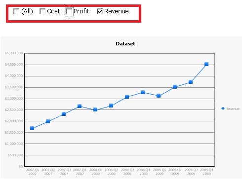
And if the user decides to only select Revenue in the metric selection selector, the color of the Revenue series changes one more time, from red to blue:
CAUSE:
This is working as designed in Strategy 9.4.x-10.x. Each series in a graph has an index, and said index is not tied to any one particular metric. Formatting settings are not associated to specific metrics, but to a series based on their index. Whenever the information in the selectors is modified, the graph is redrawn and therefore the series are re-indexed. This also applies to regular reports without selectors.
ACTION:
In Strategy 10.4 and higher, users can use Advanced Thresholds to set a specific color for a series on a graph as described here.
Users can also assign a set of formatting settings to any particular metric in a graph, regardless of the internal index assigned to the series in which the metric appears. To access this setting, follow the steps below:
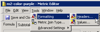
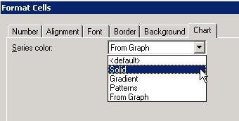
1. Edit the metric, go to Tools > Formatting > Headers...
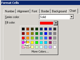
2. In the Format Cells editor, go to the Chart tab, and define the formatting for that particular series. From the drop down, for example, select Solid and provide a color.
In this example, we will select Solid and then the color Red:
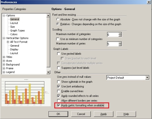
3. In the graph's Graph Preferences menu, make sure that the option to "Apply metric formatting when available" is selected, as shown in the screenshot below:
4. Now when the metric is placed in any report it will always use the color/formatting defined though the Metric's Chart tab.
Internal Reference Number US30932