Starting with the release of Strategy ONE (March 2024), dossiers are also known as dashboards.
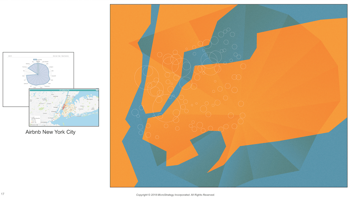
Strategy held a dossier contest across all our offices to show off our product and create artwork for our domestic and international offices. The Creative Services team created artwork for our offices inspired by the winning dossiers. Take a look at this dossier on NYC Airbnbs that was transformed into an orange and blue map of New York City.
For this dossier, we used this Airbnb dataset.
Recommended to view in Strategy Web.
Dossier created on Strategy version 10.11.
To learn more about the Dossier and data analysis, check out this interview with Amy Laresch, Product Specialist.
"I made a dossier using Airbnb data since I often visit NYC and wanted to explore the Airbnb options in a more visual way."
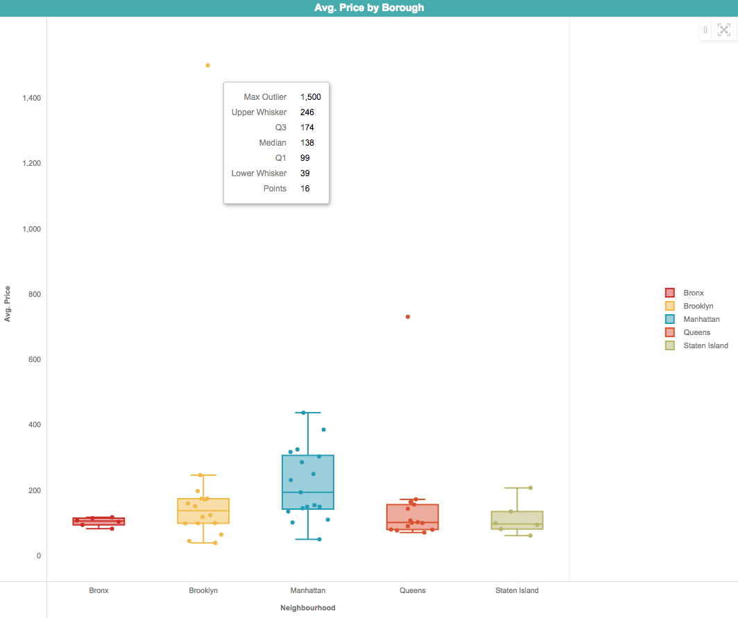
"I wanted to see which neighborhoods were more affordable so I used a box plot to compare the price ranges by property type. Each box represents the likely range of price variation by property type. The $1,500 outlier is a villa in Brooklyn. The middle line tells me the median price of each neighborhood by property type. So the median for Manhattan is about $200, while the median for Bronx, Queens, and Staten Island is about $100."
For a more thorough explanation of box plots, check out this page on Community!
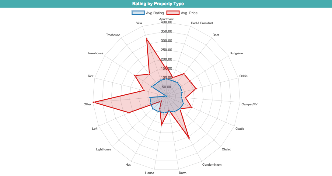
"Using a Radar chart, I was able to compare multiple variables and easily spot outliers. Here, I can see that I might want to avoid villas and condominiums since they are much more expensive on average, but have a similar rating to other property types. I might want to check out Bed & Breakfasts on Airbnb since they have a lower average price and a higher average rating."
View the Radar chart below:
For a more thorough explanation of Radar charts, check out this page on Community!
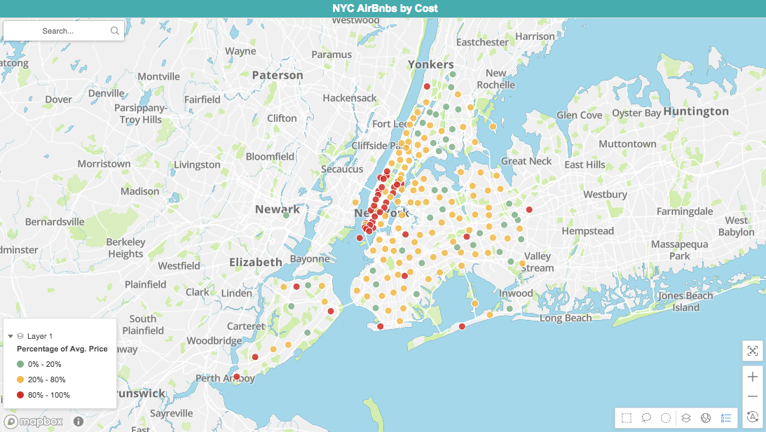
"I used a map to plot each Airbnb location based on their price. The cheapest 20% are green, while the most expensive 20% show as red. This shows me that Manhattan is the priciest borough, so it might be worth staying in Brooklyn or the Bronx and taking the subway into Manhattan." View the map below:
"This visualization creates a narrative based on the attributes and metrics I drag in. I wanted to compare average rating by property type and the natural language generation tells me that castles and lighthouses have the best rating, while tents have the lowest."

For a more thorough explanation of these narratives, check out this final Community page!
"Next time I visit NYC, I'll look into staying in a B&B in Brooklyn."
Download the attached dossier to check out the other visualizations.
Make your own dossier with MicroStrategy Desktop!
Feel free to comment on this article below!
Note: If using Desktop, you won't be able to view the custom visualization plug-ins.
Interested in learning more about Dossier authoring? Visit the Learning Center on Community!
